2022! The color choices that dictates hope and renewal. Optimism, Positive energy. Happiness! Yellow has no fear!
Two regions chose yellow as their Key color! First time ever that this happened, which says a lot about the mindset all over the world post-pandemic. Although different in chroma, they are both red-influenced and share the same level of brightness. Warmer colors, more saturated colors, are definitely more trending after the uncertainty of the pandemic!
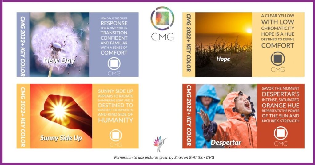
North America – New Day
As per CMG: “The gentle nature of New Day conveys the desire for a compassionate, civil emergence from the pandemic.
Conditions were overcome and the expectation for 2022 is a strong move into a decade of happiness, economic growth, and prosperity.
At first one would think New Day is just a calm soothing hue, but the red undertone has a stimulating effect that would be acceptable for any application.
New Day is a color that stands for truth and hope.
It is a color that inspires trust with its connection to nature. It suggests friendliness and innocence, fresh and welcoming.
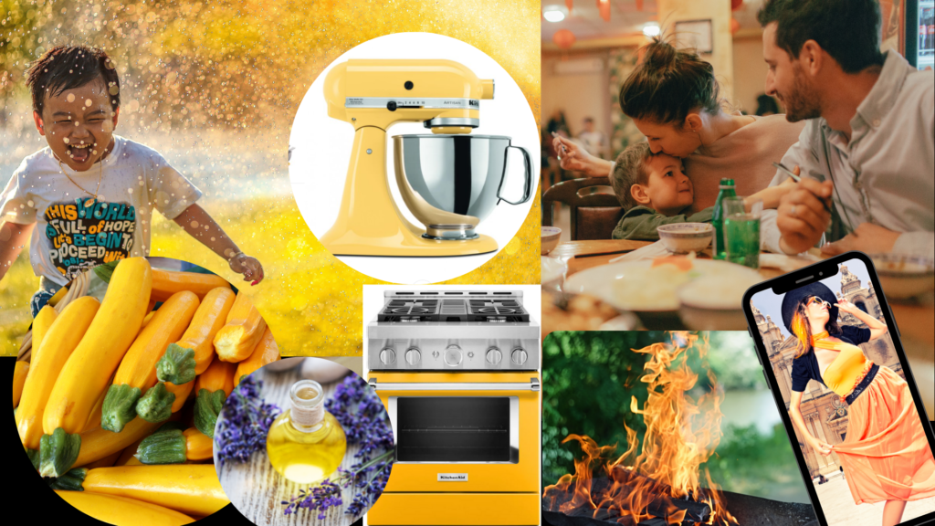
Asia Pacific – HOPE
As per CMG: “Hope has the slightest touch of red to add additional warmth to a hue destined to define comfort.
Hope is created to exude optimism and renewal as the region, with the world, continues to emerge from the pandemic.
Visually related to nature, light, and growth, Hope will create a color environment of optimism and comfort.”
Don’t be surprised to see this specific yellow in kitchenware, kitchen appliances, and tabletop products.
Kitchens became our offices, our school rooms, gathering areas. Hope is said to create a continuous flow of positive energy.
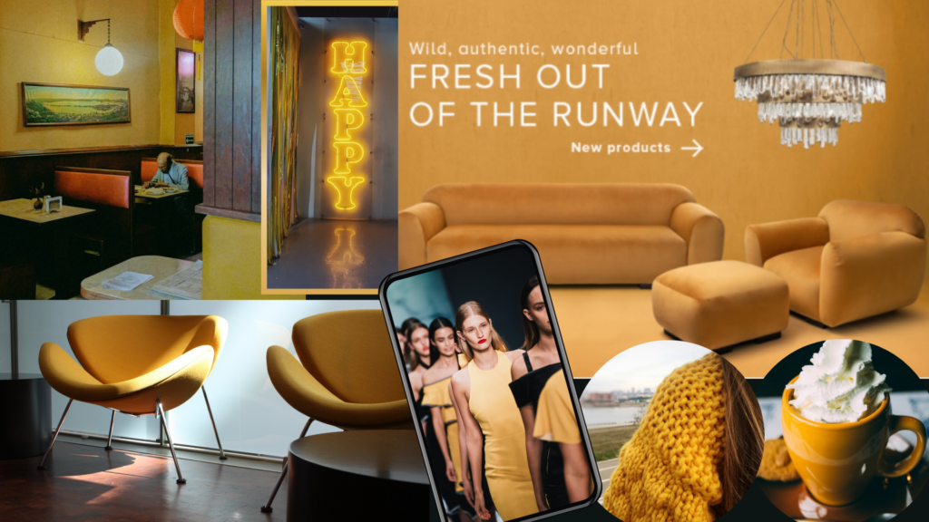
Europe – Sunny Side Up
Sunny-Side Up is defined as a color that exudes light and freshness. It is considered a color that creates feelings of optimism, energy, and forward-thinking ideas.
It appears to radiate shimmering light and is destined to represent the empathetic and kind side of humanity.
People or not so afraid of Yellow anymore.
It is a friendly warm and welcoming hue! It can be used in a very successful way to upholster a cozy sofa or your favorite office chair. The color of Happiness!
Latin America – DESPERTAR
The warm, bold color of Despertar is considered revitalizing with its connection to nature and is a natural addition to design.
It offers a sense of warmth and energizes whatever it embraces.
Eco-living will become key for interior spaces. people are more focused on sustainability
Ready to take the next step?
You can book an appointment with me for personalized support or schedule a discovery call if you’d like to explore how I can help.
Enjoy this blog?