COLOR IS PERCEIVED IN CONTEXT. NOT IN ISOLATION
This is one of the first lessons I was taught when I started my color career and also one of the basic principles I teach my clients when I do a Color Consultation. Color is affected by what other colors it is surrounded with.
For those of you who have had a Professional Color Consultation with me before, you know that I always show you the suggested paint color by isolating it, using a large white poster board if you don’t have a white wall that I can use during the demonstration
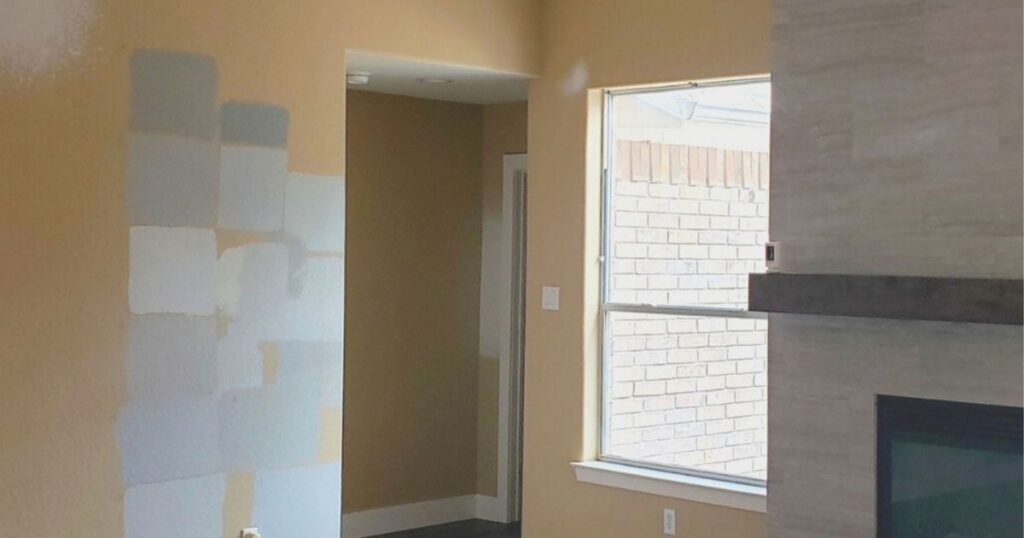
One of the biggest mistakes that anyone can make when trying to decide on a wall color, is to paint tiny color samples on top of the existing old color in a house. The internet is flooded with images like that!
In the first place, painting tiny little swatches or stripes is most definitely not going to even give you the faintest idea of how that new color will look in the bigger scheme of things. You might as well just stick the tiny paper swatches on the wall, it will show the color more accurately than 27 little paint smudges.
As a matter of fact, I would go as far as to advise you not even test paint directly on your walls. Paint samples are usually a lower quality paint and I know from experience that the Sherwin Williams sample of paint that I bought at Lowes before, was way shinier than the one I got directly from Sherwin Williams.
And you really want to avoid having layer upon layer of paint in a certain spot. It might still be visible under the new coat of paint if a primer has not been applied or if the old swatches weren’t feathered out to soften the edges.
Secondly, if you paint color such as a taupe or a beige color on top of a paint color that has a warmer feel or a yellow hue (undertone) to it, your cool beige will now look gray! See image below. Exact same “paint color” different backgrounds
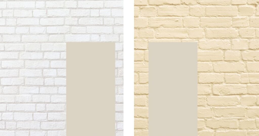
I had two phone calls from different clients, different parts of the town, at different times of the year where I specified the same wall color. Elmira White HC-84 from Ben Moore . It is a beautiful cooler beige and although they both loved the color when I showed it to them, they both were very upset that I gave them a gray after they were very specific about not wanting gray paint color!
Needless to say, both had yellowish walls, that’s why they called me, and the painter painted right on top of it. They obviously saw the wall before it was completely painted and panicked
Just as well that I very confidently told them to breathe and call me once the painting was done and then tell me how they feel about it. Both loved their fresh new look!
PLEASE NOTE:
In the perfect world, you should test a paint color on a neutral gray background. Any Professional Color Consultant will tell you that.
But I have also learned over the years, that very few people understand what a neutral gray is, so for practical reasons, just use a white background. But you need to understand that any color will look brighter when it is held against a white background, right! Keep that in mind when you are trying out a few neutrals.
Of course, you don’t have to buy a paint sample, a brush or a roller, or a posterboard, take the time and make a mess!
We live in a world of convenience. Nowadays you can just order an actual painted sample without having to store yet another paint sample in your garage.
I partnered with this company, because I really like the concept of just ordering the samples you need, and it can be used over and over again.
Ready to take the next step?
You can book an appointment with me for personalized support or schedule a discovery call if you’d like to explore how I can help.
Enjoy this blog?