It’s always amusing to witness the varied reactions people have when Pantone announces their Color of the Year. In my professional sphere, the immediate association tends to be with PAINT colors – the idea of painting a room in that shade raises eyebrows.
Remember the days of Veri Peri? It brings a smile to my face when I recall the skepticism back then. The Veri Peri color was chosen due to its significance in the virtual landscape, where colors play a major role in the realms of Metaverse and AI. And Metaverse became a household world right at the same time.
The Color of the Year isn’t just about paint, my friends; it transcends into the domains of technology and many different areas of design.
Color, in our modern context, extends far beyond walls. Take a moment to look around – from your cell phone cover and dog leash to the color of your mouse pad, the pillow on your sofa, or even the hue of your shampoo bottle. Everything is about color, and these choices often align with collective movements, trends, or the prevailing moods of a specific point in time.
Behind the scenes, the research into the trending Color Palette, or the Color of the Year, is a rigorous process, grounded in scientific approaches. It goes beyond aesthetics, reflecting the dynamic interplay of colors in sync with the evolving tastes, preferences, and moods of society.”
Who or what is PANTONE?
In layman’s terms, Pantone is a standardized system for identifying and matching colors. It’s widely used in various industries, such as graphic design, printing, painting, and manufacturing, to ensure consistent and accurate color communication.
Let me explain. Pantone provides a unique number for each color in its system. This number is like a code that helps people easily communicate about specific colors across different industries to ensure that that specific color translates to different surfaces.
Think Tiffany Blue for example. The specific Pantone color associated with Tiffany Blue is Pantone 1837. If a company is producing products like electronics or home goods, fabrics, or printing an ad for that product, the Pantone code is used to maintain a consistent brand color across all items and eliminate any chance of confusion.
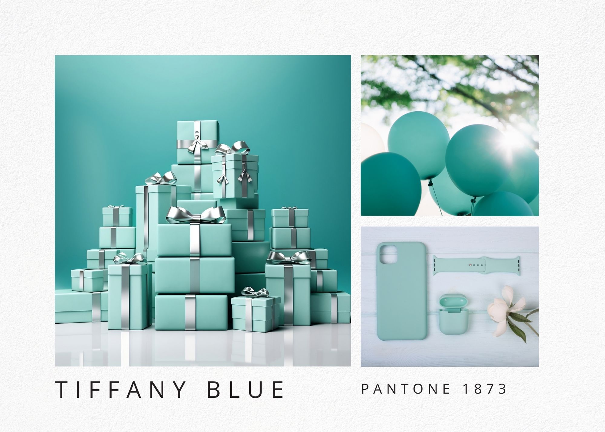
So let’s get back to the Color of the Year 2024 Peachy Fuzz- PANTONE 13-1023
Leatrice Eiseman, the director of the Pantone Color Institute (and also the woman who taught me all about the Power of Color/Color Psychology) explains a bit more about how they, at the Pantone Color Institute chose the color for 2024, and what Peachy Fuzz represents for the coming year.
Here’s what she said: “It is a compassionate and nurturing soft peach shade conveying a heartfelt kindness, a velvety gentle peach whose all-embracing spirit enriches mind, body, and soul.
At a time of turmoil in many aspects of our lives, our need for nurturing, empathy, and compassion grows ever stronger—as does our yearning for a more peaceful future.
A warm and cozy shade that highlights our desire for togetherness and the feeling of sanctuary this creates, PANTONE 13-1023 Peach Fuzz presents a fresh approach to a new softness.
Subtly sensual, it is a heartfelt peach hue that brings a feeling of tenderness and communicates a message of caring and sharing, community and collaboration.”
We are all totally overwhelmed! Sensory overload on steroids! We are bombarded by text messages, WhatsApp, Messenger, IG reels, and beeping phones, people from all directions are attacking us to listen to, to click, to subscribe, to BUY! BUY! BUY!
Why not close your eyes for a moment, embrace the warmth, the comfort, even if it is just for a moment, of the soft gentle feeling of Peachy Fuzz!

Could you? 🙂 Let me if you found this explanation useful and how you would use it. A wall color? A soft fuzzy pillow in your guest bedroom? The cover of your new journal for 2024?
Let’s embrace the warmth 🙂
Ready to take the next step?
You can book an appointment with me for personalized support or schedule a discovery call if you’d like to explore how I can help.
Enjoy this blog?
