Well…EVERYTHING!!!
The 60/30/10 rule serves as a helpful guideline in interior design, ensuring a balanced and visually appealing color scheme. It prevents colors from overwhelming the space while keeping it visually engaging.
Here’s how it works:
60% Dominant Color: This is the main color that sets the tone for the room. It covers the majority of the space and is typically used on walls, large furniture pieces, and floors. Let’s say you choose white for your walls and kitchen cabinets; it will serve as the dominant color in the room.
30% Secondary Color: This color complements the dominant color and adds depth to the space. As seen in the photo below, warm orange wood tones soften the starkness of all the white in the space.
10% Accent Color: This color is used sparingly to add pops of interest and draw attention to specific elements in the room. It’s incorporated through accessories like throw pillows, artwork, or decorative items.

Here is another example of applying the 60/30/10 rule

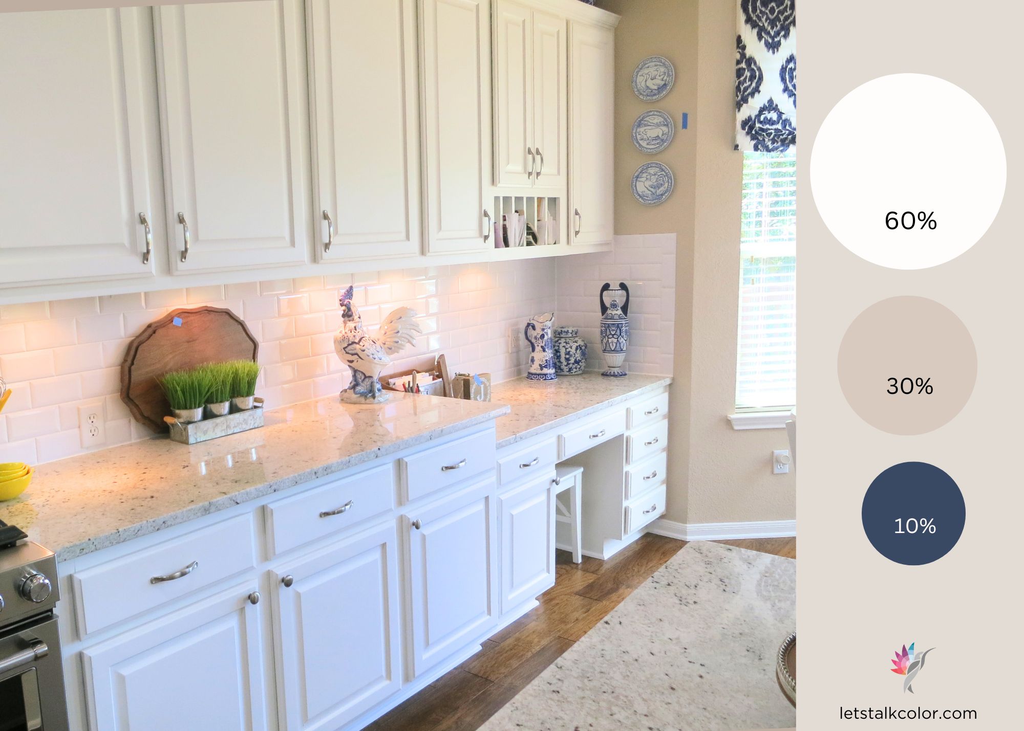
By following the 60/30/10 rule, you’ll achieve a well-balanced and visually appealing interior design.
Now that doesn’t mean you cannot have a 50/50 or a 70/20/10 percent balance. What you need to take from this quick lesson is that you need to create color rhythm and a harmonious look. More about that later!
How have you been using color in a room? Have you ever thought of creating a balance like this intentionally? I know I haven’t. I’d be curious to know your story!
Ready to take the next step?
You can book an appointment with me for personalized support or schedule a discovery call if you’d like to explore how I can help.
Enjoy this blog?
2 Responses
Hello,I’m stuck! I have a beautiful kitchen with many windows. Basically, 1/2 or mostly one side of my kitchen is embraced with custom wood windows. Long with windows starting approximately 12-14 inches from ceiling & same from floor up. Lots of wood matching my cupboards & Island as it leads to our dining area which in turn opens into our large living room space. 12 windows total with 2 French doors leading out to ground level backyard. Love the simplicity of the windows not wanting to ad curtains or toppers of any sort. However, I’d like to add some color to this natural,inviting space. I find myself mostly focusing on backsplash & fabric for color. Leaving me stuck on both % & colors?
Hi Sherry, email me a few pics taken in natural daylight. Don’t use the flash. ma*@***********or.com I will see if I would be able to help you via a Virtual Consultation. If you are in my neck of the woods, I can always come by and help you in person. I am in the Austin TX area