Everywhere you look, someone is yelling:
- “34 Best White Paint Colors Designers Love!”
- “Top 40 Favorite Whites of All Time!”
- “You Can’t Go Wrong With These 20 Whites!”
But let’s get very clear… You don’t need 40 options of anything!
You just need the right one for your space.
Yes, I agree, there are the 50 proverbial shades of white, of gray, of beige, but my goal is to simplify the process and help you choose with confidence.
Below is your no-fluff, bullet-pointed guide to choosing white paint like a pro.
Before You Choose a White Paint, Understand These Key Factors:
1. Hue Families (aka Undertones) and Color Temperature
- Whites can have subtle undertones: yellow, blue, red, green, etc.
- Warm whites will have Orange, Red and Yellow in it. Ask yourself which “warm” do you want to choose. I doubt that it will be red (pink) or orange (peachy salmon tones)
- Your cooler undertones will be green, purple and blue.
- Compare white swatches on a true white background to spot these differences. COMPARE! COMPARE! COMPARE!
- Work with your fixed elements. Got orange wood floors? Skip blue-based whites. Try Alabaster SW7008, a creamy white from the yellow family.
- Most people don’t actually like stark white walls. They want comfort, not cold.
2. The Impact of Natural Light
Different directions bring different light quality:
- North-facing: cooler light → use warm whites (I had White Dove OC-17 painted in my North Facing studio and it looks like Chantilly Lace! Stark, crisp and sterile!)
- South-facing: warm light all day → cooler whites work well
- East-facing: warm AM, cool PM → try soft, warm whites
- West-facing: golden PM light → cool whites help balance the glow
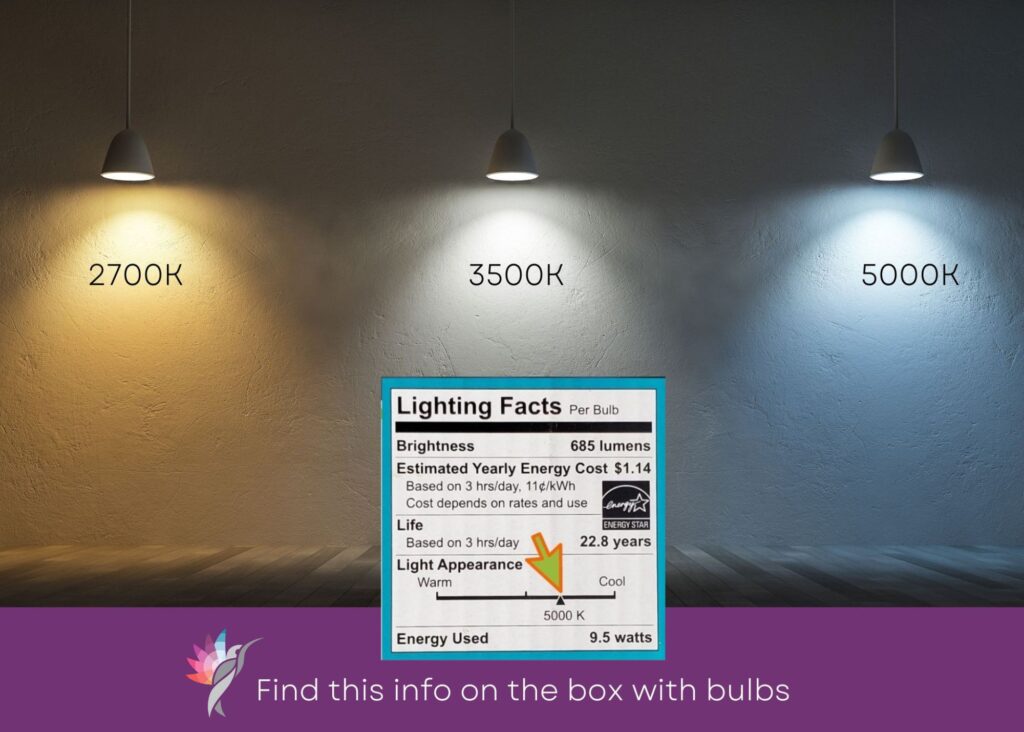
3. How Kelvin Temperatures Affect White Paint
Your light bulbs matter! Here’s how:
- 2700K (warm yellow light): makes white look creamier, cozier and warm.
- 3000K: still warm but more balanced
- 4000K: neutral/cool light, truer whites
- 5000K (daylight): can feel clinical, may pull blue tones out of your white
⚡ Always check your whites under your real lighting.
4. Context is Everything
White paint never lives in a vacuum. Look at:
- Flooring. Light reflects onto other surfaces. If applicable, keep the stain colors of your exterior patio, fence, or other surfaces that will reflect color through your windows in mind (ask me how I know that!! Ugghh!!)
- Countertops
- Furniture fabrics (especially creamy vs cool white sofas)
- Metal finishes
If you’ve got creamy-colored upholstery, avoid blue-based whites. Try BM Simply White or SW Snowbound
5. Paint Sheen Affects Appearance
- Flat: Paint will look darker/dingier because it doesn’t reflect any light waves
- Eggshell/Satin: soft glow, will look slightly lighter because of the light reflection
Want an all-white room? Use the same color in different sheens for walls, ceiling, and trim.
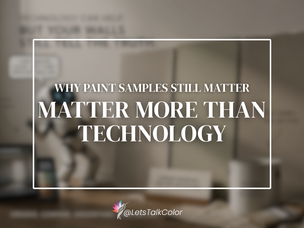
6. Test Before You Commit
Never skip this step! Use peel-and-stick samples instead of messy little pots. I recommend Samplize for real paint samples, shipped to your door. No mess, no paint cans in the garage. Place them on different walls against a white background and watch how they change throughout the day.
Final Thoughts
If you’ve made it this far, Congrats! You’re no longer at the mercy of overwhelming Top-40 paint lists. Choosing the right white isn’t about luck or trends. It’s about making informed decisions that match your home.
AND FOR THE LOVE OF COLOR, DO NOT EVER CHOOSE A PAINT COLOR BASED ON WHAT YOU SEE ON A SCREEN!
Order your samples. Test them.
And choose the white that works for YOUR walls—not someone else’s Pinterest board.
You’ve got this!!
Ready to take the next step?
You can book an appointment with me for personalized support or schedule a discovery call if you’d like to explore how I can help.
Enjoy this blog?