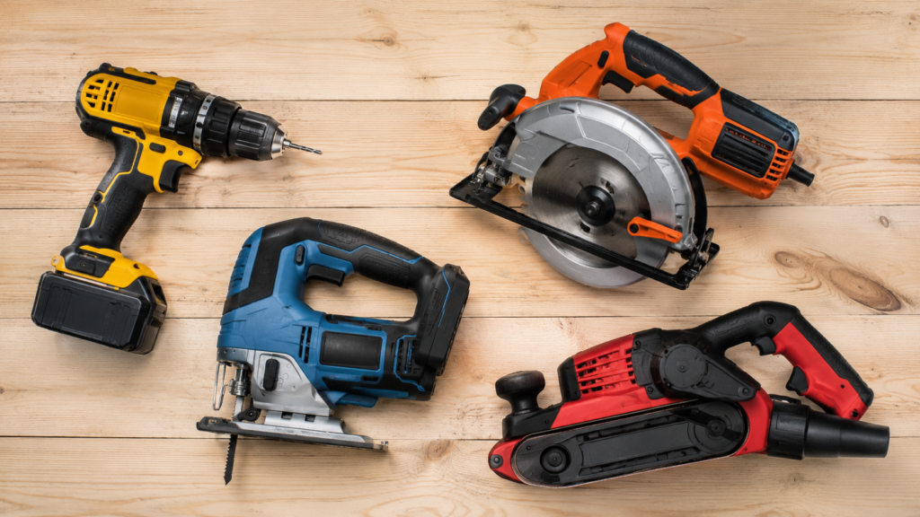
When you walk down the aisle of a hardware store, chances are you can identify a DeWalt drill or saw from across the room—not because of its shape or size, but because of its striking black-and-yellow color scheme. This isn’t an accident. In fact, the colors chosen for power tools are often the result of strategic branding, psychology, and functionality.
The Science of Color in Tools
Color is more than an aesthetic choice. In the world of industrial design, it’s a functional and psychological signal:
- Visibility & Safety: Colors like yellow and orange are high-visibility tones. They ensure tools are easy to spot on a busy job site, reducing the risk of them being misplaced or stepped on.
- Association with Caution & Power: Black and yellow together echo the same visual cues as warning signs, construction tape, and hazard markings. This subconsciously signals durability, toughness, and caution—all qualities workers associate with tools built to perform under pressure.
- Ergonomic Recognition: When brands keep a consistent color palette, workers can quickly identify their tools without confusion. That speed matters in environments where efficiency is everything.
DeWalt: The “Black & Yellow” Identity
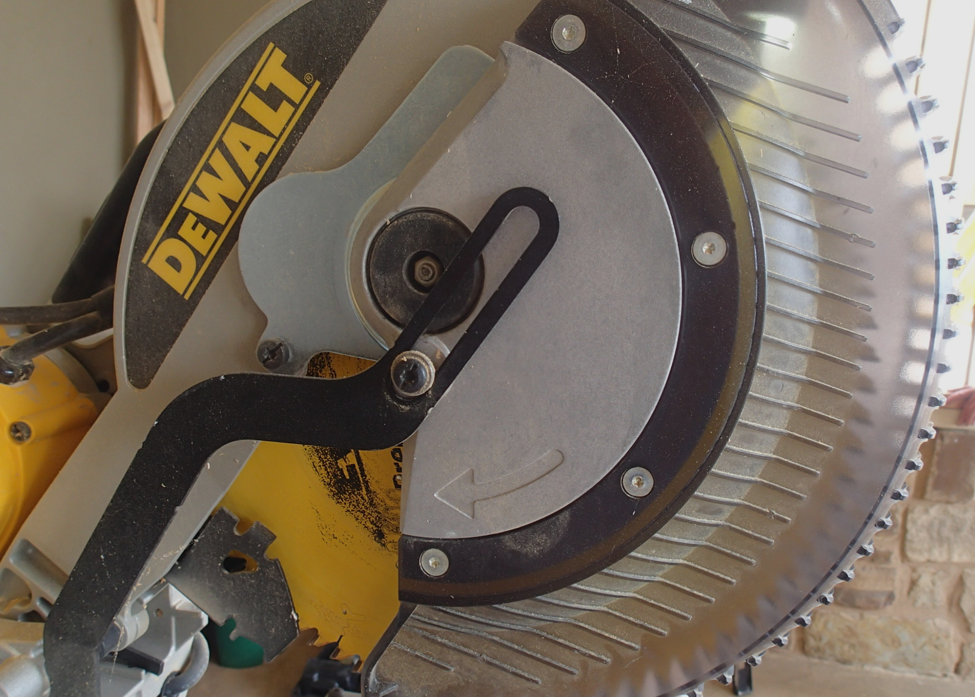
DeWalt has mastered this principle. Their yellow-and-black design not only stands out visually but also reinforces their brand identity as a professional-grade tool for serious work. The yellow communicates energy and alertness, while the black anchors it in strength and authority. Together, they build trust with professionals who need tools that won’t let them down.
Other Color Choices in the Industry
DeWalt isn’t alone—different power tool brands lean on intentional color psychology to separate themselves:
- Orange & Black (Ridgid) → Bold and rugged, signaling dependability.
- Red & Black (Milwaukee) → Aggressive, powerful, and commanding—perfect for workers who want to feel like they’re using the “muscle car” of tools.
- Green & Black (Hitachi/Metabo HPT) → A fresh, energetic take that differentiates from the primary warm tones in the industry.
- Blue (Makita, Bosch) → Trusted and dependable, evoking reliability and engineering precision.
Each brand knows that color builds recognition as much as performance does. Professionals are loyal not just to the tool’s specs but to the way the brand makes them feel—confidence, trust, and identity.
Why This Matters
For homeowners, DIY enthusiasts, or professionals, the tool’s color is often the first impression of its purpose and reliability. It’s a reminder that design isn’t just about how something works, but how it communicates its role through visual language.
Next time you pick up that black-and-yellow DeWalt drill, you’ll know: it’s not just a drill—it’s a statement of power, visibility, and trust.
Ready to take the next step?
You can book an appointment with me for personalized support or schedule a discovery call if you’d like to explore how I can help.
Enjoy this blog?