When it comes to choosing paint colors, most homeowners start with inspiration photos, fan decks, or trending palettes. But without considering your home’s architecture and fixed elements, your dream palette can quickly turn into a design disaster. Color isn’t just about preference – it’s about context!
Let’s explore how undertones, architectural style, and fixed elements influence your choices and why ignoring them can sabotage even the most well-intentioned color plans.
1. Understanding Undertones (Hue Families)
Every color lives in a hue family, meaning it leans toward an underlying base such as red, yellow, blue, or green. This is the subtle undertone that may not be obvious until it’s placed next to another color or in a particular light. It can also be the “color temperature” not only the actual hue.
- Warm undertones: Yellows, reds, oranges, and warm beiges often create a cozy or traditional feel.
- Cool undertones: Blues, greens, and violets lean fresh, modern, or calming.
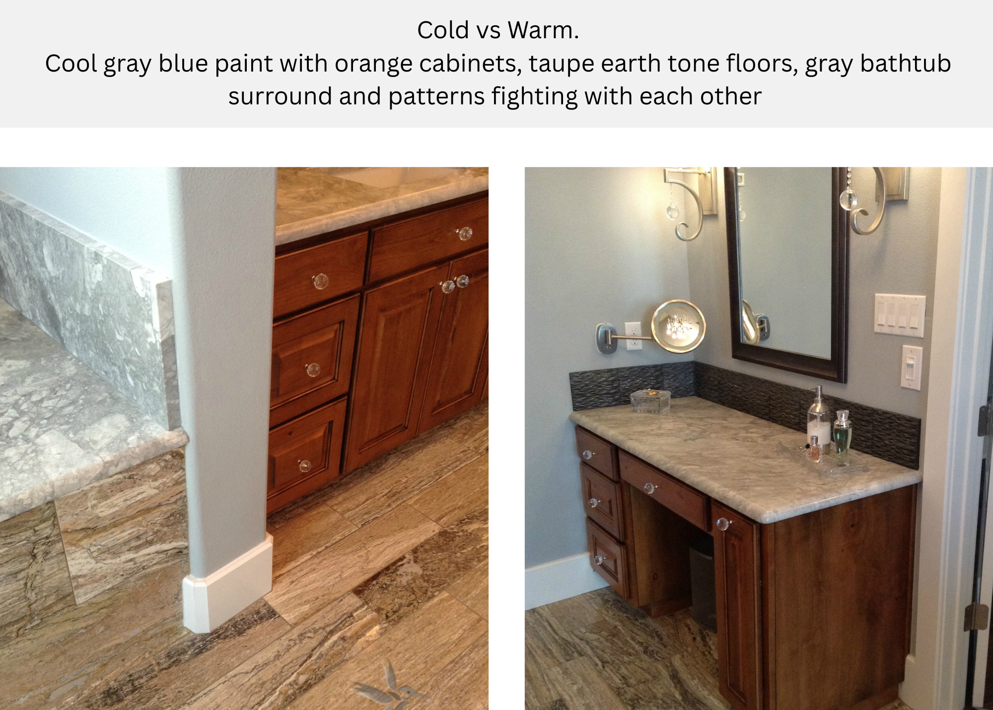
- The trap: A “neutral” beige may suddenly look pink when paired with orange-toned wood floors. A “crisp white” might look stark or blue against warm stone.
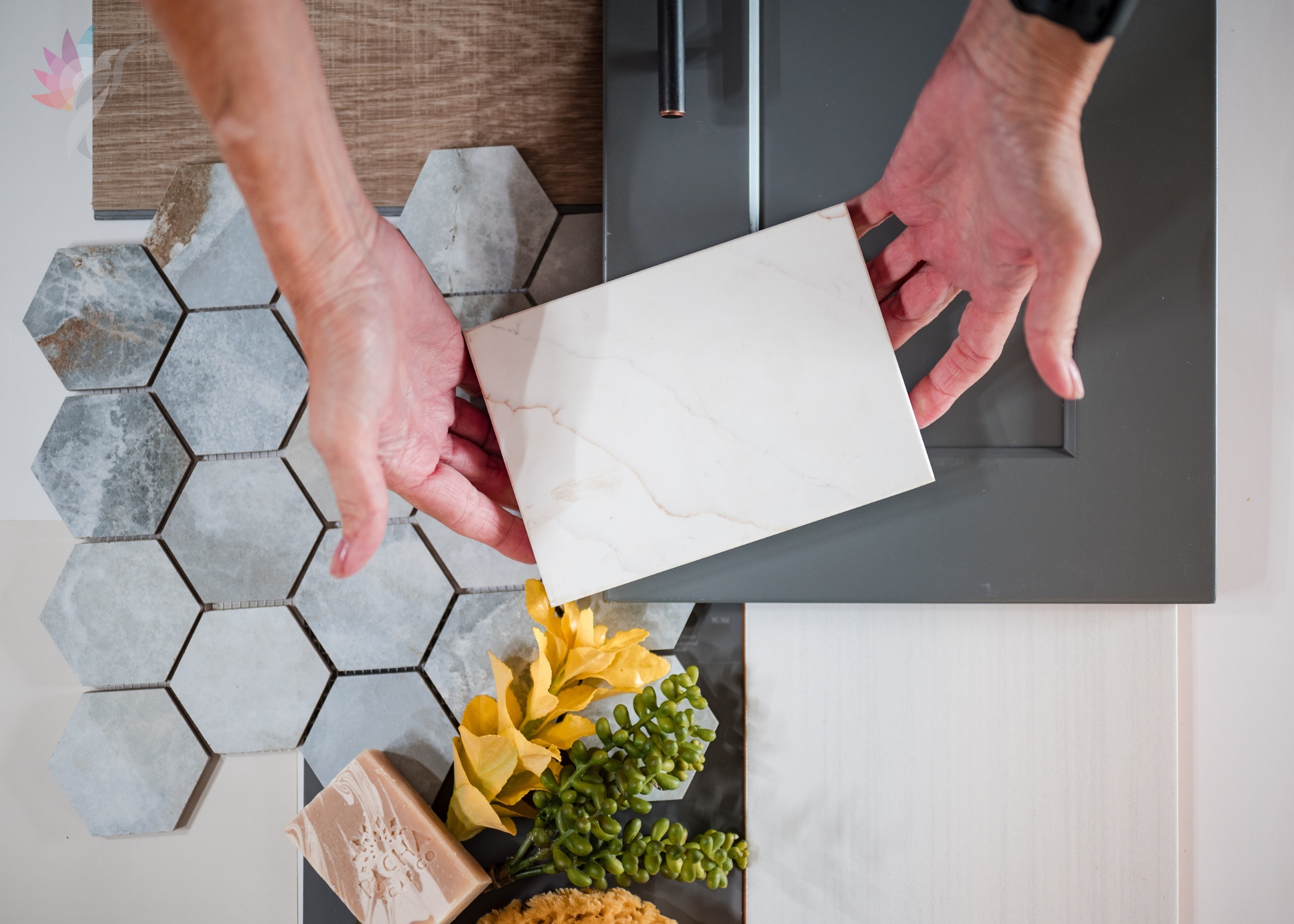
Pro tip: Always identify the hue family of a paint sample before committing, and test it against your fixed elements (flooring, countertops, trim). COMPARE the colors to each other on a white background and ask yourself what color you see (Red, blue, green, yellow etc.)
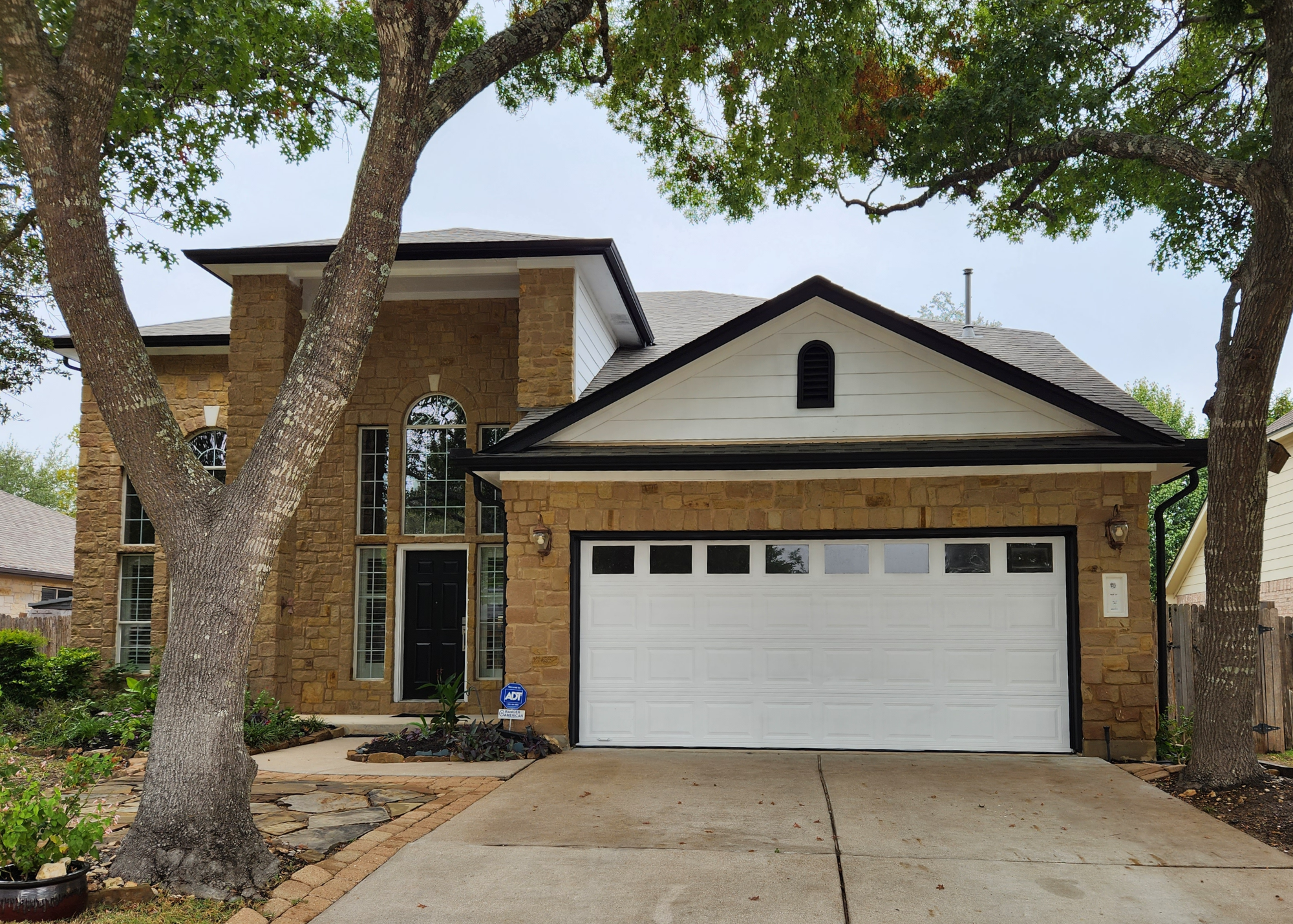
2. Respecting Architectural Style
Your home’s architecture has its own design language, and the color palette you choose should enhance, not fight it
- Traditional homes: Often favor classic, timeless palettes (creams, muted greens, brick reds, navy).
- Modern or contemporary homes: Tend to look best with crisp contrasts (charcoal, bright whites, deep blacks, bold accent walls).
- Farmhouse or Craftsman: Require respect for natural materials (stone, brick, wood) and softer palettes that honor handcrafted detail.
- Mediterranean or Spanish Revival: Call for earthy tones (terracotta, warm whites, ochre, deep blues).
Forcing a trendy palette onto the wrong style can make a home feel disjointed, lowering both curb appeal and resale value. Not all homes should have the black and white Waco look – It just DOES NOT WORK!
3. Working With Fixed Elements
Fixed elements are the surfaces that won’t be changing anytime soon. Things like:
- Flooring (wood, tile, carpet)
- Countertops
- Stone or brick
- Cabinetry
- Fireplace surround
These surfaces already carry a dominant undertone. Ignoring them is one of the biggest mistakes homeowners make.
- If your countertop has strong gold veining, pairing it with a cool gray wall will create visual tension.
- A roof with green undertones can clash with a red-based brick if you ignore the color relationship.
- Even grout lines, hardware finishes, and trim color play a role in harmony.
Pro tip: Start your palette with what’s permanent. Paint is flexible – stone, roofing, and flooring are not.

4. Lighting and Color Behavior
Even when undertones and fixed elements align, light can shift perception. The Kelvin Rating of your bulbs and the orientation of your home (north vs. south facing) change how a color reads.
- North-facing rooms = cooler light, colors appear grayer or bluer.
- South-facing rooms = warmer light, colors intensify.
- East/West = shifting light that changes the feel of the color throughout the day.
This is why large painted samples and observing colors in your own light are non-negotiable.
5. Why Ignoring These Elements Sabotages Your Design
When homeowners choose colors in isolation, they risk:
- Creating undertone battles (a pink-beige wall clashing with a green-gray tile).
- Diminishing architectural features instead of highlighting them.
- Spending money twice – repainting or re-decorating when the first attempt feels “off.”
- Lowering resale appeal by confusing future buyers with disjointed style.
Color done right should look effortless, as though it naturally belongs to the home.
Final Thoughts
Color is powerful, but it doesn’t live in a vacuum. It interacts with style, materials, light, and context. By paying attention to undertones, respecting your home’s architectural language, and working with — not against — your fixed elements, you’ll create a palette that enhances your home’s beauty and adds lasting value.
Takeaway: Always let your home’s bones guide the color story. Paint can transform, but it must harmonize with what’s already there.
Don’t let guesswork derail your design. Undertones and architecture work hand in hand — and when they’re not in harmony, even the perfect color looks wrong.
Before you pick a paint color, Book a Professional Color Consultation. Let’s create a palette that complements your home’s style, enhances its features, and feels intentional from every angle.
Enjoy this blog?