I just came back from Charleston, South Carolina, and every time I walk those cobblestone streets, I’m reminded of how powerful color really is. This city doesn’t just use color — it tells its story with it.
Charleston’s charm isn’t accidental. In the historic districts, there’s an entire process behind the colors you see. The Board of Architectural Review (BAR)is responsible for protecting the look and feel of Charleston’s historic neighborhoods. If a building’s exterior is visible from the street, owners and designers often need a Certificate of Appropriateness before painting. That might sound intimidating, but it’s there to keep the city visually harmonious and to honor its layered past.
The city has Design Guidelines (often called the Charleston Standards) that guide decisions on everything from materials to paint color. They’re not meant to stifle creativity — minor changes can often be approved through a simpler review — but they do prevent jarring choices that could disrupt the streetscape. The BAR is especially watchful for colors that feel too harsh, overly vivid, or distracting. Charleston doesn’t want to lose the quiet rhythm of its streets.
But here’s where it gets fascinating: Charleston’s color story is far more nuanced than just “stay neutral.”
The Rainbow Row Myth & the Real Story
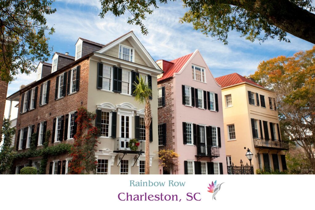
Take Rainbow Row — those candy-colored houses that have become one of the most photographed spots in the city. Most people assume those pastels have always been there, but the truth is different (and better).
The houses themselves were built between the mid-1700s and about 1845. After the Civil War, many fell into disrepair. By the 1920s and ’30s, the waterfront was neglected and crumbling. Enter visionary preservationists like Susan Pringle Frost and Dorothy Haskell Porcher Legge. In 1931, Legge painted her own house at 99–101 East Bay Street a soft pink — partly to beautify and partly to spark interest in saving these historic buildings. Neighbors followed, and by the 1930s–1940s, a cheerful, pastel revival was underway.
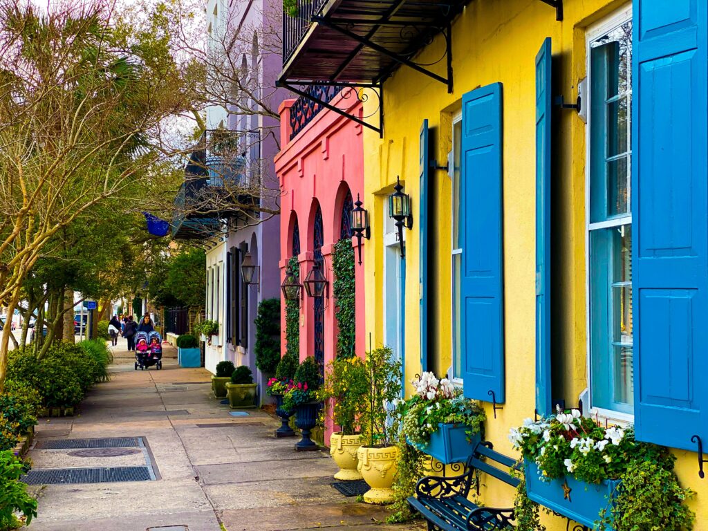
These colors weren’t random; they were intentional acts of hope during hard economic times, especially post–Depression. They also drew from Caribbean influence— Charleston’s port history connected it to tropical trade routes, so light, sun-friendly hues felt natural. That’s why you’ll see cool blues, mint greens, peachy pinks, and buttery yellows — colors that not only celebrate the architecture but also cope well with intense Southern sunlight and humidity.
Materials, Finishes & Authenticity
The finishes matter just as much as the hues. Historically, exteriors were often treated with limewash— a matte, chalky coating that sinks into masonry, breathes with the building, and naturally patinas over time. Limewash colors like soft ochre or aged whites give that velvety, timeworn look you can’t fake with glossy latex.
In later restorations, oil-based and modern paints stepped in, but the best projects still respect historical textures and depth. Even when using new formulas, designers often aim for that slightly weathered, muted finish rather than a harsh, plastic sheen. Dark shutters — deep greens, almost-black charcoals — are a classic Charleston accent, adding contrast and framing pastel façades beautifully.
Why This History Still Matters Today
For me as a color consultant, Charleston is a masterclass in how history, environment, and culture shape a palette:
- Preservation + revitalization — Color was used to breathe life back into forgotten architecture.
- Climate & geography — Light pastels keep buildings cooler under strong Southern sun.
- Caribbean influence — Trade and proximity to the sea inspired those breezy, cheerful tones.
- Storytelling — Myths like “drunken sailors identifying shop fronts” aren’t strictly true, but they make the color narrative memorable.
Today, collections like Sherwin-Williams’ Colors of Historic Charleston™ make it easier to respect this heritage while still choosing something fresh. These palettes echo centuries of architecture but translate beautifully for modern homes — whether you’re in Charleston or just inspired by its timeless style.
The Takeaway for Homeowners & Designers
If you’re planning an exterior update — in Charleston or anywhere historic — start with the story. Look at your fixed elements: roof, brick, stone. Consider climate and light. Think about finish — matte limewash or satin paint can change how a color feels. And most importantly, aim for harmony. Bold is fine when it’s grounded in place and history.
Charleston proves you don’t have to pick “safe” beige to keep things classic. You just need to choose color with intention — honoring the architecture, respecting the environment, and connecting to something bigger than a single paint chip.
Ready to take the next step?
You can book an appointment with me for personalized support or schedule a discovery call if you’d like to explore how I can help.
Enjoy this blog?