Creating a Home That Connects People Through Color and Comfort
Before the rush of Thanksgiving, it’s worth pausing to appreciate one simple truth: our homes are more than places we live — they’re where connection happens.
The walls, colors, and lighting around us influence how we feel, how we connect, and even how deeply we express gratitude.
As the season of gathering begins, let’s explore how to use color, light, and thoughtful design to nurture that sense of warmth and togetherness.
1. The Psychology of Warmth: Colors That Bring People Together
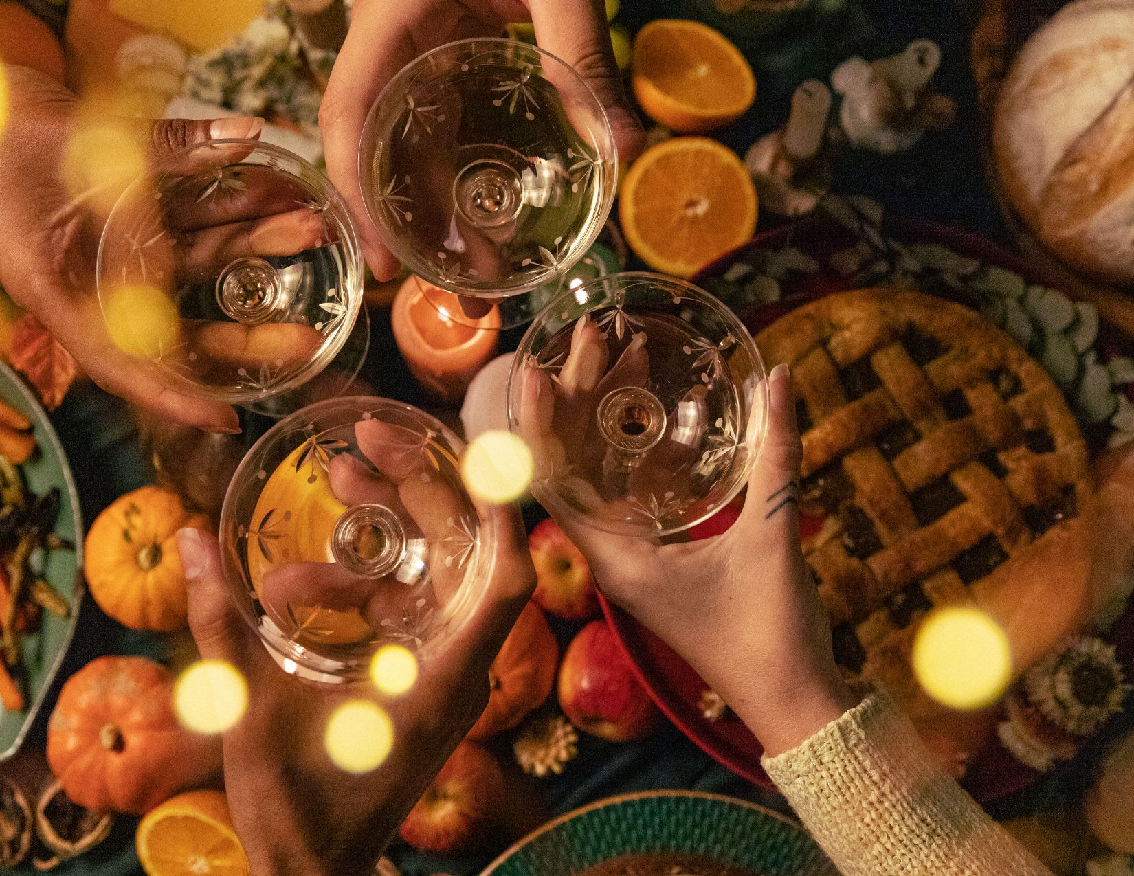
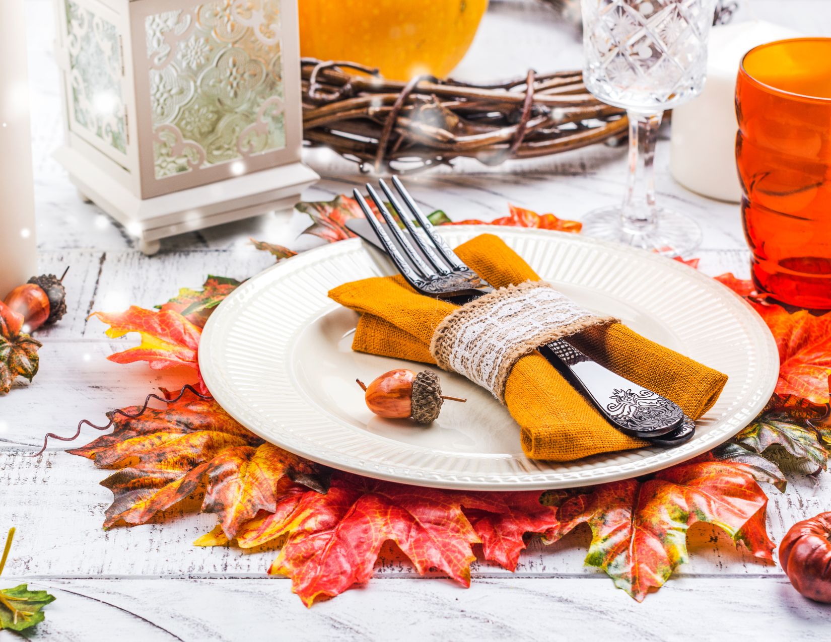
Warm colors are naturally social — they invite conversation and closeness. Shades like caramel, terracotta, ochre, soft gold, and cinnamon mimic the colors we see in nature this time of year, sparking feelings of comfort and gratitude.
If your dining or living area feels a little cold or stark, consider softening it with warm neutrals and earthy undertones. Even a single accent wall, area rug, or art piece can shift the entire mood from distant to cozy.
💡 Designer Tip:
If your fixed elements lean cool (gray flooring or blue-based stone), introduce balance with warm décor accents like amber glass, brass tones, or textured wood finishes.
2. Create Visual Connection Zones
Color has the power to define gathering spaces. When you subtly shift tones from one area to another — say, a deeper hue in the dining room and a lighter version in the kitchen — it creates a natural flow that keeps conversation and energy moving.
Open-concept homes, in particular, benefit from intentional color zoning. It draws people in and visually signals where togetherness happens.
💡 Designer Tip:
Use accent walls, area rugs, or a shift in lighting warmth to “frame” a gathering zone. Soft pendant light over a dining table or warm sconces by a reading nook can feel like a visual embrace.
3. Gratitude Lives in the Details
You don’t need to redecorate your home to make it more welcoming. Often, it’s the smallest design choices that leave the biggest impression — a soft table runner, candles at dusk, or a cozy throw on the sofa.
Gratitude in design is about being intentional. It’s about creating an environment that encourages slowing down, lingering, and connecting.
💡 Try This:
Next time you host a gathering, think about how your lighting, table setting, and color palette work together to make people feel seen and comfortable.
4. The Color of Gratitude
If gratitude had a color, it might be a mix of warm amber and golden beige — tones that radiate calm, appreciation, and abundance. These hues remind us to enjoy life’s simple pleasures: a meal shared, a conversation, a home filled with laughter.
This season, let your home reflect what truly matters — not perfection, but connection.
Gratitude starts with noticing what already feels good, then enhancing it with thoughtful touches that welcome others in.
Color and comfort set the stage. The memories you make do the rest.

Ready to take the next step?
You can book an appointment with me for personalized support or schedule a discovery call if you’d like to explore how I can help.
Enjoy this blog?