Did you know that paint color is one of the least expensive design decisions — yet one of the costliest to get wrong?
A $70 gallon of paint can unintentionally turn into:
- Thousands of dollars in repaints
- New rugs or décor to “fix” a color that feels off
- A room that never looks or feels the way you pictured it
- or worse — A space you stop enjoying because something feels “not quite right.”
Most homeowners don’t make mistakes because they lack taste.
They make mistakes because they pick colors in the wrong order, under the wrong lighting, or from the wrong assumptions.
And, ohhh! Did I mention because they believe EVERYTHING they read on the internet?? That still blows my mind!
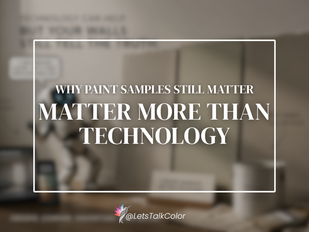
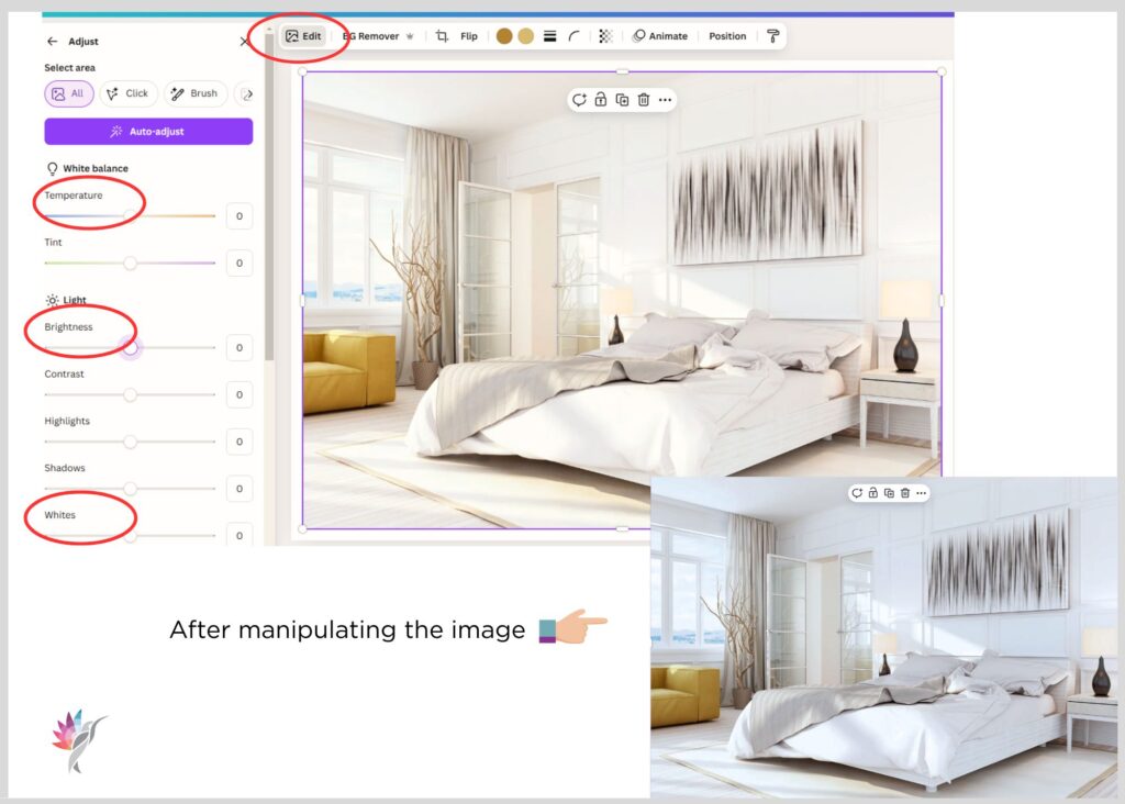
Never trust how a paint color looks online! It’s one of the easiest things to manipulate. I learned that a long time ago. Anyone can brighten an image, adjust the saturation, tweak the contrast, or add warm or cool lighting, and then simply attach a paint color name to it. Relying on online images sets unrealistic expectations and almost always leads to disappointment once the paint goes up on your walls.
Let’s break down why the wrong hue can derail your entire design plan — and how to confidently avoid these mistakes in 2026.
1. The Undertone Trap: Why Your Paint Doesn’t Look the Way You Expected
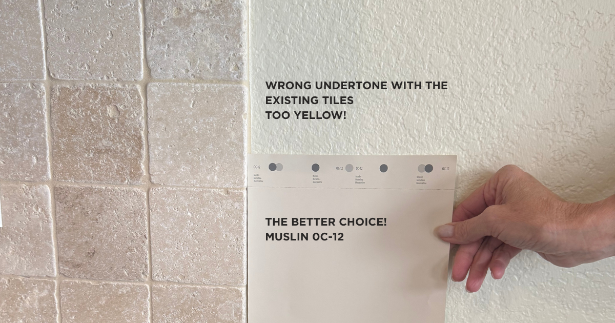
You know the “perfect beige” you fell in love with online?
In your home, it suddenly looks pink, green, or muddy.
That’s what is commonly referred to as undertones.
Every neutral — even the ones that appear “plain” — has an underlying hue bias.
That undertone becomes visible once the color is on your walls, interacting with your lighting, furnishings, and fixed elements.
Common color sabotage mistakes:
- Choosing a taupe with purple undertones next to warm yellow floors
- Pairing a cool white with warm countertops
- Selecting a beige that turns green against natural light from the north (and don’t let anyone tell you light doesn’t matter! It may not change the actual physical paint color undertone, but it will certainly change the way it feels or shows up in a certain space. It’s called science!)
- Choosing a trending color that doesn’t match your home’s architecture or style
The fix:
Learn your home’s undertones first before choosing a paint color.
The undertones of your fixed elements are the compass, the map to your paint color choices.
2. Ignoring Light: Winter, Direction, and Bulbs All Change a Color
Color doesn’t exist without light.
This means the same neutral paint color can look like three different colors in three different rooms.
The most common lighting mistakes:
- Choosing a color in the paint store (under commercial LED lights)
- Ignoring north/south/east/west exposures. I wouldn’t say that this will completely “break” your color scheme, but I painted White Dove OC-17 in my North facing color studio and trust me when I say it feels just as cold and sterile like Chantilly Lace would
- Using the wrong Kelvins or Lumens at home (making whites look dingy or yellows look neon)
- Testing paint in a room without the color bulbs of your choice and no natural light
The fix:
Study your home’s lighting before choosing the hue.
The right color supports the light you have — the wrong color fights it.
Not sure what you need to know about lighting. No need to knit-pick through AI and Google! Here is a complete guide regarding lighting and what you need to know when you are updating light fixtures and bulbs in your home
Get your copy of The Professional Lighting Guide for Homeowners™ now and learn exactly how bulbs, exposure, and placement impact your home — before you make costly mistakes.
3. Picking Paint First Instead of Last
This is the #1 design mistake I see and no matter how much I explain it, I still have clients who ignore this rule! I know, sometimes the situation just calls for paint first. Frustrating!
Homeowners fall in love with a paint color → then try to make everything else match.
But paint should support your fixed elements, not dictate them.
Choosing paint first causes:
- mismatched countertops,
- clashing flooring,
- backsplashes that look wrong,
- furniture that feels dull or outdated,
- a patchwork, disconnected color flow.
The fix:
Always choose paint after flooring, countertops, backsplash, cabinetry, and textiles. Paint is the easiest thing to change — fixed elements are not.
4. Trend Chasing: When the “It” Color Creates an Expensive Mistake
I’ve seen countless homeowners try to force the gray during the gray trend and then the black-and-white modern look into a traditional Texas home, and it simply doesn’t always work. Out of respect for my clients, I won’t share their images, but please embrace your home’s architectural style — or be prepared to change your décor and fixed elements to match the look you want.
Sometimes, the only way to achieve a completely different style is to choose a home that actually supports it. I’ve even had clients who wanted the modern black-and-white aesthetic so badly that I eventually had to tell them their current home would never deliver that look – they may have to seal their current home. Which they did, by the way. And now the black-and- white trend is on its way out! Sigghhh….
Just because a color is trending doesn’t mean it belongs in your home. Trends can sabotage your architectural style, existing décor and personal comfort and emotional connection to your space.
The fix:
Use trends as inspiration — not direction. Build a color palette that reflects you, not someone else. It never lasts anyway
5. Micro-Choices Create Macro-Problems
Color mistakes rarely happen from a single decision. They build up from small choices layered over time. A few examples are:
- a white that’s too stark
- a beige that leans pink or orange
- a blue that looks childish in low light. You have to choose a blue-gray to end up with a blue, especially if the room has a lot of natural light!
- Choosing the wrong wall as an accent wall
One small mismatch snowballs into new décor purchases, maybe new furniture,
endless repainting and ultimately frustration and decision fatigue. That’s when you say “I cannot do this, I hate it! I am so frustrated!”
The fix:
Create a whole-home color plan before painting even one room.
This keeps undertones consistent and creates that seamless, calm flow homeowners dream of.
6. The Real Cost: Time, Money, Emotional Drain
Color mistakes cost more than money.
They cost:
- decision burnout,
- loss of confidence,
- frustration with the home,
- stress from living with a “wrong” color,
- feeling overwhelmed and unsure where to start.
But here’s the good news: Every mistake is avoidable with clarity, education, and the right guidance.
How to Choose Color With Confidence
The key isn’t guessing.
Color choices become simple when you have a professional walking you through the logic behind every choice.
You need to know the basic fundamentals on how to choose colors so that you can make an informed, educated choice. Stay tuned, more information about this topic coming soon! In the meantime, if you need help choosing colors RIGHT NOW, Book your Consultation Here
Enjoy this blog?
Follow me on Instagram and Facebook for more.
Curious to learn more about your style?
Take this Quick Quiz and discover your Dominant Color and Design Style!