When it comes to designing a home, one of the most common mistakes I see is the temptation to use too many colors. It often starts innocently enough – you love the blue sofa, the green rug, the patterned pillows, and the trendy accent wall you saw on Pinterest. But before long, every room feels busy and disconnected. Instead of creating harmony, the space becomes overwhelming. Like the one below, right!
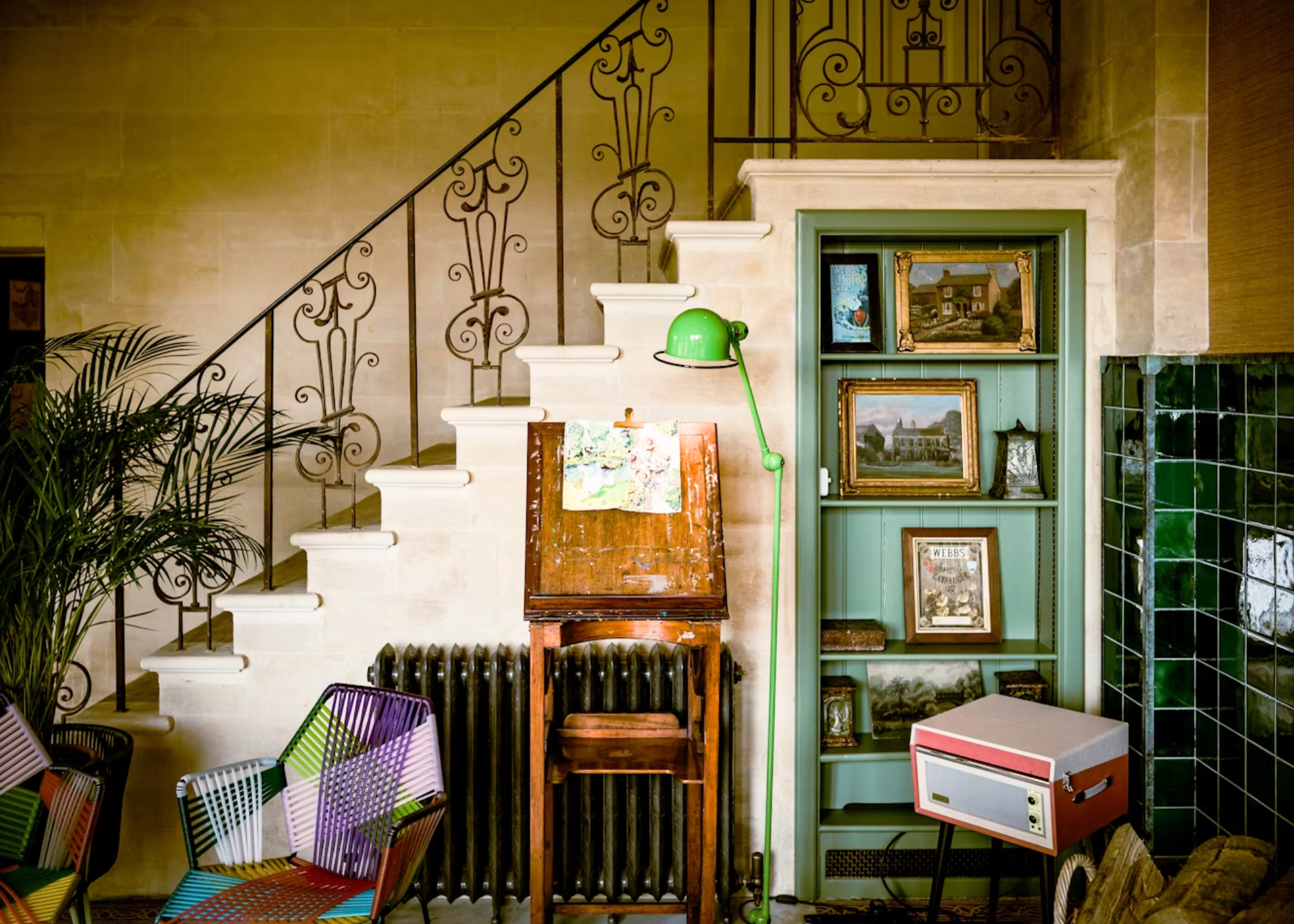
The good news? There’s a simple formula to avoid this kind of color chaos. By focusing on consistency and visual flow – and sticking to a 3-5 color palette rule – you can create a home that feels cohesive, calming, and intentional.
Why Too Many Colors Create Chaos
Our eyes crave order. When every room introduces a brand-new set of colors, the brain struggles to connect the spaces. This lack of consistency makes your home feel disjointed and smaller than it is. On the other hand, when colors repeat and flow naturally from room to room, the entire home feels larger, more balanced, and beautifully pulled together. Always keep in mind, your eyes need a place to rest. We are in total sensory overwhelm most days as it is. I am not saying avoid color at all, I am just saying, choose with intention!
The 3 – 5 Color Palette Rule (Also called the 60-30-10 rule)
The key to avoiding color chaos is limiting your palette to 3-5 core colors. This doesn’t mean your home will look bland – it means you’ll use these colors in different proportions, intensities, and finishes throughout your home. Texture is super important and layering textures and colors with intentions, supports great design actions.
Think of your palette as a toolkit:
- 1-2 Neutrals – Your foundation shades (for walls, ceiling, trim, or large furniture).
- 1-2 Supporting Colors – Mid-tone shades that add depth and variety.
- 1 Accent Color – A punch of personality that is repeated in accessories, art, or textiles.
By reusing these colors in different ways, you give each room its own identity while maintaining an effortless sense of flow.
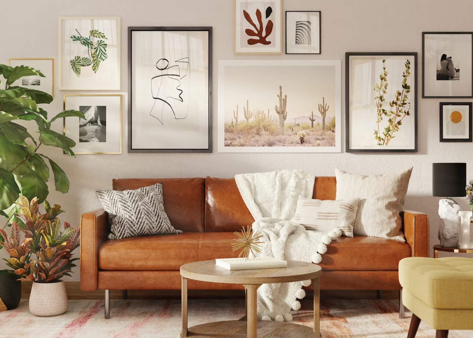
Consistency Creates Flow
Imagine walking through a home where the same warm beige is used on walls, soft blue-green repeat in upholstery and pillows, and a bold green appears in artwork or plants. The palette feels intentional, connected, and polished. Even if you shift the dominant color from one room to another, the repeating hues create a natural rhythm. Pro tip: Carry a small fan deck or paint samples of your chosen palette when shopping. This prevents impulse buys that introduce “stray” colors not in your scheme.
Where to Add Variety (Without Chaos)
Within your palette, you can still create plenty of interest. Vary textures, patterns, and finishes. A soft velvet sofa, a glossy ceramic vase, and a woven rug can all share the same hue but bring different character in the space. This way, your home feels layered and dynamic – not flat.
Bringing It All Together:
The 3-5 color palette rule is less about restriction and more about clarity. It helps you make confident choices, avoid overwhelm, and design a home that feels intentional and welcoming. By simplifying your palette, you’ll gain the freedom to focus on what matters most: creating a space that reflects your personality and supports your lifestyle.
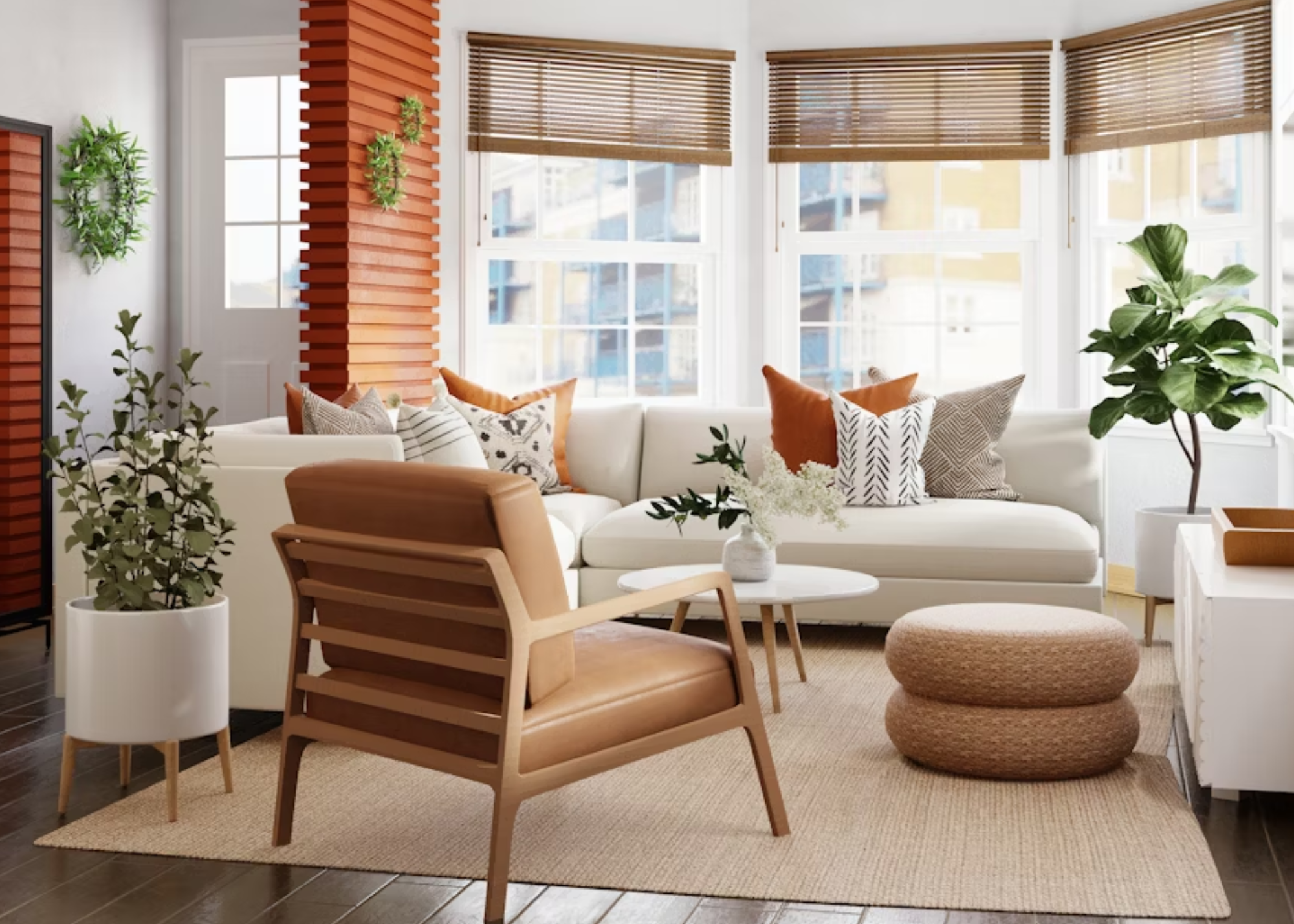
Follow me on social media and make sure you sign up for our emails to stay informed.
Ready to take the next step?
You can book an appointment with me for personalized support or schedule a discovery call if you’d like to explore how I can help.
