Mindset and well-being are today’s buzzwords, and in design, that focus is translating into color.
In 2026, the world of color is evolving from flat statements to emotional landscapes. We’re entering a season where color choices are less about fashion and more about how we live, how we feel, and how our homes support that.
Below, I break down the macro forces shaping the 2026 color trends, what they say about us, and how to bring them into your home with intention.
1. The Big Forces Shaping 2026’s Palette
A Search for Grounding & Well-Being
After years of uncertainty, we crave comfort and calm. 2026 forecasts highlight earth tones, muted neutrals, and nature-inspired greens and browns.
According to National Color Systems (NCS), one of the biggest drivers is a “wellness-focused design” mindset — colors that reduce stress, feel rooted, and reconnect us to nature.
Blurring Boundaries: Past + Future + Nature
We’re merging nostalgia with innovation — celebrating heritage while embracing modern simplicity.
Behr’s Commercial Color Forecast notes that traditional boundaries are dissolving, creating interiors that feel timeless yet current. Organic materials meet tech-inspired finishes, bridging the gap between natural and new.
Complex Neutrals & Layered Darks
The “new neutrals” are warm, nuanced, and full of character. Instead of flat greige or stark white, we’re seeing complex tones of sand, clay, and olive.
Likewise, dark colors have become dimensional — smoky blacks, charcoal greens, and enriched teals add depth and quiet drama.
Two standout examples perfectly capture this shift:
- Sherwin-Williams Color of the Year 2026: Universal Khaki SW 6150
A mid-tone neutral with a subtle yellow undertone.
Sherwin-Williams describes it as “beautifully balanced, timeless, and versatile — a neutral that pairs livability with longevity.”
Universal Khaki embodies the idea of comfort and continuity — a color that feels grounded without being predictable. - Benjamin Moore Color of the Year 2026: Silhouette AF-655
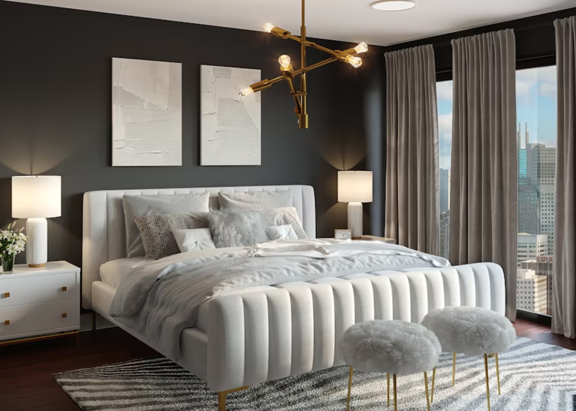
A deep smoky tone with charcoal and burnt-umber undertones.
Silhouette creates a sense of refined drama — both romantic and restrained. It brings dimension and mood to interiors without overpowering them.
It’s perfect for accent walls, powder rooms, or any space where you want depth and intimacy.
Together, Universal Khaki and Silhouette reflect a balance of light and shadow — grounded and comforting yet rich and evocative — the essence of 2026’s Mood Move.
Emotional Storytelling Through Color
As NCS describes, “There is an overarching theme threading through these selections—a hunger for authenticity, wellness, and connection.”
We’re learning to use color as narrative—tones that shift subtly, evoke mood, and tell a personal story. This “emotional color” trend goes beyond symbolic meaning (“blue = calm”) and moves into intuitive design that supports how people feel in their spaces.
2. What This Says About Us: The Psychology Behind the Palette
Craving Authenticity & Nature
We’re drawn to hues that echo soil, stone, and moss. These earth-based colors signal a collective desire for authenticity, sustainability, and simplicity.Desire for Emotional Safety
Soft neutrals and grounded mid-tones act like visual therapy — creating spaces that help us exhale and reset.Selective Boldness
Deep reds, terracottas, and smoky greens show up as purposeful accents — thoughtful moments of personality rather than loud statements.Mood Modulation
As color psychology becomes more mainstream, we’re selecting palettes that
3. How to Apply These Trends Without Feeling Overwhelmed
Use the New Neutrals as a Foundation
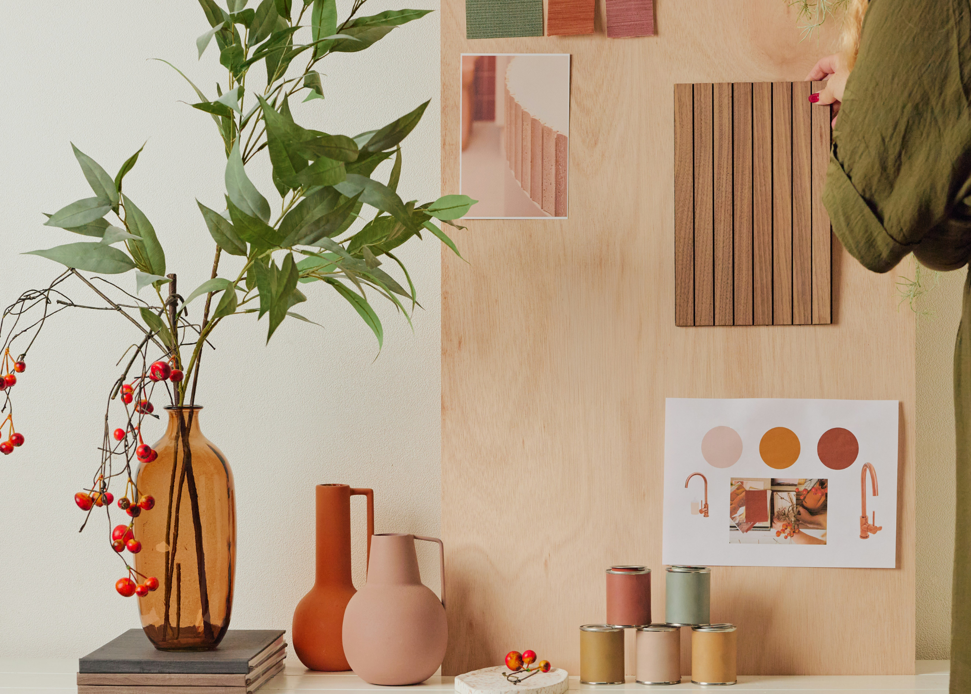
Start with a base of nuanced warm neutrals—sandy beige, soft taupe, or clay gray. These create harmony and allow richer tones to layer seamlessly.
Introduce Depth with Accent Moves
Add deeper greens, warm browns, or muted reds to doors, cabinets, or niche walls for visual interest without overwhelming a space.
Test in Real Life
Color behaves differently under changing light. Always swatch and observe in morning, midday, and evening light—undertones can shift dramatically.
Balance with Texture and Material
Pair your color palette with natural woods, linens, stone, and woven surfaces. Texture enhances warmth and brings dimension to earthy hues.
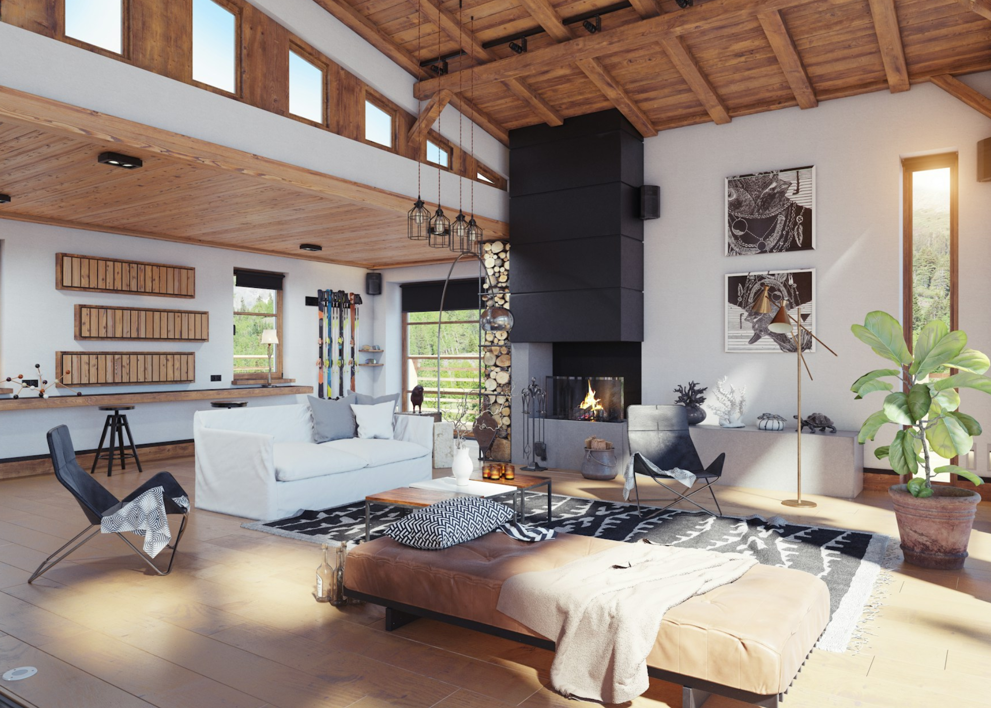
Reserve Contrast for Intent: Keep high-contrast pairings (pure white + black) minimal. Instead, explore soft transitions –warm off-white trim against a taupe or clay wall.
Let Function Guide Intensity: Moody tones can shine in small rooms like powder baths or dens, while layered midtones are ideal for open living areas.
Harmonize via Nature’s Palette: Research shows that people prefer color pairings found in nature – leaf green with bark brown, or clay with sage – because they feel familiar and emotionally balanced
Designer’s Take
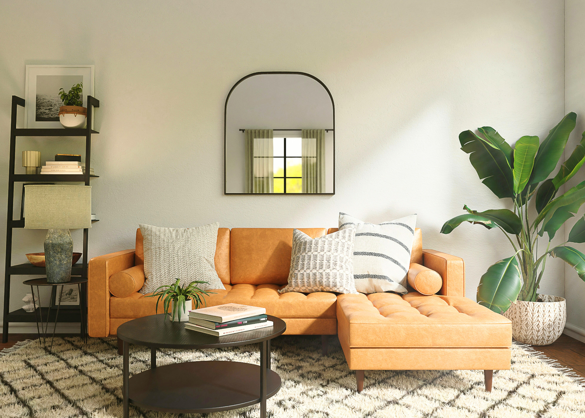
Universal Khaki SW 6150 — The ultimate supporting neutral. Pairs effortlessly with warm whites and muted greens. Use it when you want comfort and continuity.
Silhouette AF-655 — A modern classic. Perfect for creating cozy contrast or anchoring a room with natural light and texture.
Trends come and go — but color that supports your lifestyle never fades.
Ready to bring the Mood Move home?
Book your Consultation today and let’s create your feel-good palette for 2026.
Enjoy this blog?
