As we approach Thanksgiving, I find myself not only looking forward to the time around the table — the warmth, the gathering, the gratitude — but also to the color story of this holiday. Because as someone deeply immersed in color, design, and the home, I’m fascinated by how the palette of our Thanksgiving spaces speaks volumes.
Here’s the story behind those rich autumnal hues — and how you can lean into them in fresh, meaningful ways this year.
1. A brief story of Thanksgiving
The modern U.S. Thanksgiving holiday draws from a long tradition of harvest-festivals and days of giving thanks, though the version many of us know (with the Plymouth settlers and the Wampanoag people) is wrapped in legend and myth. (Wikipedia)
What matters for us is the ESSENCE of it: gathering, harvest, reflection, gratitude. And the colors we wrap that essence in – through décor, table settings, clothing are far from arbitrary.

2. The color story behind Thanksgiving
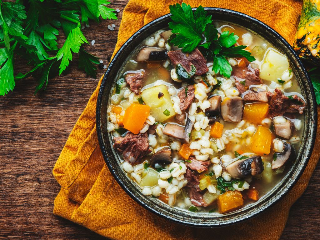
- Orange: Think pumpkins, fall foliage, harvest squash. Orange is vibrant, energetic, and rooted in the season. It stimulates appetite and joy.
- Brown: The earth, the wood, the fields. Brown anchors us; it’s warm, stable, comforting. It reminds us of the soil and the harvest.
- Gold / Yellow: Corn, late-lights, dried grasses. Yellow evokes optimism, the fading light of autumn, the rich treasures of the year.
- Red / Burgundy: Cranberries, wine, warm textiles. Red adds richness, depth — while not overwhelmingly “holiday” in the Christmas sense, it brings warmth and significance.
- Green: Less obvious, but important. Think moss, evergreens, lingering leaves — green grounds the palette in nature, reminding us of continuity, life.
Together these colors are a visual echo of the “harvest season” — of pulling in abundance, of slowing down, of giving thanks.

3. Why this matters in design and in your home
As someone who helps homeowners and designers with color decisions, I often emphasize that COLOR = EMOTION + STORY
The Thanksgiving palette isn’t just “what everyone uses” — it’s meaningful.
- When you incorporate brown as a base (think wooden table, woven runner, kraft-napkins) you’re creating a foundation of comfort and reliability.
- Adding orange or gold accent pieces (napkins, pumpkins, taper candles) invites energy, vibrancy, look-at-me warmth.
- A touch of green (foliage, succulents, olive-toned linens) reminds the eye that nature continues, though it’s shifting.
- Red or burgundy adds depth and richness — maybe in textiles, seasonal florals, a berry accent.
By choosing your Thanksgiving palette intentionally, you connect the décor back to the meaning of the holiday rather than simply mirroring a “look.”
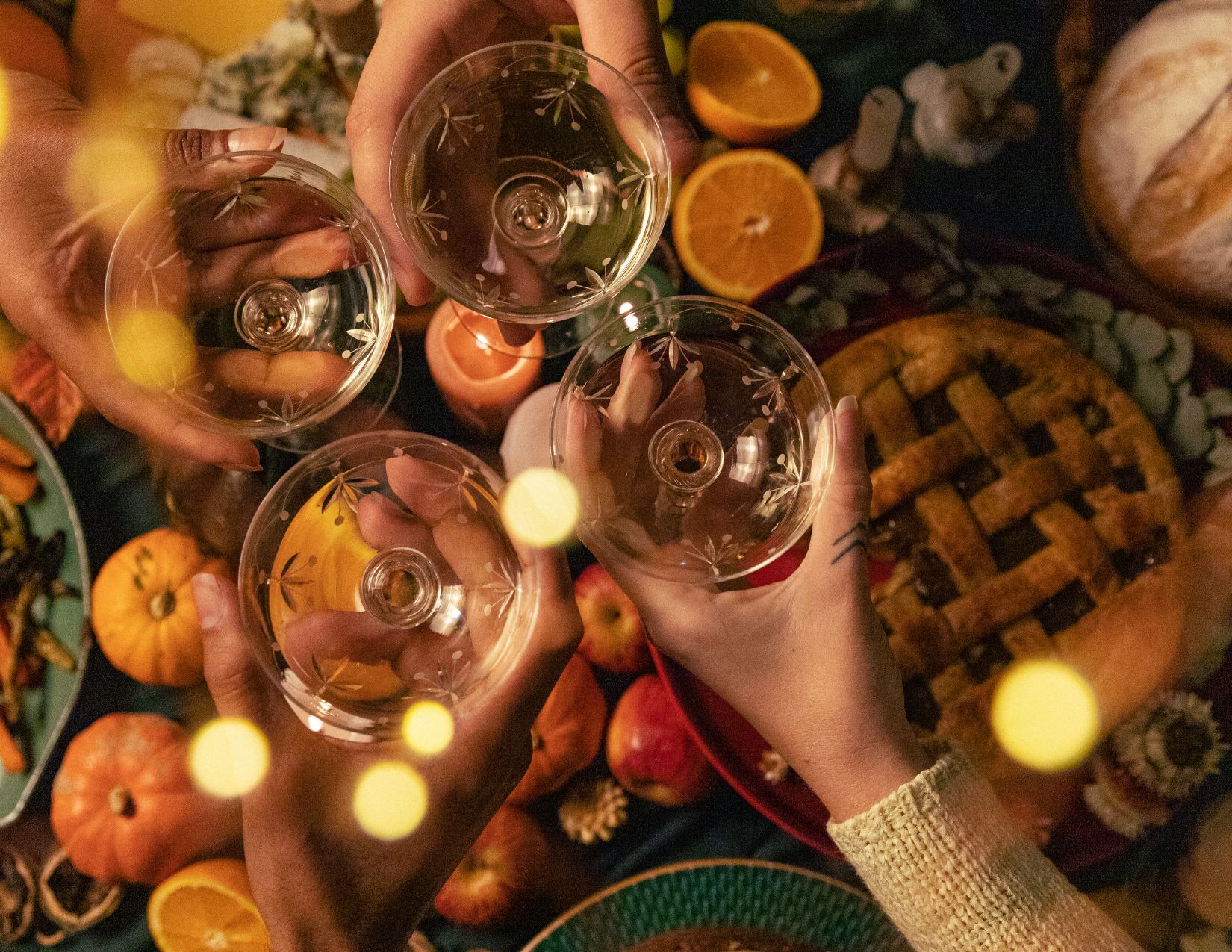
4. A thought for gratitude and connection
As you set the table, choose the linens, and plan your décor, reflect on this: the colors we choose become part of the memory. Your guests will visually remember the warm amber glow of candlelight, the deep wood tones of the table, the leafy green sprigs in the centerpiece. And those choices reinforce thanksgiving— not just as a meal, but as an experience.
So this year, lean into the palette with purpose. Let your décor speak the season and the sentiment: we are grateful, we are rooted, we rejoice together.
Wishing you a rich, warm, and beautifully-colored Thanksgiving,.
Ready to take the next step?
You can book an appointment with me for personalized support or schedule a discovery call if you’d like to explore how I can help.
Enjoy this blog?