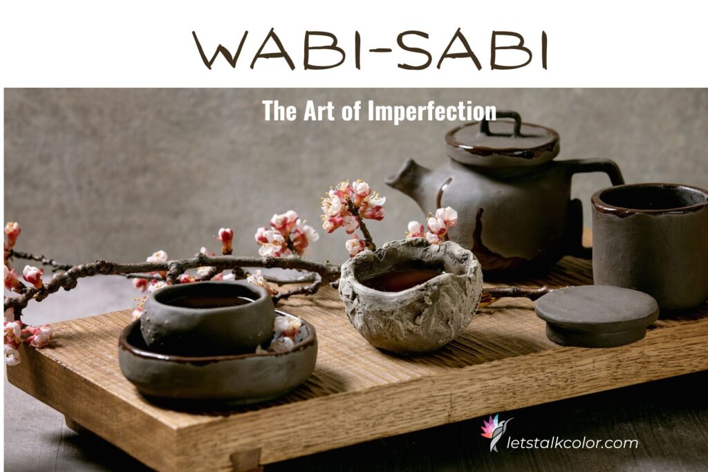
Wabi-Sabi: The Beauty of Imperfection — And How to Bring It Into Your Home With Color
In a world obsessed with perfection, symmetry, and the constant pursuit of “new,” there is something deeply refreshing—almost healing—about Wabi-Sabi.
Rooted in ancient Japanese philosophy, Wabi-Sabi is the art of finding beauty in imperfection, simplicity, and authenticity. It’s not a design trend; it’s a way of seeing. A way of living. A way of experiencing your home with more presence and less pressure.
And when you understand Wabi-Sabi through the lens of color, the entire philosophy opens up in a new way.
What Is Wabi-Sabi?
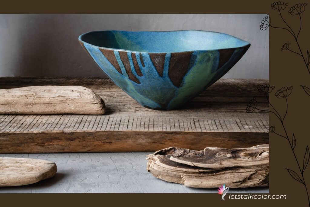
Wabi-Sabi celebrates the natural cycle of growth and decay: weathered wood, worn stone, uneven edges, patinaed metals, frayed linen—elements that tell a story.
It rejects the glossy, the overly polished, the matchy-matchy, and the “perfectly styled for Instagram” aesthetic.
Instead, it embraces:
- Natural materials
- Soft textures
- Subtle asymmetry
- Earth-based color palettes
- A sense of calm, groundedness, and simplicity
Wabi-Sabi spaces feel like an exhale. They are warm, tactile, lived-in, and beautifully honest.
Color and Wabi-Sabi: A Perfect Match
Even though Wabi-Sabi is often described as “minimalist,” color plays a powerful role. But the colors are not loud or attention-seeking—they are softened, muted, organic, grounded.
Think of colors found in nature after weathering, sun exposure, or oxidation.
Wabi-Sabi color palettes include:
Earthy Neutrals
- Mushroom taupe
- Clay beige
- Weathered sand
- Warm stone
- Putty gray
These neutrals anchor a space, creating a gentle backdrop for texture and organic materials.
Soft Greens
- Sage
- Olive dust
- Moss
- Lichen
Green is the most grounding color in the Wabi-Sabi palette—calming, restorative, and deeply connected to nature.
Washed Blues
- Slate
- Stormy sky
- Blue-gray
- Indigo softened with gray
These blues offer peacefulness without feeling cold or sharp.
Warm Browns
- Tobacco
- Chestnut
- Driftwood
- Umber
Brown is the quiet hero of the Wabi-Sabi palette — rich, grounding, and comforting.
Muted Whites
Not stark gallery whites, but:
- Bone
- Porcelain
- Chalk
- Soft cream
These whites feel warm and lived-in instead of crisp or sterile.
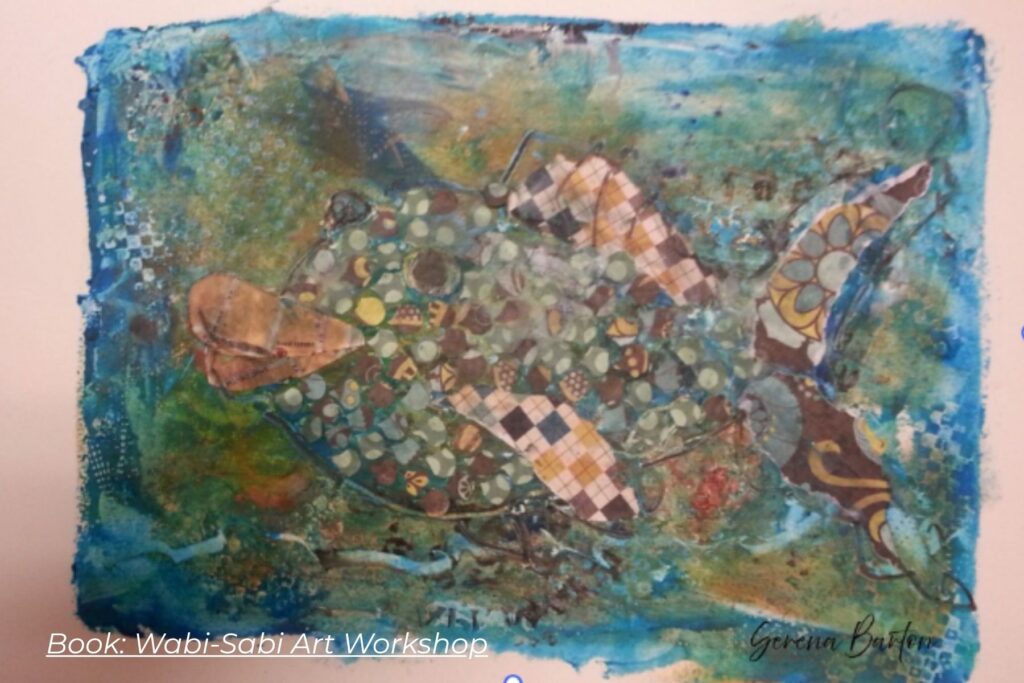
Obtained permission from Serena Barton to showcase image on this post
The Power of Imperfect Color
Wabi-Sabi color is never high-chroma and never “clean.” Instead, it has depth and subtle complexity.
Think undertones. A mushroom taupe might have hints of green, violet and a grounded brown base. A sage green might lean slightly yellow or gray depending on natural light. This subtle complexity is what makes Wabi-Sabi color so tranquil and timeless. It’s not loud. It’s not trendy.
It doesn’t demand perfection. It simply is.
How Lighting Enhances Wabi-Sabi Color
Wabi-Sabi color transforms beautifully throughout the day. Because the palette is soft and organic, it reacts poetically to morning shadows, warm afternoon sun, cool winter light, the soft glow of a lamp. In Wabi-Sabi interiors, lighting is never harsh — only soft, layered, and gentle.
Texture: The Secret Ingredient
Color and texture work hand-in-hand in Wabi-Sabi design.
Pair muted colors with clay, stone, linen, jute, plaster, raw wood, handmade ceramic, oxidized metals. These textures absorb light differently, adding dimension to a low-chroma palette. Texture is color in Wabi-Sabi.
How to Bring Wabi-Sabi into Your Home
Here are simple ways homeowners can incorporate Wabi-Sabi color intentionally:
- Choose Muted, Nature-Inspired Paint Colors
Opt for taupes, greens, soft browns, creamy whites. Avoid crisp whites, sharp grays, or anything overly saturated.
- Embrace Variation
A Wabi-Sabi room doesn’t need every neutral to match. Layer colors with different values and textures. This creates harmony, not perfection.
- Incorporate Weathered or Aged Materials
Aged wood or stone adds soul and depth that fresh paint can’t replicate.
- Warm Up the Light
Use warm LEDs and multiple light sources to soften the palette.
- Choose Handmade Over Mass-Produced
Hand-thrown pottery, artisan textiles, limewash walls — these bring authentic imperfection to the home.
Why Wabi-Sabi Matters Today
We live in a visual culture of filters, flawless finishes, and comparison.
Wabi-Sabi invites the opposite. It reminds us that a slightly uneven brushstroke is beautiful. Aa dented table tells a story. A faded cushion means the room is lived in.
A home doesn’t have to be perfect to be meaningful
When you combine this philosophy with intentional color, you create spaces that nurture your well-being, calm your nervous system, and help you feel at home in your home.
Wabi-Sabi isn’t about messy or minimal. It’s about meaningful.
It’s about choosing colors that feel grounded, honest, and connected to nature.
It’s about letting go of perfection and embracing spaces that support presence, comfort, and authenticity.
If you’re ready to design a home that feels peaceful, intentional, and deeply soulful, Wabi-Sabi may be the perfect philosophy to explore.

Ready to take the next step?
You can book an appointment with me for personalized support or schedule a discovery call if you’d like to explore how I can help.
Enjoy this blog?