Wallpaper as an Architectural Tool: How to Use Pattern Without Overwhelming a Space
Over the last few years, wallpaper has quietly re-entered the design conversation — but not in the way most people think. I see it being used in model homes, powder rooms, dining rooms, bedrooms and yes, I even saw it in a media room albeit a very subtle pattern. Not sure that I would use it there. What’s the pint, right?
But today’s wallpaper is less about decoration and far more about architecture, scale, and spatial correction.
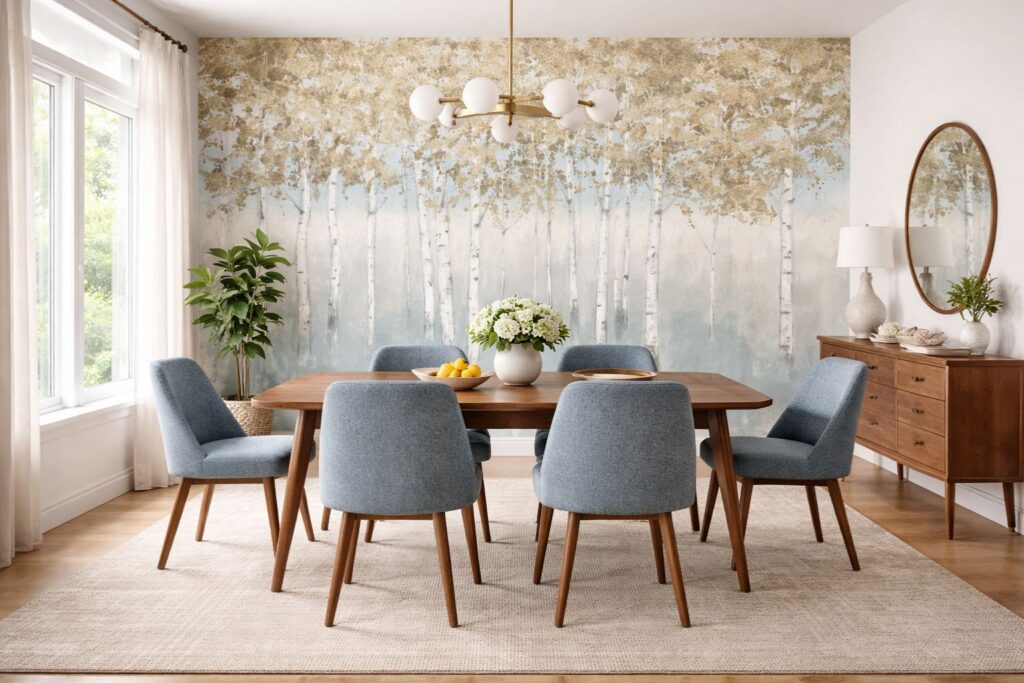
Used correctly, wallpaper can quietly do a lot of heavy lifting. I often walk into homes with tall ceilings and expansive walls where something clearly needs to happen — but large-scale art doesn’t always make sense. A common example is a tall wall behind a TV: adding artwork there can feel awkward, forced, or visually disconnected. In those situations, wallpaper becomes one of my suggested solutions — not as a bold statement, but as a subtle presence that gives the wall weight and intention without demanding attention.
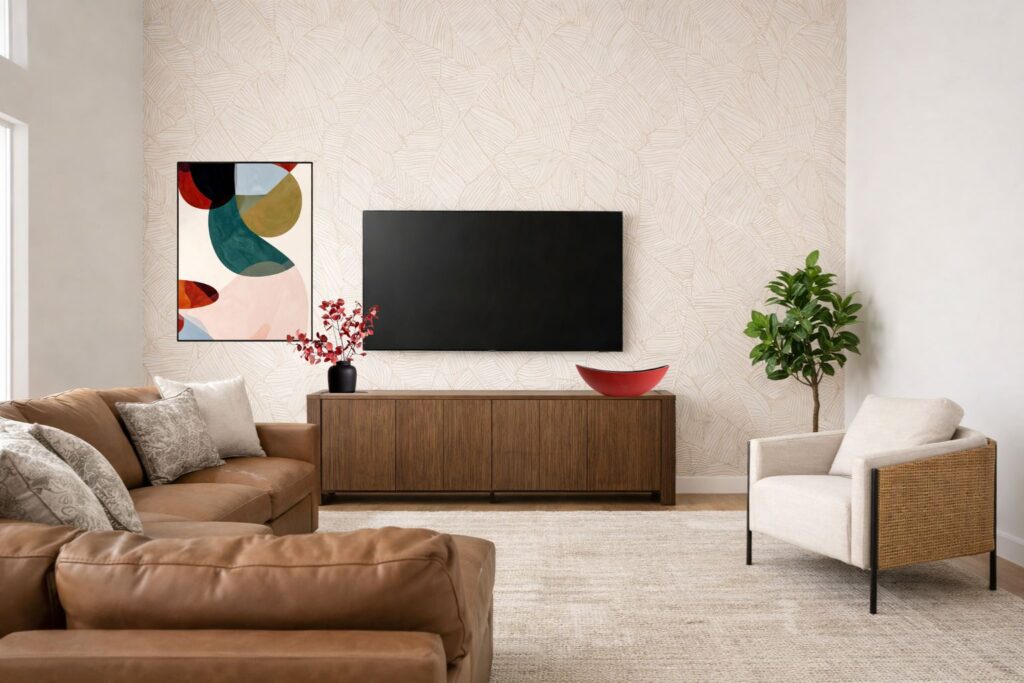
I also see wallpaper work beautifully in homes where flat paint simply isn’t enough — especially in rooms that feel echoey or visually empty. A soft pattern or textural paper can absorb some of that harshness and introduce rhythm in a way paint alone can’t. That said, when wallpaper is chosen without considering scale, contrast, or proportion, the effect can flip quickly. Instead of grounding the space, it may overwhelm the room, distort the architecture, or feel dated far sooner than expected.
This guide breaks wallpaper down as a design tool, not a trend — so you can decide when it belongs, where it works best, and how to use it with confidence.
What Wallpaper Really Is (and Is Not)
Wallpaper is not simply “pattern on a wall.” At its best, it functions like architectural detailing — adding movement, depth, and visual pacing.
Modern wallpapers range from:
- Subtle textural grounds
- Soft mural-style landscapes
- Grass-cloth and woven materials
- Large-scale painterly or geometric patterns
The key difference from paint is that wallpaper guides the eye. That guidance must always be intentional.
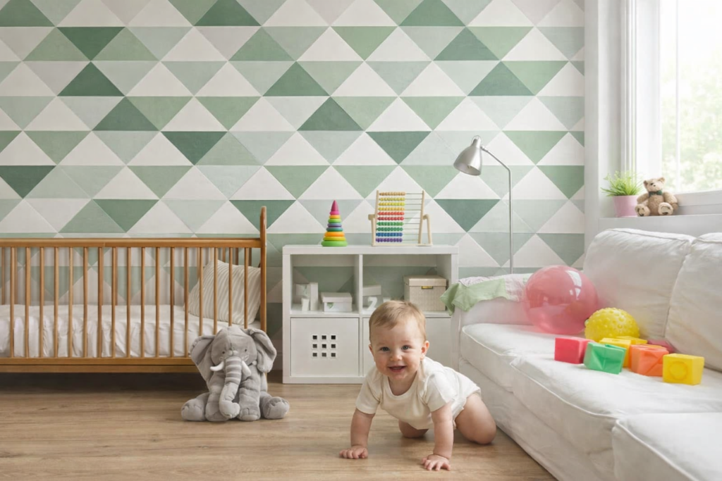
Best Rooms for Wallpaper
Wallpaper performs best where the wall itself needs purpose.
Ideal applications include:
- Dining rooms (controlled enclosure)
- Powder rooms (small scale, high impact)
- Bedrooms (headboard walls or ceiling applications)
- Home offices (depth without clutter)
- Transitional spaces (hallways, stair landings)
What Wallpaper Solves
When used strategically, wallpaper can solve several common design challenges:
- Blank or oversized walls that feel empty or cold
- Low ceilings, when vertical patterning is applied correctly
- Echo or acoustical harshness, especially with grass-cloth or textile-backed papers
- Awkward proportions, by visually compressing or expanding space
Wallpaper gives a wall a job. A purpose.
Color Rules: Contrast, Value & Sheen
Wallpaper works best when contrast is controlled, not extreme. In practice, this means looking beyond whether you simply like the pattern and instead asking how it will behave once it’s surrounded by trim, furniture, flooring, and light. Low-to-mid contrast wallpapers tend to age better because they read as part of the architecture rather than as a focal point competing for attention.
One of the first things I do when working with wallpaper is identify one dominant color within the pattern. That color becomes the anchor. From there, I’ll often repeat it elsewhere in the room — sometimes as a paint color on an adjacent wall, sometimes in upholstery, pillows, or even a rug. This repetition is what creates color rhythm. Instead of the wallpaper feeling like a standalone moment, it becomes part of a visual conversation that moves your eye through the space.
Color rhythm is about controlled repetition at varying intensities. You don’t want to repeat the wallpaper exactly — that feels literal — but you do want to echo its colors at different scales and finishes. A mid-tone pulled from the wallpaper might appear as a wall color, while a lighter or deeper variation shows up in accessories. This creates flow without feeling matchy.
Sheen also plays a quiet but important role. Highly patterned wallpaper paired with glossy trim can create too much visual friction, especially in rooms with strong natural light. I generally prefer matte or softly reflective finishes around wallpaper because they keep the wall grounded and allow the pattern to sit back rather than jump forward.
Finally, wallpaper should always relate to what’s happening beyond the room it’s in. Even a subtle color reference to an adjacent space — through paint, textiles, or materials — can make the entire home feel more cohesive.
When wallpaper is integrated thoughtfully, it doesn’t announce itself. It supports the space. That’s when it stops feeling decorative and starts feeling architectural.
Think integration, not isolation.
Proportion Rules: Scale Matters More Than Pattern
One of the most common wallpaper mistakes is choosing the wrong scale.
- Large rooms can handle large-scale patterns
- Smaller rooms benefit from mid-sized patterns with tighter, quieter repetition
- “Murals” require uninterrupted wall space with minimal visual clutter (see below)
- Ceiling height should influence pattern orientation (vertical vs. horizontal)
If the pattern is the first thing you notice, it’s likely too dominant.
Shimmer Forest
One Common Mistake to Avoid
Treating wallpaper as décor instead of structure.
Wallpaper can absolutely be decorative, but it should always be an intentional decision — not something chosen simply because it’s having a moment. When I suggest wallpaper, I’m always evaluating how the colors relate to the rest of the room and whether they create rhythm rather than visual noise. One of the biggest mistakes I see is treating wallpaper as mere decoration instead of structure. When it’s added just to “create interest,” it often feels forced or overly noticeable.
The most successful applications are usually the quiet ones — you sense that the room is more resolved before you can fully explain why. Wallpaper isn’t always about being bold or dramatic; it’s about restraint and purpose. When chosen with discipline, it becomes one of the most effective architectural tools for shaping and grounding a space.
Don’t leave your walls to chance.
Wallpaper is a powerful architectural tool, but the wrong scale or contrast can quickly overwhelm a room. If you are ready to introduce texture or pattern to your home, our Interior Fixed Elements service ensures your selections align perfectly with your existing architecture, flooring, and lighting. We help you choose with confidence so your space feels grounded, not cluttered.
Book your Design Consultation here! if you feel overwhelmed but inspired
Ready to move beyond basic paint choices?
Color is more than a decorative detail—it’s an architectural tool that shapes how you experience your home. If you are ready to stop playing it safe and start designing with intention, our new eBook, “Immersive and Bold Color Techniques,” is your professional roadmap. Learn how to master color drenching, color capping, and high-contrast blocking to transform your space into a cohesive, high-end sanctuary.
Download Your Guide to Immersive Color Design Here
Let’s continue learning!
If you’re considering how to elevate your walls beyond paint, these guides will help you understand how each treatment functions within a space — not just how it looks:
Decorative Wood Patterns used as an Architectural Tool → Link Here
Vertical Slats vs. Fluted Panels: What Actually Works (and What Doesn’t) → Link Here
Limewash & Plaster Walls: Softness, Movement, and Depth → Link Here
Tile & Stone as Architectural Wall Surfaces → Link Here
Enjoy this blog?