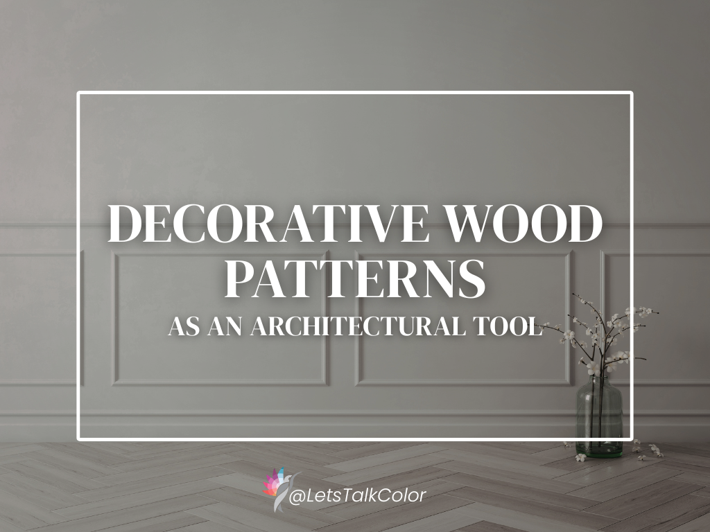
How Herringbone, Chevron, and Plank Layouts Shape a Space
Decorative wood patterns — such as herringbone, chevron, and geometric plank layouts — are often treated as stylistic choices. In reality, they are architectural tools. When used intentionally, they influence how a space feels, how it’s perceived, and how the eye moves through it. When used without restraint, they can quickly overwhelm a room or compete with the architecture itself.
This is not about following trends. It’s about understanding when patterned wood belongs, what problems it solves, and how to use it in a way that feels grounded and long-lasting.
What Decorative Wood Patterns Really Are
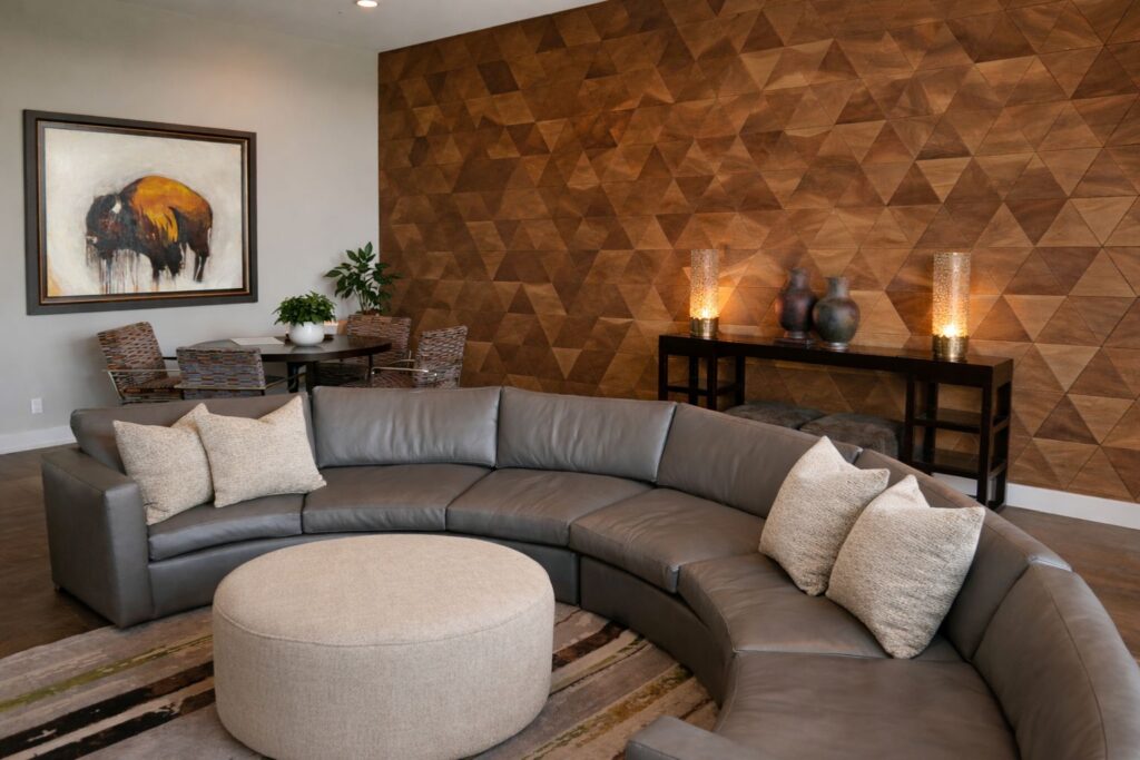
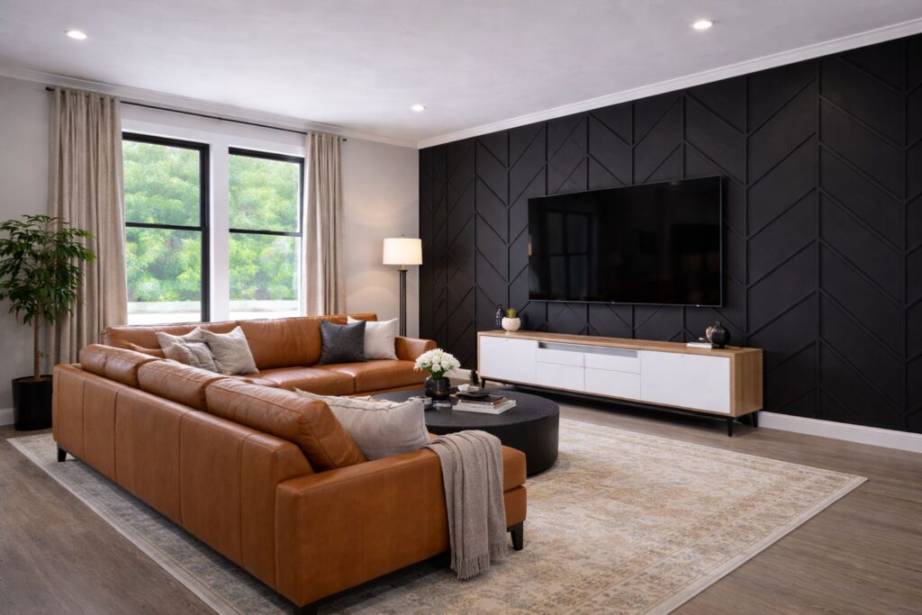
At their core, decorative wood patterns are directional surfaces. Unlike standard horizontal planks, patterns like herringbone or chevron introduce movement and rhythm. They guide the eye, establish hierarchy, and add depth to otherwise flat planes.
Because these layouts are visually active, they should be treated more like architectural detailing than surface decoration. They work best when they are given a clear role in the space — supporting proportion, balance, or flow — rather than being added simply for visual interest.
Best Rooms and Walls for Decorative Wood Patterns
Decorative wood patterns perform best where a surface needs definition or intention.
They are particularly effective in:
- Entry walls that need presence without clutter
- Dining rooms or breakfast nooks where enclosure feels appropriate
- Living room feature walls with minimal adjacent ornamentation
- Stair walls or landings that benefit from visual movement
- Ceilings, when used sparingly, to add warmth and dimension
Not every wall needs pattern. In fact, restraint is what allows these layouts to feel architectural rather than busy.
What Decorative Wood Patterns Solve
When applied thoughtfully, patterned wood can address several common design challenges:
- Blank or oversized walls that feel flat or unresolved
- Poor proportion, by visually elongating or grounding a space
- Lack of warmth, especially in modern or minimal interiors
- Acoustic harshness, as wood surfaces help soften sound
- Weak focal points, where paint alone feels insufficient
Rather than adding décor, these patterns give the wall a purpose.
Color Rules: Contrast, Value, and Sheen
Wood pattern layouts work best when contrast is controlled.
- Low-to-mid contrast between wood and surrounding surfaces feels more architectural
- Highly contrasting stains can dominate the room and limit flexibility later
- Matte or satin finishes read calmer and more timeless than high gloss
- Color should relate to floors, cabinetry, or adjacent rooms — not compete with them
The goal is cohesion. The wood should feel like part of the structure, not an applied feature.
Proportion Rules: Scale, Spacing, and Direction
Patterned wood layouts demand careful attention to proportion.
- Larger rooms can handle wider planks and more pronounced patterns
- Smaller spaces benefit from tighter, quieter layouts
- Direction matters: vertical orientation can enhance height, while horizontal movement can widen a space.
- Consistent spacing is critical — irregularity reads as visual noise
If the pattern draws attention to itself before it supports the room, it’s likely out of scale.
One Common Mistake to Avoid
The most common mistake I see is using decorative wood patterns as decoration rather than structure. When they’re added simply to “make the wall interesting,” the result often feels forced or overly busy. These patterns work best when they are subtle enough that you notice the room feels better before you consciously register why.
Decorative wood isn’t about boldness. It’s about intention, proportion, and discipline.
When used with restraint, decorative wood patterns can quietly elevate a space — adding warmth, rhythm, and architectural clarity without overwhelming it. Like wallpaper or plaster finishes, their success depends less on the pattern itself and more on how thoughtfully it’s integrated into the larger design.
Ready to move beyond basic paint choices?
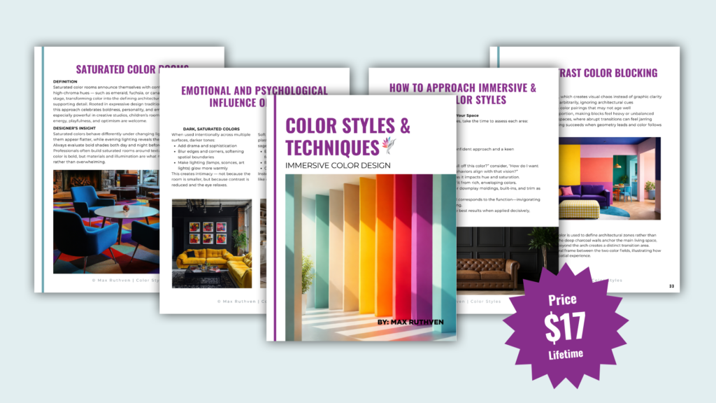
Color is more than a decorative detail — it’s an architectural tool that shapes how you experience your home. If you are ready to stop playing it safe and start designing with intention, our new eBook, “Immersive and Bold Color Techniques,” is your professional roadmap. Learn how to master color drenching, color capping, and high-contrast blocking to transform your space into a cohesive, high-end sanctuary.
Download Your Guide to Immersive Color Design Here
Let’s continue learning!
If you’re considering how to elevate your walls beyond paint, these guides will help you understand how each treatment functions within a space — not just how it looks:
Wallpaper as an Architectural Tool (Not a Trend) → Link Here
Vertical Slats vs. Fluted Panels: What Actually Works (and What Doesn’t) → Link Here
Limewash & Plaster Walls: Softness, Movement, and Depth → Link Here
Tile & Stone as Architectural Wall Surfaces → Link Here
Ready to take the next step?
You can book an appointment with me for personalized support or schedule a discovery call if you’d like to explore how I can help.
Enjoy this blog?
For ongoing insights and real project examples, you can also follow along on Instagram and Facebook for more.