Neutral Does Not Mean Flat
One of the most common misunderstandings in interior design is the idea that neutral spaces are boring, bland, or one-dimensional. In reality, neutrals are some of the most complex and sophisticated color palettes you can work with — when they’re layered correctly.
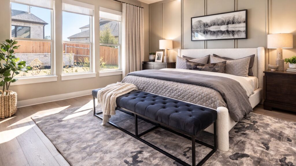
Neutral design isn’t about choosing one beige and calling it a day. It’s about building depth through subtle shifts in tone, texture, and sheen that enhance the architecture rather than compete with it. When done well, neutral spaces photograph beautifully, feel elevated in person, and age far better than trend-driven color schemes.
Why Flat Neutrals Feel “Off”
When people say a neutral space feels flat, they’re usually reacting to a lack of variation—not the absence of color.
Common reasons neutral rooms fall flat:
- Using the same paint color on walls, trim, ceiling, and doors
- Ignoring undertones and how they interact with flooring and fixed finishes
- Using a single sheen throughout the entire space
- Failing to layer materials, textures, and tonal shifts
The eye needs contrast to perceive depth. Without it, even the most expensive finishes can feel underwhelming.
Layered Neutrals Create Architectural Depth
Layering neutrals allows architectural elements to quietly stand out without creating visual clutter. This is especially important in homes with beautiful trim work, millwork, ceiling details, or intentional proportions.
Key ways layering creates depth:
- Slight shifts between wall color and trim color
- Tonal variations within the same color family
- Strategic contrast between vertical and horizontal planes
- Thoughtful separation of surfaces using sheen
Instead of drawing attention to the color, layered neutrals draw attention through the color—right to the architecture.
The Power of Tonal Variation
Tonal variation means working within a narrow range of color while adjusting lightness and depth. This keeps a space cohesive while still visually interesting.
Examples of tonal variation:
- Soft taupe walls paired with a soft white trim
- Pale neutral walls with mid-tone painted cabinetry in the same hue family
- Ceilings that are lighter against the walls painted in the same color
This approach creates dimension without visual noise, making spaces feel intentional and calm rather than busy.
Why Sheen Shifts Matter More Than You Think
Sheen is one of the most overlooked tools in neutral design—and one of the most powerful.
Using different sheens allows light to interact with surfaces differently, creating contrast even when the color stays the same.
Common sheen strategies:
- Matte or eggshell walls for softness
- Satin or semi-gloss trim to highlight architectural lines
- Flat ceilings to reduce glare and visually lift the room
- Higher sheens on doors or built-ins to subtly anchor the space
Sheen shifts photograph exceptionally well because they create natural highlights and shadows, adding depth without introducing additional colors.
Neutrals That Look Better in Photos and Real Life
A well-layered neutral space translates beautifully both on camera and in person. Instead of appearing washed out, the room gains dimension, balance, and clarity.
Benefits of layered neutrals:
- Better real estate and design photography
- Spaces that feel calm but not sterile
- Timeless appeal that doesn’t rely on trends
- Architecture that feels intentional and elevated
Neutral done right doesn’t fade into the background—it quietly does the heavy lifting.
Architectural Depth Without Visual Clutter
The goal of neutral design isn’t minimalism for the sake of minimalism. It’s clarity. Layered neutrals allow the eye to move easily through a space without being overwhelmed.
When neutrals are thoughtfully layered:
- The architecture leads, not the color
- Spaces feel grounded and cohesive
- Design choices feel confident rather than safe
Neutral does not mean flat. It means refined, intentional, and deeply considered.
Ready to turn “For Sale” into “Sold”?
Understanding the power of color is the first step, but applying it to your unique space is where the magic happens. My Home Staging Consultation provides up to 2 hours of onsite expertise followed by a detailed report tailored specifically to your home. I’ll help you highlight your home’s best features and create those “Emotional Connection Points” buyers can’t resist.
Check My Home Staging Consultation Here!
Want More Practical Staging Tips?
Make sure you read the following post as well to help you get your home ready for to sell
- Why Home Staging Matters — And How Color Makes the Difference
- Why Curb Appeal Matters — Whether You’re Selling or Staying
- Color Flow in Staged Homes: Why seamless transitions makes a better impact
Ready to take the next step?
You can book an appointment with me for personalized support or schedule a discovery call if you’d like to explore how I can help.
Enjoy this blog?