How Professional Draperies and Color Flow Elevated This Entire Home
Torri and Rob hold a very special place in my heart, and working with them was an absolute delight. They were enthusiastic, open to ideas, and fully invested in the design process—which made this project both joyful and creatively fulfilling. I’ll admit, I was a little sad when it was done.
Not long afterward, they moved—and I had the privilege of transforming their new home as well, this time by repurposing nearly everything they already owned and simply adjusting the accent color percentages. This is exactly why I love what I do.
Because I’m not a full turn-key designer, I always begin by working with what clients already have. Thoughtful use of color—layered, intentional, and balanced—is the secret ingredient that brings a space together, no matter the budget.
The Goal: “Pull It All Together”
Their home in Shoreview Overlook already had some great pieces and pops of color, but Torri described it perfectly:
“It feels unfinished.”
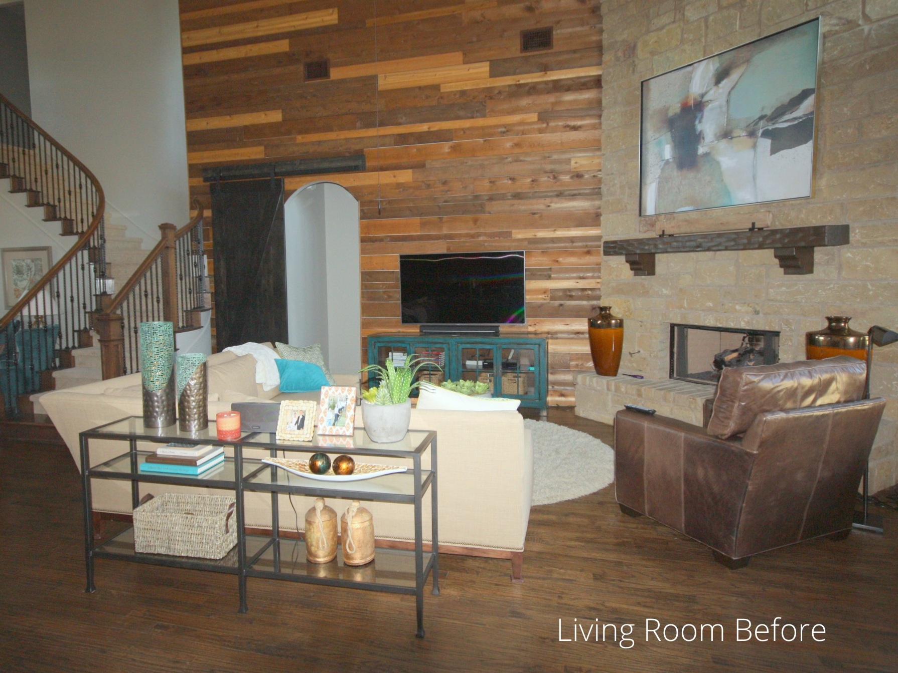
The walls and trim had recently been painted a neutral gray, which we kept. My inspiration came from two key elements:
- The artwork above the fireplace
- The turquoise TV console
These established the foundational hues for the entire design plan.
Why Professional Draperies Matter
One of the biggest lessons I’ve learned in my decorating career:
If you want your home to look like a model home, invest in professional draperies.
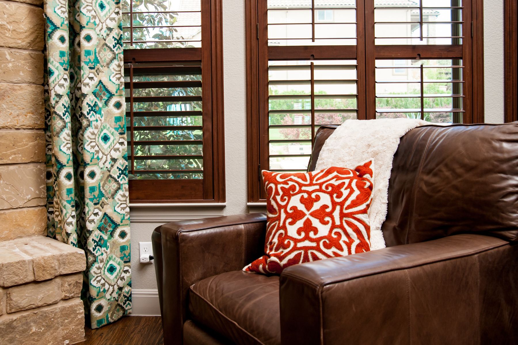
With a soaring 20-foot wall next to the fireplace and brown tones throughout the home — from stone to wood finishes — curtains were essential. They added height, softness, color, and the impact the room was missing.
We added custom draperies to both the living and dining rooms. Not in matching fabrics, but in coordinating textiles that spoke to each other and created flow.

Creating the Color Strategy: The 60-30-10 Rule
For this home, the existing architecture and furnishings naturally guided the palette:
- 60% Brown (floors, stone, wood)
- 30% Green-Turquoise (console, accessories, fabrics)
- 10% Orange to tie in the artwork, décor, and warm undertones
Orange also played beautifully with the wood tones throughout the home, adding warmth without overpowering the palette.
Living Room & Dining Room Updates
We repurposed many of their accessories, supplemented with affordable finds from HomeGoods and Hemispheres. The dining room drapery fabric echoed the greens and even added touches of gold—stunning, and perfect for visual continuity.
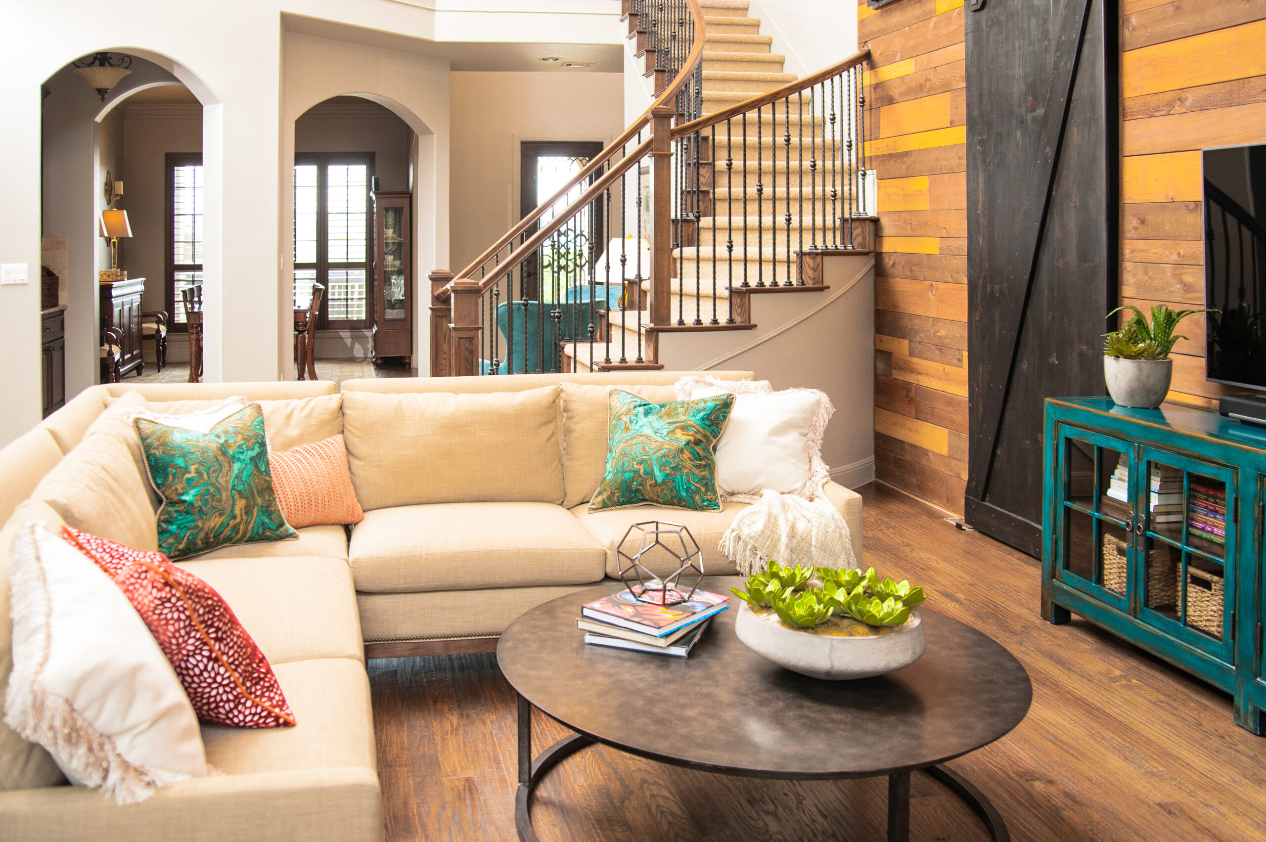
We used that same fabric to create accent pillows for the living room sectional, weaving the colors together between both spaces. Bronze and brass accents gave the rooms a finished, elevated look.

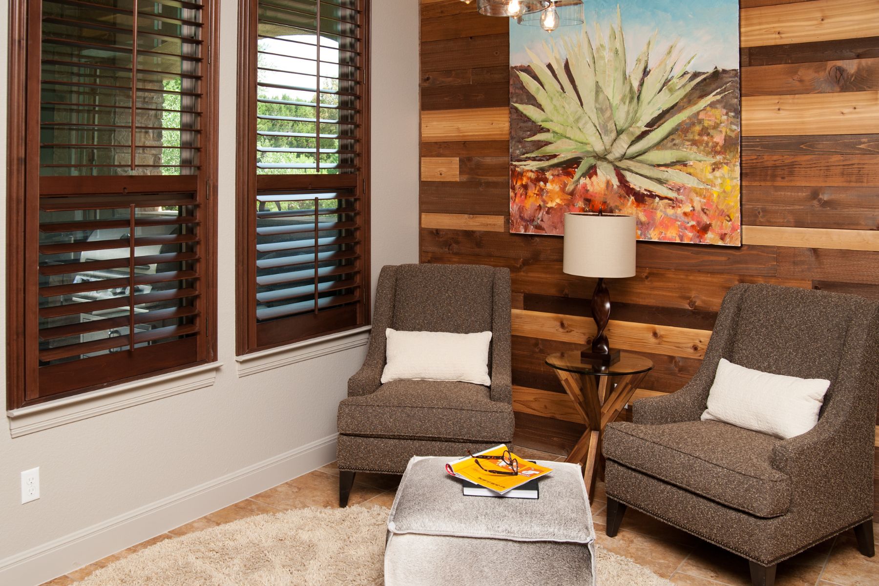
A Fresh, Airy Reading Corner
This room formerly had bold orange walls, but repainting it the home’s main neutral created a lighter, more balanced look. Existing furniture was rearranged and repurposed, eliminating the heaviness the space originally had.
Guest Bedroom: Fresh, Flowing, and Connected
Since this room is visible from the dining area, continuity was essential.
We kept the furniture but updated lamps, bedding, and accessories—and found the perfect butterfly prints on Amazon that carried the turquoise and orange palette beautifully.
By adding more white, the room felt fresher without repainting the walls (repainting was not an option).
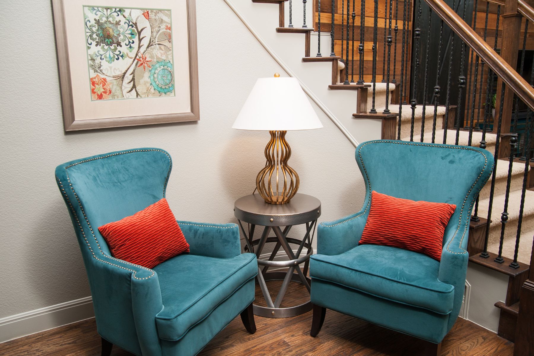
The Foyer: A Hidden Gem Comes to Life
We pulled turquoise chairs from upstairs and placed them in the foyer. Then I rescued artwork from a closet —yes, a closet! — and paired it with a brass lamp from another room. Suddenly the foyer felt intentional, welcoming, and perfectly tied into the rest of the home.
Creating Visual Flow Throughout the Entire House
Repeating key colors—bronze, warm browns, turquoise, and orange—made every space feel connected, cohesive, and intentionally designed. Most items were already in the home; they simply needed direction, placement, and purpose.
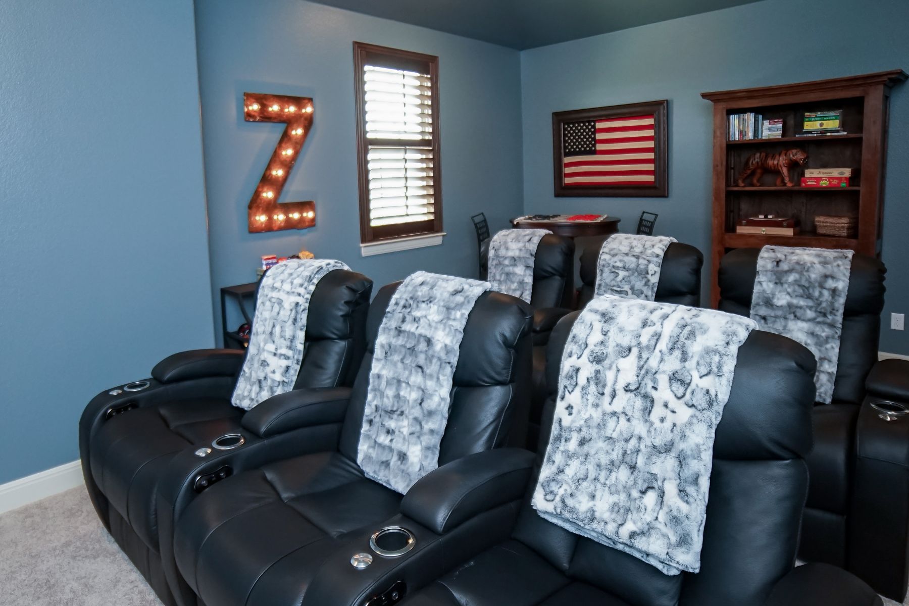
Media Room Makeover
The only major change upstairs was the media room, originally the girls’ playroom. With their input (and a bit of my guidance), they chose Benjamin Moore Smokestack Gray 2131-40—a beautiful deep-value blue that feels cozy but not heavy.
We added top-grain black leather theater seating with USB ports and fun purple underlights and repurposed existing furniture to build a game area. Clean, functional, welcoming.
The Investment That Made the Biggest Difference
Hands down:
The professional draperies.
They transformed the entire feel of the home and elevated the design from “nice” to truly “model home.”
If you’re dreaming of a cohesive, beautifully designed space, I’d love to help.
Let’s create a home that finally feels pulled together.
Ready to take the next step?
You can book an appointment with me for personalized support or schedule a discovery call if you’d like to explore how I can help.
Enjoy this blog?