The Art of Ombré: How Gradient Color Can Transform Your Home
If you’ve ever paused mid-scroll because a room felt soft, dreamy, and visually magnetic, there’s a good chance you were looking at an ombré design.
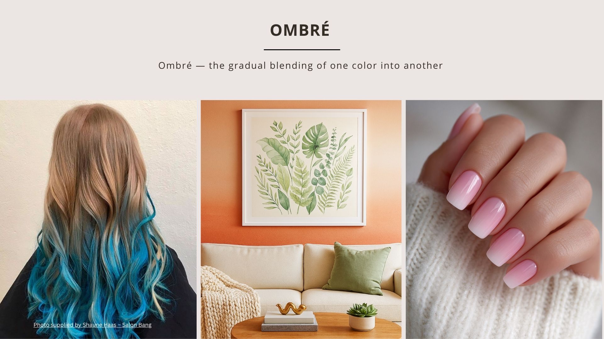
Ombré — the gradual blending of one color into another — has moved from fashion and hair trends into the world of interior design, and it’s changing the way homeowners use paint, color, and light.
Whether you prefer subtle, tone-on-tone transitions or bolder shifts from dark to light, the ombré technique adds dimension, softness, depth, and a sense of movement to a room. It’s artistic, expressive, and surprisingly timeless when done well.
What Is Ombré?
In design terms, ombré refers to the smooth gradient of one color shifting into another — often from dark to light or from one hue to a related hue.
This technique works beautifully because:
- It mimics what naturally happens in nature (sunsets, ocean waves, light rays).
- It adds visual interest without overwhelming a space.
- It softens architectural lines and expands perceived height or width.
Think of it as color storytelling — one shade dissolving gracefully into the next.
Why Ombré Works in Interior Design
Ombré is more than a trendy wall treatment. When used intentionally, it becomes a powerful color strategy.
1. It transforms the height and proportions of a room
A darker base fading upward into a lighter top can make ceilings feel higher.
A horizontal gradient can open up small rooms or draw attention to architectural features.
2. It creates mood and atmosphere through color psychology
The emotional impact of a gradient is different from a solid color:
- Warm colors create coziness and energy.
- Cool colors bring calm and serenity.
- Neutrals feel airy and sophisticated when softened into gradients.
3. It adds softness without patterns
For homeowners who dislike busy wallpaper but want more than a flat wall color, ombré becomes the perfect artistic middle ground.
4. It layers beautifully with furniture and décor
Because the gradient already offers depth, your artwork, textiles, and furniture don’t compete.
They sit in harmony against the color transition.
Where to Use Ombré in Your Home
Ombré works in nearly any area, but especially in spaces where you want visual softness or mood enhancement.
✔ Bedrooms: Soft gradients create a tranquil, spa-like feel — perfect for sleep and relaxation.
✔ Living Rooms: A tone-on-tone neutral ombré becomes a subtle, elegant backdrop that elevates the entire room.
✔ Bathrooms: Blues, greens, and sandy neutrals mimic nature and create a luxe retreat.
✔ Kids’ Rooms & Nurseries: Playful pastels or whimsical color transitions add charm without overwhelming the space.
✔ Accent Walls or Nooks: If you’re nervous about a full room, an ombré accent wall offers the same “wow” factor on a smaller scale.
Choosing the Right Colors for an Ombré Wall
Color choice is everything — and the wrong undertone can ruin a gradient instantly.
Here’s how to choose wisely:
- Stay in the same hue family: The best ombré looks come from one hue in different strengths (tints, tones, and shades). Example: A dusty green transitioning into a soft sage.
- Be mindful of undertones: If the undertones don’t match, the transition will feel “off.” Cool green into warm green rarely works. Warm gray into cool gray can look accidental.
- Choose 2–3 colors max: Your wall should look artistic, not busy.
- Test samples in different lighting: Lighting changes everything — especially gradients.
- Observe your samples morning, midday, and evening before committing.
Best Color Palettes for Ombré Walls
Some of the most popular and beautiful gradients include:
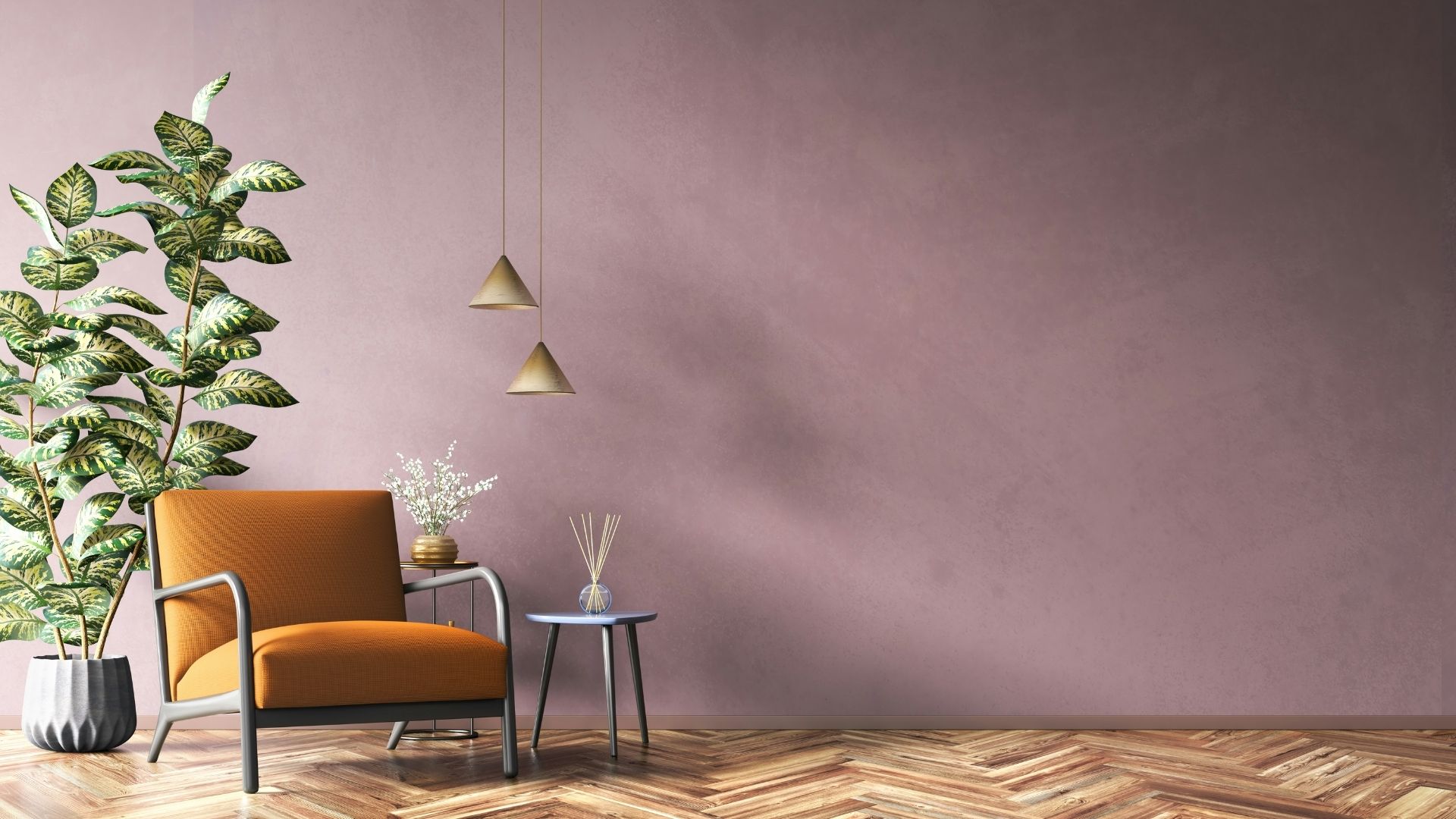
- Soft Whites → Greige → Warm Taupe Timeless, elevated neutrals perfect for living rooms.
- Navy → Dusty Blue → Misty Sky Calming and serene.
- Sage → Soft Green → Blush Beige Earthy, organic, and modern.
- Charcoal → Smoky Gray → Pearl White A dramatic yet sophisticated transformation.
- Terracotta → Peach → Warm Cream Cozy, warm, and full of personality.
Ombré Beyond Paint: Where Else It Works
Paint is just the beginning. Ombré can also elevate:
- Fabric and textiles (drapes, bedding, rugs)
- Cabinetry (popular in modern European kitchens)
- Furniture finishes
- Artwork
- Tile installations
- Throw pillows
- Wallpaper
It’s a design language — not just a paint technique.
Ombré Is Timeless When Done With Intention
In a world of overly trendy design ideas, ombré stands apart because it’s rooted in color theory, light behavior, and emotional balance.
When planned with:
- the right undertones,
- the right lighting,
- the right hue family,
- and a professional blending technique…
…ombré becomes a stunning statement that feels enduring, intentional, and uniquely yours.
Have you ever painted anything Ombre in your home? I would love to see it!
Ready to take the next step?
You can book an appointment with me for personalized support or schedule a discovery call if you’d like to explore how I can help.
Enjoy this blog?