Same color. Different surface. Different result.
One of the most misunderstood aspects of exterior color is this:
paint color does not exist independently of the surface it’s applied to.
Two areas painted with the exact same color can—and often will—look noticeably different once applied to different exterior materials. This isn’t a mistake. It’s physics, light, texture, and material interaction at work.
As a color consultant, this is one of the most important concepts I explain to clients before any exterior paint decision is finalized.
Why Texture Changes the Way Color Looks
Color is not just pigment. Color is light interacting with a surface.
Different exterior materials handle light in very different ways:
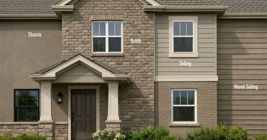
- Stucco is porous and irregular. It absorbs light and creates soft shadowing. Colors often appear darker, warmer, and more muted than expected.
- Brick has natural variation, mortar joints, and texture. It scatters light unevenly, which can make painted brick look richer, deeper, or more complex than smooth surfaces.
- Smooth siding or fiber cement reflects light more evenly. Colors tend to look cleaner, lighter, and more true to the swatch.
- Wood siding introduces grain, seams, and shadow lines that subtly shift how color reads throughout the day.
Even when the paint formula is identical, the surface texture changes how much light is absorbed, reflected, or diffused. That’s why color behaves differently from one elevation to another—or even from one wall to the next.
Ai generated images to depict Taupes across different surfaces (There’s even a black window in there! 🙂 )
The Role of Sheen: Often Overlooked, Always Influential
Sheen plays a quiet but powerful role in how exterior color performs.
- Flat or matte finishes absorb more light. They reduce glare and can make colors appear deeper and softer—but also slightly darker.
- Satin or low-lustre finishes reflect more light. They can make the same color appear brighter and more defined.
- Higher sheens (used selectively on trim or doors) intensify reflection and contrast, which can exaggerate undertones.
This means the same color in a flat finish on stucco will not read the same as that color in a satin finish on trim—even if they’re technically “matching.”
Sheen doesn’t just affect durability or cleanability. It affects visual perception.
Why Paint Chips, Screens, and Photos Fall Short
Paint chips are flat. Screens are backlit. Exterior surfaces are neither.
This is why choosing exterior color based solely on:
- a small paint chip
- a digital rendering
- or a photo of another home
often leads to disappointment.
Those tools don’t replicate:
- surface texture
- material porosity
- scale
- changing daylight
- or shadow patterns
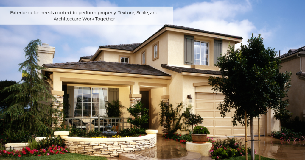
Exterior color needs context to perform properly.
Texture, Scale, and Architecture Work Together
On exteriors, color is never just decorative—it’s architectural.
Texture interacts with:
- scale (large wall planes vs. smaller details)
- proportion (how much of the surface is textured vs. smooth)
- contrast (adjacent materials, trim, stone, rooflines)
This is why a color that looks balanced on lap siding may feel too heavy on stucco—or why a subtle neutral suddenly feels much darker once applied across an entire façade. The color didn’t change.
The surface did.
Why Professional Guidance Matters
Exterior color success isn’t about finding a “pretty color.”
It’s about choosing a color that performs correctly on the materials your home is actually made of.
A professional color process accounts for:
- material texture
- sheen selection
- light exposure
- fixed elements (roof, stone, brick, hardscape)
- and architectural style
When these factors are ignored, homeowners often blame the paint—when in reality, the issue was never the color itself.
If you’ve ever wondered why a color looked perfect on one home but completely wrong on another, texture is a big part of the answer.
Color doesn’t live on a swatch. It lives on a surface.
And that surface quietly reshapes everything.
Is your home truly aligned with its environment?
Color is more than a decorative choice—it is a biological tool that can turn a flat space into a restorative sanctuary. If you are ready to move beyond trend-driven paint colors, our new eBook, “Nature-Derived Architectural Palettes,” provides the professional framework you need. Learn how to master the five signature styles that bring the enduring calm of the natural world into your home.

You can explore the Nature-Derived Architectural Palettes Guide here!
Ready to take the next step?
You can book an appointment with me for personalized support or schedule a discovery call if you’d like to explore how I can help.
Enjoy this blog?