Why Some Homes Feel Instantly “Right” (And Others Don’t)
You’ve experienced this before.
You walk into a space, and within seconds, something registers. It feels settled. Grounded. Like everything belongs.
You may not be able to explain it. You may not even consciously notice the color.
But the space just works.
And then there’s the opposite.
A home that looks beautiful—styled, thoughtful—but something feels off.
Not wrong. Just… unresolved.
This Is Not About Preference
What you’re responding to isn’t personal taste. It’s not a style or trend.
It’s something more structural: coherence.
Not visual coordination. Not matching.
Felt coherence—the sense that everything is working together, even if you don’t consciously understand why.
When coherence is present, a space feels effortless.
When it’s missing, the space feels like it’s quietly working against itself.
The Difference Between Looking Right and Feeling Right
A space can look cohesive and still feel unsettled.
That usually happens when decisions are made in isolation. Each element works on its own, but nothing is actually working together.
The result isn’t chaos—it’s more subtle than that. The eye hesitates instead of flowing. Transitions feel abrupt instead of natural. The space lacks an internal rhythm.
Visual cohesion is about appearance.
Felt coherence is about experience.
And the difference between the two is almost always color.
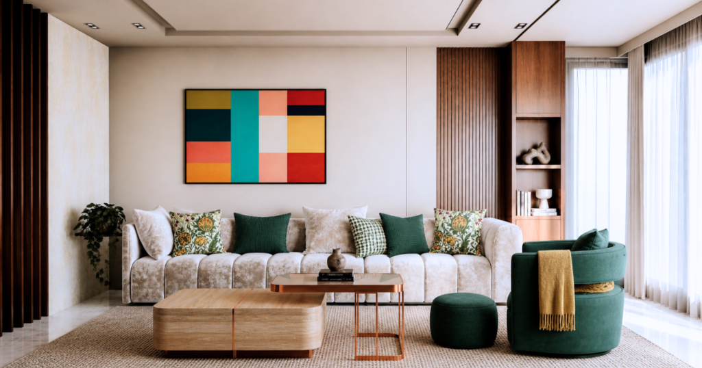
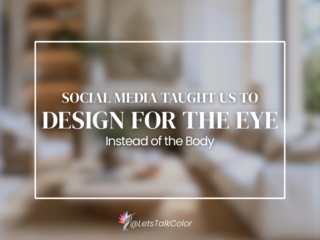
In the image above, the artwork is where this space begins to break.
It doesn’t relate to the palette, it competes with it. The colors are too saturated, too disconnected from the softened, grounded tones in the furniture. Instead of supporting the room, it interrupts it.
Nothing is technically wrong. But it doesn’t belong.
This is the difference between looking right and feeling right.
Individually, the elements work. Together, they hesitate. The eye doesn’t move—it stops. And that pause is what creates the sense that something is off, even if you can’t immediately explain why.
This is where color stops being visual, and becomes experiential.
What Actually Creates Coherence
Coherence isn’t created by a single color choice. It’s created by how color behaves across the environment.
Hue Family Alignment
Every color belongs to a broader directional family—even when it reads as neutral. When those directions align, the space feels stable. When they compete, the space feels unsettled—even if every individual choice works on its own.
Spatial Rhythm
The eye is constantly searching for structure—where to move, where to pause, and where to rest.
This is where tonal relationships matter—not just as light and dark, but as rhythm.
When value shifts are intentional, the eye moves easily through a space. When they jump without pattern or purpose, the space begins to feel visually unstable—even in neutral palettes.
Without rhythm, a space has no internal logic.
Sequential Experience
A home isn’t experienced all at once—it’s experienced in sequence.
Every doorway and sightline creates a moment of comparison. The brain is constantly asking: Does this relate to what I just saw?
When it does, movement feels natural. When it doesn’t, something feels interrupted.
Coherence isn’t built room by room. It’s built across movement.
Sequential Experience
A home isn’t experienced all at once. It’s experienced in sequence.
Every doorway, every sightline, every transition creates a moment of comparison. The brain is constantly asking: Does this relate to what I just saw?
When the answer is yes, movement feels natural. When it’s no, something feels interrupted.
This is where many homes begin to break down—not within individual rooms, but in the transitions between them.
Coherence isn’t built room by room. It’s built across movement.
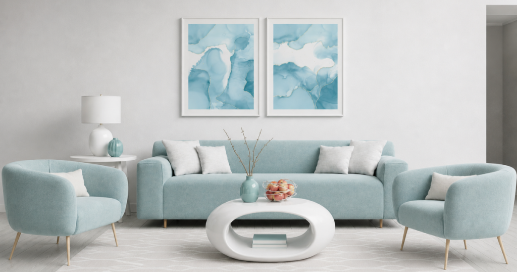
Why Matching Doesn’t Solve This
Matching creates repetition.
But repetition is not the same as coherence.
A home where everything is the same can feel flat. And oh so! boring! (see image below)
A home where everything relates can feel complete.
Coherence comes from relationship — not duplication.
Color doesn’t exist independently. It responds to light—and light changes from space to space.
The same color won’t behave the same way everywhere.
Coherence isn’t about forcing consistency. It’s about understanding variation—and controlling it.
Most homes are not lacking good decisions. They’re lacking connected decisions.
Choices are made individually: a paint color here, a floor there, a finish somewhere else.
Each one makes sense on its own.
But no one is asking:
• How does this relate to what’s next to it?
• What happens when I move through the space?
• Is there a rhythm holding this together?
Without those questions, coherence becomes accidental.
And when it’s missing—you feel it.
The Shift: From Selecting to Structuring
Once you understand coherence, the process changes.
You stop selecting colors. You start constructing relationships.
You begin to consider:
• How the eye will move through the space
• Where contrast should anchor attention
• Where softness should allow the space to recede
This is where color stops being visual—and becomes spatial.
Where This Is Going
This is the next layer in understanding color as architecture.
Not just what color does.
But how it holds a space together—or allows it to fall apart.
In the next post, we’ll explore what traditional architecture understood about color that modern design has largely forgotten—and why those principles still matter today.
If you’ve ever felt unsure about your color decisions or struggled to make a space feel complete,
👉 Download the free guide to making color work
The Strategic Color Guide shows you how to approach color with clarity, structure, and confidence.
Don’t let your home feel “off” any longer.
If your spaces feel disconnected, the solution may be found in nature’s own palette. Nature-Inspired Color System shows you how to move beyond trends and use grounded, balanced color relationships with more confidence.
From soft neutrals to richer earth-inspired hues, this guide helps you understand what works, why it works, and how to get the details right the first time.
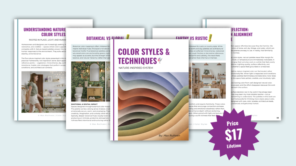
Click Here to Download the new Nature-Inspired Color System eBook
Ready to take the next step?
You can book an appointment with me for personalized support or schedule a discovery call if you’d like to explore how I can help.
Enjoy this blog?