For years, I’ve struggled to talk about the most popular paint colors; the undertones of taupe, gray, or beige, the “perfect” white, the warmest gray. Over the course of my career, I’ve seen that there is so much more to color than just paint. In fact, color has never been just about paint.
In my previous blog posts, we’ve covered the fundamentals—how to choose color, how to apply it, and how to correct common mistakes. But this is where the conversation begins to shift.
Because color, when used with intention, is not decoration.
It is structure.
It is atmosphere.
It is functional.
It is behavioral.
It shapes how a space feels, how we move through it, and how we experience it—often before we even realize it.
Over the next few weeks, we’re moving beyond surface decisions and into something far more powerful:
Color as an architectural tool.
If you’ve ever felt that a space was “off” without being able to explain why—this is where it starts to make sense. And more importantly, how to fix it. We’ve been taught to approach color as a final layer—something applied at the end to make a space feel complete. Styled. Aesthetic.
But that way of thinking misses its true role entirely.
Before furniture is placed, before styling begins, color is already shaping how a space will be experienced.
Color Is a Physiological Experience
Most people believe color is visual. In reality, it is physiological.
Color interacts directly with the nervous system. It influences how we:
- relax or stay alert
- move through a space
- perceive comfort, safety, or tension
How Color Shapes Behavior in Space
When color is used with intention, it starts to guide behavior—quietly, but consistently.
You may not notice it right away, but you feel it.
Color can create flow.
When tones move with continuity, the eye—and the body—naturally follow.
It can create pause.
Deeper, more saturated moments give the eye a place to land… and the body a reason to slow down.
It can expand or compress a space.
Subtle shifts in tone can make a room feel open and airy—or more contained and intimate.
This is what defines architectural color.
It’s not about choosing a “nice shade.”
It’s about shaping experience.
A soft, mineral-based palette can slow the body down.
High-contrast environments can increase stimulation and restlessness.
Darker, enveloping tones can create a sense of containment—or, when misused, heaviness.
This is why two rooms with identical layouts can feel completely different.
The difference is not just the furniture.
It is the color system in relation to the architecture.
Why Most Spaces Feel “Off” (Even When They Look Good)
You’ve probably walked into a space that looked beautiful… but didn’t feel right.
That disconnect is more common than people realize.
And it usually comes down to this—color was treated as a surface decision, not a system.
So even if each individual choice works on its own, they’re not working together.
You start to see it in subtle ways:
- Colors shift from room to room without any real connection
- Contrast feels random instead of intentional
- Undertones quietly clash with the light and surrounding materials
Nothing feels dramatically wrong.
But nothing feels resolved either.
And that’s the part most people can’t quite put into words—
the space looks finished… but it doesn’t feel complete.
The Shift: From Color as Paint to Color as System
When you start to see color as an architectural tool, everything shifts.
You’re no longer standing there asking,
“What color should I paint this wall?”
The questions become different. More intentional.
- What do I want this space to feel like?
- How should someone move through it?
- Where does the eye naturally come to rest?
Because at that point, color isn’t a standalone decision anymore.
It becomes part of a larger system—one that’s connected to the light, the materials, the scale of the room, and ultimately, how a person experiences the space.
Where This Series Is Going
This is the foundation.
Over the next few weeks, we’re going to build on it—layer by layer.
We’ll explore what traditional architecture understood about color that we’ve lost…
why nature-based palettes feel instantly resolved…
and how strategic color can transform a space.
Not cosmetically, structurally.
Because that’s what architectural color reveals.
Not just what looks good, but what actually works.
If you’ve ever felt unsure about your color decisions or struggled to make a space feel complete
👉 Download the free guide to making color work here!
The Strategic Color Guide shows you how to approach color with clarity, structure, and confidence.
Don’t let your home feel “off” any longer.
If your spaces feel disconnected, the solution may be found in nature’s own palette. Nature-Inspired Color System shows you how to move beyond trends and use grounded, balanced color relationships with more confidence.
From soft neutrals to richer earth-inspired hues, this guide helps you understand what works, why it works, and how to get the details right the first time.
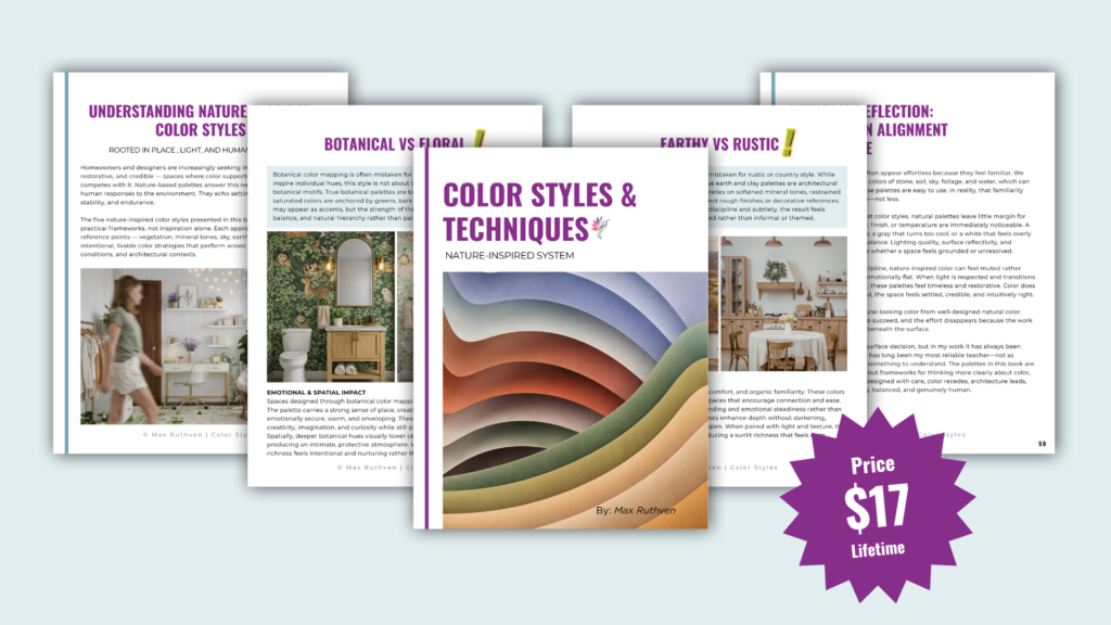
Click Here to Download the new Nature-Inspired Color System eBook
Ready to take the next step?
You can book an appointment with me for personalized support or schedule a discovery call if you’d like to explore how I can help.
Enjoy this blog?