Vertical slat walls and fluted paneling are showing up everywhere right now — and not just in modern homes. Used correctly, they can blend beautifully into transitional spaces and add the kind of architectural rhythm that many rooms are missing. They’re especially effective around kitchen islands, fireplace walls, oversized living room walls, and in media rooms where you want structure without visual clutter. In some installations, they can even help soften acoustics by breaking up hard, flat surfaces.
The appeal is simple: vertical slats add depth and order without relying on décor. When executed well, they read as an intentional architectural layer. When executed poorly, they can look striped, overly busy, or randomly placed—even with high-quality materials.
This guide walks through the practical decisions that matter most: where this treatment works best, what it solves, how to choose finish and sheen, and the simple proportion rules that separate polished design from a DIY look.
Vertical slat wall vs. fluted paneling (quick difference)
Before we get into placement and proportion, it helps to know the two common versions of this look — because people often use these terms interchangeably, but they don’t read the same once installed.
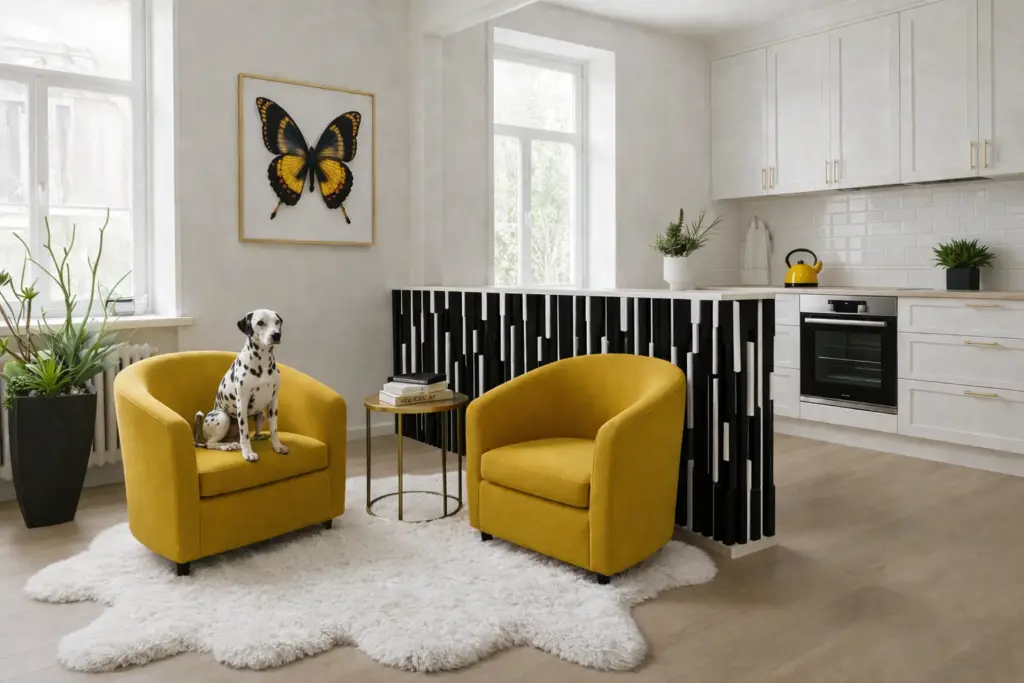
- Vertical slat wall: individual vertical slats (wood or MDF) applied in a repeated rhythm, often with visible spacing between slats.
- Fluted paneling: a panel surface with grooves (often tighter and softer), giving a more tailored, furniture-like feel.
In general:
- Slats feel a bit more graphic and modern.
- Fluting feels a bit more refined and transitional.
Both can be beautiful. The key is choosing the version that matches your home’s “language.”
Best rooms for vertical slats and fluting
This wall treatment works best when it’s used as an anchor plane—a wall that deserves more presence because it’s visible or important.
Great locations
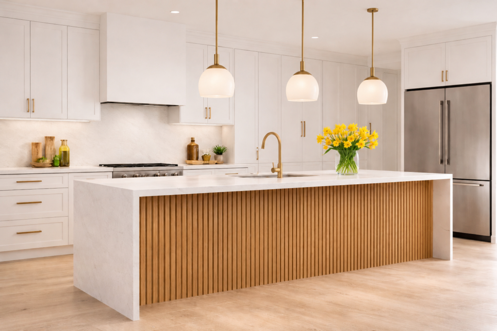
- Kitchen islands (especially the side facing the living area)
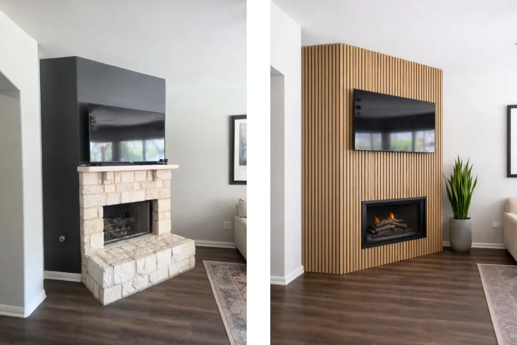
- Fireplace walls
- Media rooms (adds structure and can help reduce echo)
- Behind a bed (headboard wall)
- Home office backdrop (adds interest without busy décor)
- Entry walls and end-of-hall focal walls
- Large living room walls that feel flat or unfinished
Where I’d be more cautious
- Rooms that already have heavy pattern, strong contrast, or lots of competing focal points
- Small rooms where every wall is treated (one feature wall usually looks better than “all in”)
What vertical slats/fluting solve (why people love them)
This is the part that makes it more than a trend. Slats and fluting are popular because they solve real design problems:
1) The “big blank wall” problem
Some walls don’t need art — they need architecture. Slats add structure without adding clutter.
2) The “builder-basic” problem
If a room feels flat, generic, or unfinished, vertical rhythm instantly adds intention.
3) The “low ceiling / squat room” problem
Vertical lines naturally pull the eye upward. It’s one of the simplest ways to make a room feel taller without changing a thing about the ceiling.
4) The “open-plan needs definition” problem
Slats can quietly define a zone — like a dining area, a media wall, or a reading corner—without paint breaks or dividers.
5) The “media room echo” problem
This is not soundproofing, but it can be sound-softening. Breaking up flat surfaces can help reduce the sharpness of echo—especially when paired with rugs, drapery, and upholstered seating.
Color rule: keep it calm (contrast + sheen)
Most “striped” slat walls don’t look bad because the idea is wrong — they look bad because the contrast is too strong or the finish is too shiny.
Contrast (the calm rule)
- If you want this to feel timeless and elevated, go tone-on-tone: slats and background in the same color family (or even the same exact color).
- If you want drama, contrast can work—but keep it to one feature wall and make sure the rest of the room is visually quieter.
A helpful question:
Do you want the wall to be the room’s main feature — or a subtle architectural layer? Tone-on-tone gives you “layer.” Contrast gives you “feature.”
Sheen (the glare rule)
Slats look best when shadows create the interest. That’s why matte or low-sheen finishes usually win.
Shinier finishes can catch light and emphasize striping—especially in bright rooms with big windows.
If your are in the USA, premade finished slats are available everywhere now – Amazon, Home Depot, Lowes, Floor and Decor and even Etsy
Proportion rule: the “easy” version (no math required)
You don’t need a tape measure obsession to get this right—you just need a few guiding principles.
1) Choose the right wall first
Ask: Which wall deserves to feel more substantial?
The best wall is usually:
- the first wall you see when you enter,
- the wall behind the main furniture piece,
- or the wall that currently feels blank and unresolved.
2) Make the slat field relate to something real
Slats look most “built-in” when they align with a natural anchor:
- the width of the bed
- the width of a sofa/console
- the fireplace mass
- or the centerline of the wall
This is what makes it feel intentional instead of applied.
3) Decide: full wall or framed section
Both options work—just choose one deliberately.
- Full wall: modern, architectural, clean
- Framed section (like a panel): tailored, transitional-friendly, and easier to control visually
4) Plan the ending (not just the beginning)
Where it stops matters a lot. Clean edges read expensive:
- stop at a trim line,
- stop at a natural corner,
- or create a defined boundary.
What usually looks DIY is when slats stop in an awkward spot because of a switch plate, vent, or random endpoint.
One common mistake (and the simple fix)
Mistake: The “barcode wall”
This happens when the rhythm is too tight and the contrast is too high and the room is bright.
Fix options (choose one):
- go tone-on-tone,
- choose fluting instead of slats (so it reads softer),
- frame the treatment so it’s not dominating the entire wall,
- or keep sheen very low.
Design variations that work in real homes
If you want this to blend into different styles, here are a few approachable versions:
- Tone-on-tone painted slats: calmest, most timeless
- Fluted paneling in a soft mid-tone: refined and transitional
- Wood slats in a light natural tone: warm, airy, organic modern
- Half-height slats: adds rhythm without overwhelming a room
- Island slats: perfect for adding detail where you don’t want décor clutter
A simple planning checklist (save this)
Before you start:
- Which wall is the anchor wall?
- Do you want “feature” or “architectural layer”?
- Tone-on-tone or contrast?
- Matte/low sheen?
- Full wall or framed panel?
- Where do outlets, vents, and switches land?
- What does it align to (bed, sofa, fireplace, centerline)?
Vertical slats and fluted paneling can absolutely be a long-term design choice — not just a trend — when you use them to solve a real issue: a blank wall, a flat room, a squat space, or a zone that needs definition.
When you treat it like architecture (not decoration), it almost always looks right.
Planning to add architectural rhythm to your home?
Vertical slats and fluted paneling are incredible tools for fixing “builder-basic” rooms, but the success is all in the details. If you are building or remodeling, our Interior Fixed Elements service ensures your paneling, flooring, and cabinetry work in perfect harmony. We help you choose the right scale and sheen so your feature wall looks like a permanent architectural layer rather than a temporary trend.
Check My Interior Fixed Elements Consultation Here!
Ready to move beyond basic paint choices?
Color is more than a decorative detail—it’s an architectural tool that shapes how you experience your home. If you are ready to stop playing it safe and start designing with intention, our new eBook, “Immersive and Bold Color Techniques,” is your professional roadmap. Learn how to master color drenching, color capping, and high-contrast blocking to transform your space into a cohesive, high-end sanctuary.
Download Your Guide to Immersive Color Design Here
Let’s continue learning!
If you’re considering how to elevate your walls beyond paint, these guides will help you understand how each treatment functions within a space — not just how it looks:
Wallpaper as an Architectural Tool (Not a Trend) → Link Here
Decorative Wood Patterns used as an Architectural Tool → Link Here
Limewash & Plaster Walls: Softness, Movement, and Depth → Link Here
Tile & Stone as Architectural Wall Surfaces → Link Here
Enjoy this blog?

2 Responses
Great comprehensive article on this type of wall treatment.
Thanks Max for a thorough review….
You are very welcome, Jean! Thaks for your reply!