Understanding the gap between digital color, printed color, paint samples, and real-life spaces
Color has become easier to access than ever before, right! We can scroll through interiors online, save inspiration images, view paint colors on websites, order samples, create renderings, print mood boards, and compare colors from our phones. Exhausting!
But that convenience has also created one of the biggest misunderstandings in design:
The color you see on a screen is not always the color you will experience in a real space.
This does not mean the color is wrong. It means color changes depending on how it is being viewed, produced, printed, lit, and applied.
Color can move through several different systems before it ever reaches your wall: a screen, a website, a HEX code, an RGB value, a printed page, a rendering, a paint formula, and finally, the actual surface in your home.And if all of this sounds like Greek to you…. Don’t feel alone. I had to learn this as well.
Each step is a translation.
And every translation creates room for color to shift.
Screens Do Not Show Color the Same Way Walls Do
The first thing to understand is that screens and physical surfaces do not create color in the same way.
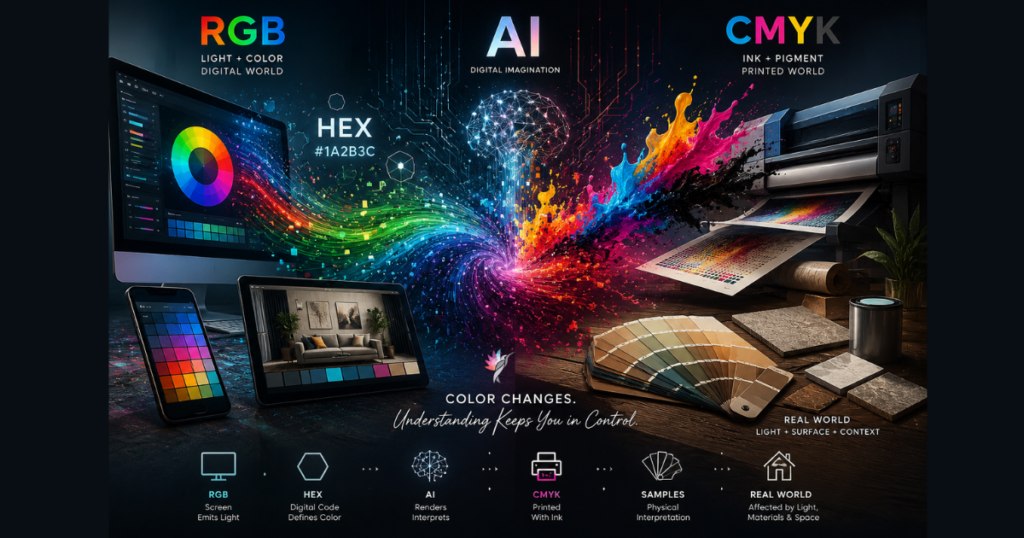
Your phone, tablet, or computer screen produces color through LIGHT.
It is backlit. It glows. Digital screens typically use RGB color, which stands for Red, Green, and Blue. These colors are combined with light to create the colors you see on your screen.
That is very different from a painted wall.
A painted wall does not glow.
A wall reflects light.
That one difference explains a lot.
When you look at a paint color online, you are seeing a digital version of that color through a device that emits light. When you apply that paint to a wall, the color is now being affected by natural light, artificial lighting, shadows, sheen, surrounding materials, flooring, furniture, and architecture.
This is why choosing paint directly from a screen is risky.
The screen may help you narrow a direction, but it should not be treated as the final authority.
HEX Codes Are Helpful — But They Are Not Paint Colors
You may also see colors represented as HEX codes, especially online. A HEX code is a six-character digital color code used in web design and digital platforms. For example, a color may appear as something like #F2E8DA.
HEX codes can be useful for websites, branding, graphics, and digital design because they tell a screen which color to display.
But a HEX code is not the same thing as a paint formula.
A HEX code belongs to the DIGITAL world. Paint belongs to the PHYSICAL world.
Paint is made from pigments, resins, bases, and formulas. It is affected by sheen, surface texture, lighting, application method, and the materials around it. A HEX code can suggest a digital direction, but it cannot fully predict how a paint color will behave on drywall, wood, brick, stucco, cabinetry, or exterior siding.
This is also why trying to “match” a paint color from a digital image or HEX code can be unreliable. It may get you close in concept, but it does not guarantee the same visual result in real life.
Every Screen Shows Color Differently
Even if two people are looking at the exact same paint color online, they may not actually be seeing the same color.
A phone screen, laptop, desktop monitor, and tablet can all display color differently. Brightness settings, night mode, blue light filters, age of the device, screen quality, and calibration all affect how color appears.
One screen may make a beige look warm and creamy.
Another may make the same beige look gray or flat.
One device may make a green look soft and muted.
Another may make it look cleaner, brighter, or more saturated.
This is one of the reasons clients often say, “It didn’t look like that online.”
They are usually right.
It didn’t.
But the issue is not always the paint color. The issue is that the digital version was never a perfect representation of the real material.
Printed Color Has Its Own Limitations
Printed color introduces another layer of translation.
Screens typically use RGB because they create color with light.
Printers usually use CMYK, which stands for Cyan, Magenta, Yellow, and Key/Black. Instead of creating color with light, CMYK printing uses ink.
CMYK
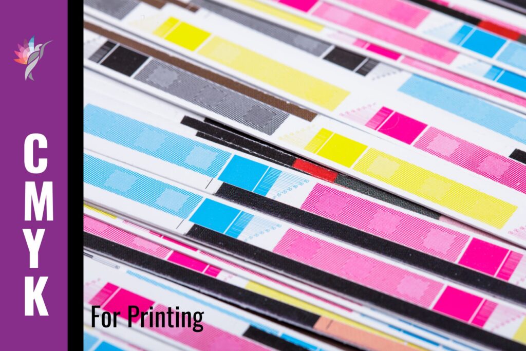
That means the color you see on a screen has to be converted into a different color system before it appears on paper.
This is one reason printed colors often look duller, flatter, warmer, cooler, or less vibrant than what you saw digitally.
And then there are more variables: the printer, ink, paper quality, paper finish, printer settings, and whether the page is printed at home or professionally. Matte paper, glossy paper, inexpensive paper, and coated stock can all shift the way color appears.
So when you print a color from a website, a rendering, a mood board, or a digital palette, you are not creating a reliable paint sample.
You are creating another interpretation of that color.
This is why a printed page should never be used as the final color standard for paint, cabinetry, tile, stone, wallpaper, fabric, or exterior materials.
It can communicate in a general direction.
It cannot replace a real sample.
Photography Changes Color Too
Inspiration photos are helpful, but they are not neutral.
Interior photos are affected by camera settings, lenses, editing, lighting, filters, exposure, and the time of day the photo was taken. Many images online are professionally edited to look brighter, softer, cleaner, or more balanced than the actual room may appear in person.
A room photographed in soft morning light may look completely different in late afternoon sun.
A white wall may appear warmer because of wood flooring.
A cabinet color may appear darker because the image was edited for contrast.
A blue may look calmer online because the photo was desaturated.
A green may look more sophisticated because the surrounding materials are doing half the work.
This is why copying a paint color from a photo rarely guarantees the same result in your own home.
You are not just copying a color.
You are trying to copy a complete environment: light, architecture, materials, exposure, furnishings, photography, editing, and screen display.
That is almost impossible to duplicate exactly.
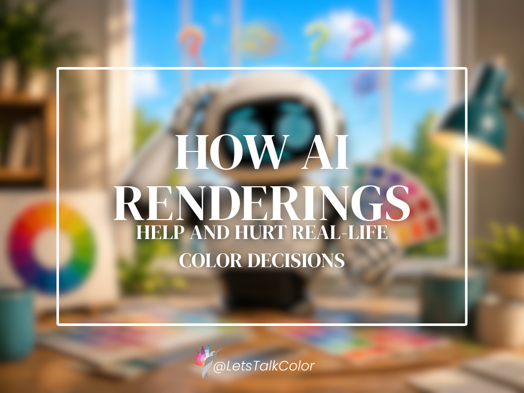
AI Renderings Are Useful — But They Are Not Color Proofs
And this brings me now to AI Renderings! I run into this issue daily and it is one of my main reasons for writing this blogpost!
AI renderings and digital mockups can be very helpful when used correctly.
They can show color placement, contrast, proportion, balance, and overall direction. They can help a client understand whether a darker trim, painted ceiling, exterior accent, or cabinet color direction makes sense before committing.
But renderings are not exact COLOR predictions.
They are visual tools, not final color proofs.
This is especially important now because AI-generated interiors and exteriors are becoming more common. These images can look beautiful and convincing, but they often simplify or exaggerate color behavior. They may not accurately account for sheen, material texture, surface porosity, natural light, artificial light, shadow, undertone shifts, or how neighboring materials will influence the final appearance.
AI tools also work within digital color environments. They may produce colors that look convincing on a screen but do not correspond accurately to a real paint color, real material, or real lighting condition.
A rendering can help answer: “Does this color placement make sense?”
It should not be used as the only answer to: “Is this the exact color I should use?”
That decision still needs to be grounded in real samples, real light, and real materials.
When I was working on my book about Spatial Color Techniques, I had to use AI renderings to help demonstrate some of the concepts visually, and below is one of those examples. It took several rounds of reviewing and adjusting before I finally found an image that communicated what I was actually trying to teach.
This particular example is about using color placement to define a space within an open-plan room. Now, is that the exact shade of blue I would personally choose in real life? Maybe yes. Maybe no. But that’s not really the point.
The point is the placement of the color and how it changes the way the space is perceived. That is where AI renderings can actually be very helpful. They allow you to explore ideas, proportions, balance, and visual zoning before making real-world decisions.
But when it comes to selecting the actual paint color, you still need to look at real samples in your own environment, under your own lighting conditions, before making a final decision.

Real Samples Still Matter
This is why I still believe in real samples.
Not because technology is unhelpful. Technology is extremely helpful. But color is physical. It lives in real space. It responds to real light. It changes depending on what surrounds it.
A paint sample needs to be viewed in the room where it will be used. An exterior color needs to be evaluated outside, in natural light, against the roof, stone, brick, landscaping, windows, and fixed materials. Cabinet colors need to be considered with countertops, flooring, backsplash, hardware, and lighting. Wall colors need to be seen next to trim, ceiling color, upholstery, rugs, and art.
Color cannot be fully understood in isolation.
And it definitely cannot be fully understood from a screen, a HEX code, an RGB value, a printed page, or a rendering alone.
The Real Problem Is Not That Color Changes
Color will always change.
That is not the problem.
The problem is making color decisions without understanding WHY it changes.
When people expect a screen image, HEX code, printed page, rendering, sample, and finished room to all look exactly the same, disappointment is almost guaranteed.
But when you understand that each version is only one stage of translation, you can use each tool properly.
A screen can help you explore.
A photo can inspire.
A HEX code can support digital communication.
A rendering can clarify placement.
A printed page can organize a direction.
A sample can confirm behavior.
The final space is where all of those decisions come together.
That is why color selection is not just about finding a pretty paint chip. It is about understanding how color behaves from digital ideas to physical reality.
What you have learned:
The digital world has changed the way we choose color, but it has not changed the way color works.
Color still depends on light, surface, material, proportion, and context.
So before you commit to a color because it looked perfect online, pause and ask:
Where did I see this color?
How was it produced?
Was it on a screen, in a photo, in a rendering, on paper, on a sample, or in the actual space?
Was I looking at RGB, CMYK, a HEX code, a printed version, or a real material?
Those are not small details.
They are the difference between a color that looks good somewhere else and a color that actually works where you live.
Explore the Architectural Side of Decorative Color
If your home feels visually flat, disconnected, or lacking in depth, the solution is not always more décor or a different paint color. Sometimes the issue is how the surfaces themselves are interacting with light, proportion, and architecture.
Artistic & Decorative Color Styles & Techniques explores how decorative finishes can be used as intentional architectural tools rather than surface decoration alone.
Inside the guide, you’ll learn how techniques such as limewash, glazing, ombré, strié, Venetian plaster, and layered finishes influence movement, softness, rhythm, and material presence within a space.
Rather than focusing on trends or DIY application methods, this eBook provides a professional framework for understanding when decorative finishes support a room—and when they overwhelm it.

Download the Artistic & Decorative Guide Here
Ready to take the next step?
You can book an appointment with me for personalized support or schedule a discovery call if you’d like to explore how I can help.
Enjoy this blog?