We have never had more access to design inspiration than we do right now.
At any moment, we can scroll through Pinterest, Instagram, design blogs, builder websites, paint company galleries, AI-generated interiors, and beautifully curated homes online. We save kitchens, compare white paints, screenshot living rooms, and build inspiration folders before ever stepping foot into a paint store.
And while online inspiration can be incredibly helpful, it has also created one of the biggest misunderstandings in modern color selection:
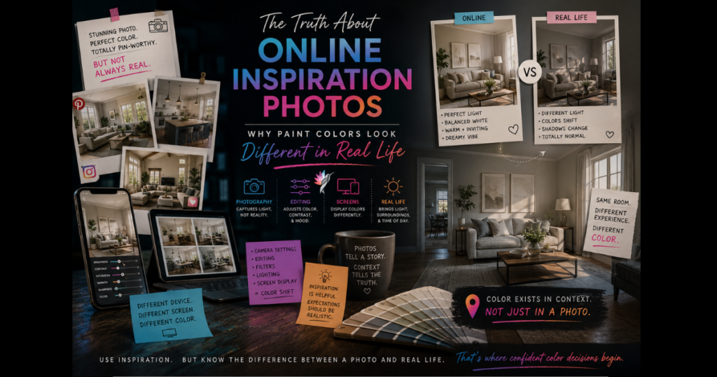
People often expect real spaces to look exactly like the photos they saved online.
But most of the time, those images are not showing color in a neutral or fully accurate way. Photography is interpretation — and color changes through every stage of that interpretation.
This is one of the most important things to understand when using online inspiration to make decisions about paint, cabinetry, flooring, tile, wallpaper, furnishings, or exterior colors.
Because the room you saved online is not just a paint color. It is an entire visual environment.
A Photo Is Never Just About the Paint Color
One of the biggest mistakes people make is isolating the paint color from everything else happening in the image.
The paint is only one small part of why the room feels beautiful.
What you are actually responding to may include:
- Light: natural light, room direction, window placement, shadows, time of day
- Architecture: ceiling height, proportion, sightlines
- Materials: flooring tone, wood finishes, stone surfaces, textures
- Styling: furniture, contrast, decorative layering
- Photography: editing, lens distortion, color grading
All of those elements influence how the color appears.
A white paint color in one home may feel warm, soft, elevated, and architectural. The exact same paint color in another home may suddenly feel flat, cold, yellow, gray, or disconnected.
Not because the paint changed. Because the environment changed.
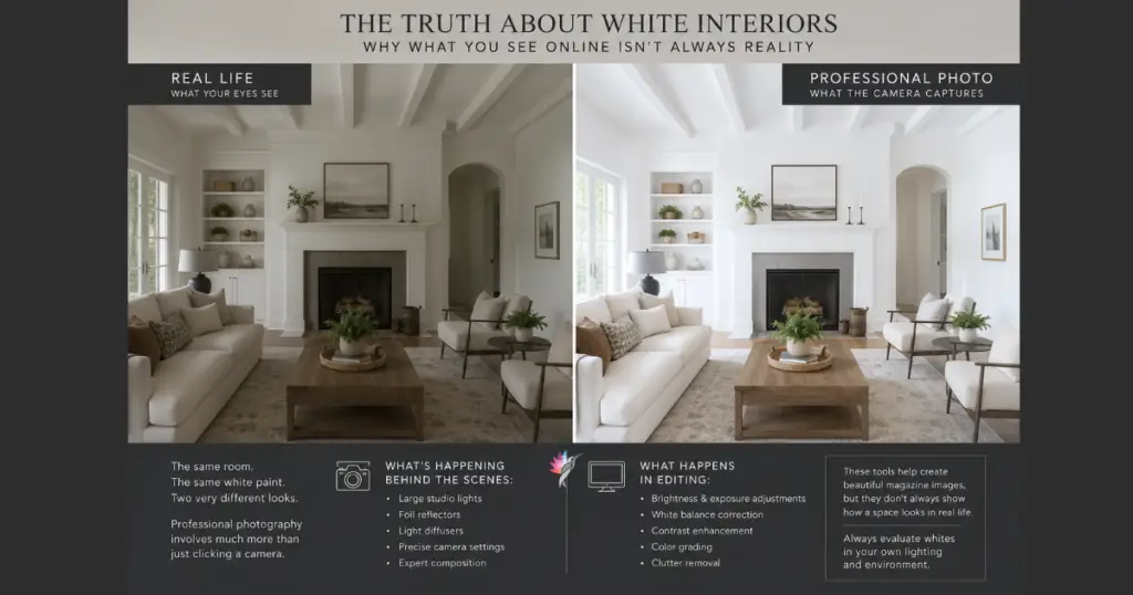
Photography Changes Color More Than Most People Realize
Most inspiration photos are professionally photographed, which means the image has already passed through multiple layers of visual interpretation before you ever see it online.
The camera influences color. The lens influences color. Exposure settings, editing software, white balance adjustments, and even your screen settings continue altering how that space is presented visually. By the time you compare the image to your own home, there has already been significant translation between the original room and what your eyes are seeing digitally.
Lighting in photography is also highly controlled.
Professional interiors are rarely photographed under random everyday conditions. Photographers carefully select the time of day, sun direction, shadow balance, brightness levels, artificial lighting, and exposure settings to create the most visually flattering result.
Many interiors are photographed when natural light is soft and diffused. Some images are intentionally brightened during editing to make spaces feel lighter, calmer, and more inviting, while others are softened to reduce harsh contrast and create a more atmospheric mood.
All of this can dramatically change how color appears. A creamy white may suddenly look crisp and bright. A gray may feel softer and warmer. A moody green may appear calm and luxurious instead of dark and heavy.
You are not simply seeing a paint color. You are seeing that color under carefully controlled visual conditions.
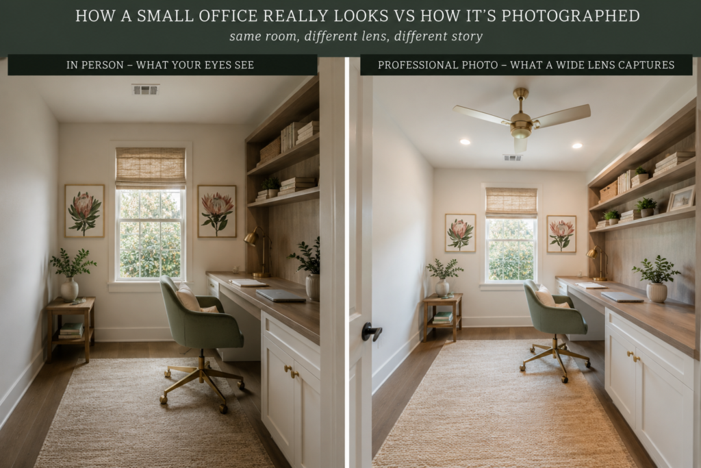
Camera Lenses Distort Space
Wide-angle lenses are often used in interior photography because they make rooms feel larger and more spacious. But they can also alter perception.
We’ve all experienced this while browsing homes online. Rooms may appear brighter, larger, more open, more balanced, and more symmetrical than they actually feel in person. The lens can also influence depth, shadow, and proportion — all of which affect how color is perceived.
This is one reason people sometimes feel disappointed when trying to recreate a room from an online image. The real room may physically feel very different than the photograph suggested.
Editing Software Alters Color
Most professional design photos are edited before publication. This is standard practice.
Editing may include adjustments to brightness, white balance, contrast, saturation, shadow softness, color balance, warmth, and sharpness. Sometimes these changes are subtle. Sometimes they are dramatic.
A white may be brightened. Yellow tones may be softened. Blue undertones may be reduced. Wood tones may be warmed.
And once that edited image reaches your phone or computer screen, another layer of digital color translation begins — through RGB display systems, screen calibration, brightness settings, and device differences. This is why the same image may look different from one screen to another.
Styling Influences Color More Than People Think
Beautifully styled spaces can make average colors look extraordinary. And poorly styled spaces can make beautiful colors feel underwhelming.
Online inspiration photos are usually professionally styled with layered textures, coordinated furnishings, intentional contrast, balanced materials, proper scale, curated accessories, carefully selected artwork, and strategic lighting. These elements help support the color palette.
A warm white wall beside warm wood flooring, linen upholstery, soft brass, textured fabrics, and filtered daylight will feel very different than that same wall color beside cool flooring, stark lighting, and disconnected finishes.
People often try to recreate a paint color when what they are actually responding to is the atmosphere created by light, texture, proportion, and material relationships working together. the materials.

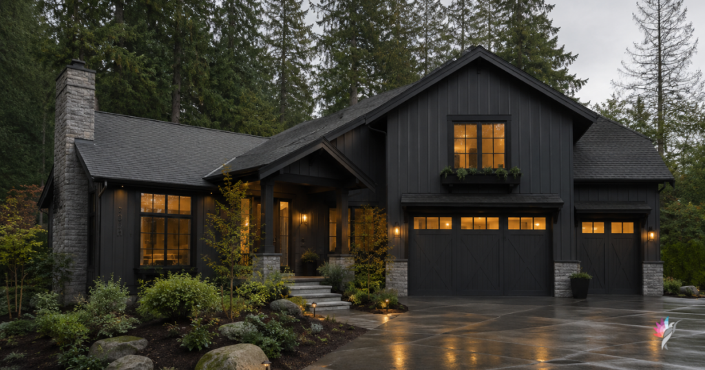
Exterior Photos Can Be Especially Misleading
Exterior inspiration photos create another layer of complexity because exterior color depends heavily on geographic location, climate, intensity of sunlight, landscaping, sky reflection, surrounding homes, roofing, brick, stone, shadow patterns, and time of day.
A white exterior photographed in cloudy coastal light may look completely different in direct Texas sunlight. A moody charcoal exterior in the Pacific Northwest may feel elegant and soft, while that same color in intense southern sun may suddenly feel sharp, heavy, or overly hot.
Exterior colors should never be selected from photos alone. Real-world lighting changes everything.
AI-Generated Inspiration Images Add Another Layer
AI-generated interiors and exteriors are becoming increasingly common online. Some are obvious. Others are becoming difficult to detect.
These images can be useful for exploring concepts, atmosphere, and color placement, but they are not always grounded in realistic material behavior. AI images often oversimplify shadows, exaggerate saturation, smooth textures, and create lighting or material combinations that may not behave realistically in real life.
The colors may feel emotionally compelling on screen while being physically difficult to recreate accurately in a real environment. This is especially important now because many people are unknowingly saving AI-generated inspiration and expecting those exact results in real homes.
Inspiration Photos Should Inspire — Not Dictate
This does not mean online inspiration is bad. It is incredibly useful when used correctly.
The goal is not to copy a room perfectly. The goal is to understand:
- which qualities draw you in
- why the room feels balanced
- how light and materials support the color
- what emotional atmosphere you want to recreate
An inspiration image should help communicate direction, mood, balance, warmth, contrast, and overall feeling. It should not be treated as a guaranteed color formula.
The Most Important Question to Ask
Instead of asking “What paint color is this?” a better question is: “Why does this room feel successful?”
Because most beautiful rooms are successful due to proportion, light, material relationships, restraint, consistency, architecture, styling, and visual balance — not just the paint color.
Real Color Selection Still Requires Real Context
This is why professional color selection still depends on real samples, real lighting, real materials, real architecture, and real environments.
A digital image can guide direction. But it cannot fully predict how color will behave in your specific home.
Your light is different. Your flooring is different. Your architecture is different. Your furnishings are different. Your surroundings are different.
And color always responds to context.
Final Thought
Online inspiration has changed the way we explore design. But it has also blurred the line between digital interpretation and physical reality.
A photograph is a moment. A home is a living environment.
The goal is not to recreate a filtered image from the internet. The goal is to create a space that works beautifully in your real life, under your real lighting, with your real materials, every single day.
That is the difference between chasing images and understanding color.
Explore the Architectural Side of Decorative Color
If your home feels visually flat, disconnected, or lacking in depth, the solution is not always more décor or a different paint color. Sometimes the issue is how the surfaces themselves are interacting with light, proportion, and architecture.
Artistic & Decorative Color Styles & Techniques explores how decorative finishes can be used as intentional architectural tools rather than surface decoration alone.
Inside the guide, you’ll learn how techniques such as limewash, glazing, ombré, strié, Venetian plaster, and layered finishes influence movement, softness, rhythm, and material presence within a space.
Rather than focusing on trends or DIY application methods, this eBook provides a professional framework for understanding when decorative finishes support a room—and when they overwhelm it.
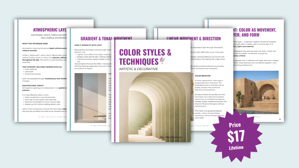
Download the Artistic & Decorative Guide Here
Ready to take the next step?
You can book an appointment with me for personalized support or schedule a discovery call if you’d like to explore how I can help.
Enjoy this blog?