Most people think they are reacting to personal color preference. But more often than not, they are actually reacting to nervous system fatigue.
We have become so accustomed to discussing color in terms of temporary trends, undertones, and aesthetics that we rarely stop to ask a deeper, physiological question: Why do some spaces feel immediately calming, while others quietly drain our energy?
Not every environment affects the body the same way. Some spaces create visual ease, while others generate a low-grade sensory tension that we feel deeply without fully understanding why. Increasingly, modern interiors are pushing our nervous systems harder than we realize.
The Modern Interior Has Become Visually Loud
Today’s environments are saturated with constant stimulation. Individually, the design elements we popularize today aren’t necessarily problematic. But collectively, they create a perfect storm of chronic visual processing:
- High-Contrast Palettes: Sharp, unforgiving black-and-white schemes.
- Aggressive Lighting: Intense LED overheads and highly reflective, glossy surfaces.
- Structural Friction: Open-concept layouts with zero visual separation or logical pacing.
- Digital Echoes: Bright screens, constant visual information, and homes styled to look like highly edited social media imagery rather than lived-in sanctuaries.
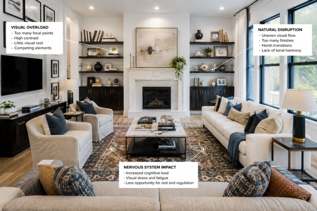
The human nervous system is an evolutionary machine. It is constantly scanning our surroundings for predictability, contrast, rhythm, and safety. When a room contains too many competing visual demands, the brain interprets the environment as a threat or a puzzle to solve, rather than a place to rest.
The Instagram Disconnect: This is precisely why some homes photograph beautifully online yet feel strangely uncomfortable, cold, and exhausting to inhabit in real life.
Stimulation vs. Regulation
Not all visual stimulation is inherently bad. Restaurants, retail boutiques, entertainment venues, and boutique hotels intentionally use high contrast, dramatic lighting shifts, and bold focal points to energize visitors, hold their attention, and create a sense of theater.
But homes function differently. A home should not constantly demand attention from your nervous system.
The core problem with modern residential design is that it borrows too heavily from these commercial aesthetics. Over time, living inside extreme contrast, excessive visual tension, and disconnected focal points shifts our home baseline from supportive to visually draining.
This doesn’t mean every home should become flat, beige, or entirely muted. It means our private environments benefit desperately from balance, rhythm, softness, and visual recovery zones.
The Biological Need for Visual Softness
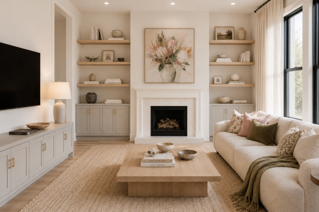
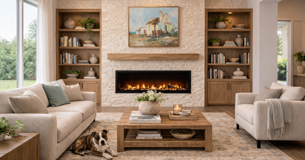
There is a profound biological reason why the design world is collectively leaning toward warm minimalism, earth-based palettes, limewash finishes, plaster textures, and tonal interiors.
This is not just another trend cycle. It is a collective psychological response to overstimulation.
Nature rarely presents color in harsh, clinical isolation. Natural landscapes are composed of layered transitions, softened contrasts, imperfect textures, and organic tonal variation.
The human eye evolved to process these exact conditions. Modern interiors that mimic these qualities feel instantly grounding because they reduce visual friction. A highly tonal space can feel emotionally quieter and profoundly peaceful, even when the color palette itself is incredibly simple.
Understanding “Visual Noise”
Visual noise occurs when too many elements compete simultaneously for cognitive attention. You might be suffering from visual noise in your home if you experience:
- Abrupt, jarring color transitions from room to room.
- Inconsistent lighting color temperatures (e.g., cool daylight bulbs mixed with warm lamplight).
- An excess of reflective finishes paired with sharp, hard furniture edges.
- Too many competing focal points and cluttered, hyper-curated styling.
The nervous system can never fully drop its guard in a noisy environment because the eye is forced to continuously scan and recalibrate.
A truly calm environment is not necessarily stark or minimalist. Rather, it is coherent. The eye immediately understands where to rest, the hierarchy is clear, and the spatial transition feels intentional instead of chaotic.
The Shift in Mental Processing:
- Visual Chaos (Jarring transitions and high contrast): Keeps the nervous system constantly scanning and on alert.
- Visual Coherence (Continuous tones and soft transitions): Allows the nervous system to finally rest and decompress.
Color is an Environmental Strategy, Not a Decoration
This is where the conversation around color becomes far more interesting than simply asking, “What color should I paint my walls?”
Color is a primary driver of human experience. It directly influences our perceived safety and comfort, our emotional regulation, and our mental sensory load.
The more digitally saturated our modern lives become, the more vital this design philosophy will be. People are no longer just searching for beautiful houses; they are searching for environments that actively help them feel better inside their own minds.
Designer’s Insight
One of the biggest misunderstandings in modern design is the belief that high stimulation automatically equals sophistication. In reality, some of the most luxurious spaces in the world are those that are deeply regulating to the nervous system.
They master the art of restraint, material softness, tonal continuity, and controlled contrast. The environment feels elevated without feeling aggressive. Achieving that balance is an environmental strategy—and that is where true architectural color expertise lives.
What We’ve Learned
- The Hidden Drain: Some interiors quietly overstimulate the nervous system, leading to unexplained fatigue.
- The Culprits: Visual stress is primarily caused by excessive contrast, fragmentation, and continuous sensory overload.
- The Antidote: Softness, tonal continuity, and layered natural materials create immediate psychological ease.
- The Blueprint: Nature-inspired palettes feel grounding because they mirror the organic environmental patterns our eyes evolved to read.
Transform Your Space
If you have ever walked into a space and immediately felt a wave of relief—or, conversely, a sense of strange exhaustion—there is far more at play than personal taste. Your nervous system is reacting to the architecture of the space.
If you are ready to move past temporary trends and design a home engineered for true psychological wellbeing, let’s look at your space through the lens of environmental strategy.
Most people choose color one room at a time.
Professionals design color as a system.
If your home feels disconnected, flat, or difficult to pull together, the problem may not be the individual colors themselves. It may be the lack of relationship between them.
Spatial Color System teaches you how to use color to create flow, balance, depth, and visual harmony throughout your home. You’ll learn how color influences movement, defines boundaries, shapes proportion, and connects spaces into a cohesive whole.
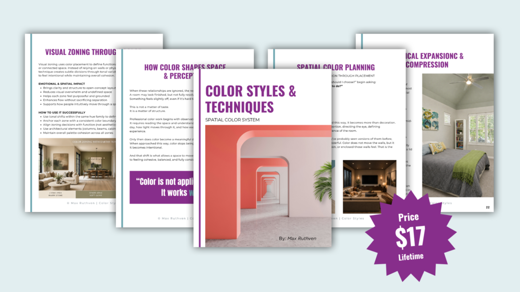
Stop choosing colors in isolation.
Start designing your home as a complete visual system.
Download Spatial Color System Here!
Ready to take the next step?
You can book an appointment with me for personalized support or schedule a discovery call if you’d like to explore how I can help.
Enjoy this blog?