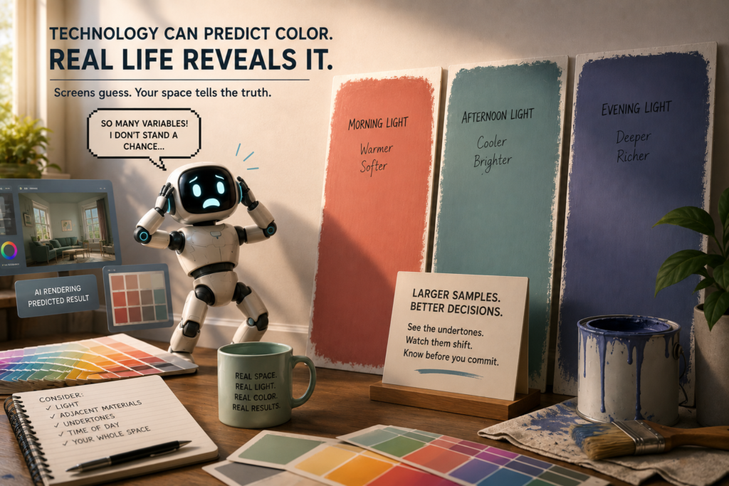
Over the last few weeks we explored how technology has completely changed the way we explore color.
We can upload photos into paint visualizers, generate AI renderings in seconds, build digital mood boards, scroll endless Pinterest inspiration, and preview entire homes through a screen before ever opening a paint can.
And while those tools can absolutely help narrow direction, they also create one very dangerous misunderstanding:
People begin expecting digital color to behave like real-life color.
But color does not work that way.
Technology can help narrow options.
But physical observation is still the only way to truly understand color.
Digital Color Is Still an Interpretation
By the time you see a color online, it has already gone through multiple layers of translation.
Lighting affects it.
Photography affects it.
Editing software affects it.
AI interpretation affects it.
Then your phone, tablet, or computer screen affects it again.
Even highly realistic renderings are still simulations.
Real paint color is physical.
It interacts with architecture, texture, surface sheen, surrounding materials, natural light, artificial light, shadows, reflections, and environmental context.
That is why a color that looked perfect online can suddenly feel too yellow, too gray, too bright, too muddy, or too cold once it enters your actual home.

Why Paint Must Be Tested in YOUR Environment
Paint does not exist in isolation.
The exact same color can look dramatically different depending on:
- Natural light exposure
- Direction of the room
- Flooring
- Cabinetry
- Countertops
- Exterior landscaping
- Ceiling height
- Artificial lighting
- Adjacent paint colors
- Surface texture and sheen
This is why professional color selection is never just about the paint chip itself.
It is about understanding how color behaves within an environment.
A warm white may feel soft and creamy in one home, yet suddenly appear heavy or yellow in another. A gray that looked calm online may turn blue in north-facing light or purple next to warm flooring.
Context changes everything.
Peel-and-Stick Samples Are Helpful — But Still Limited
Peel-and-stick samples can absolutely be useful.
They help eliminate obvious mistakes early and make testing easier and cleaner for homeowners.
But they still have limitations.
Many are printed reproductions rather than actual painted surfaces. That means the finish, depth, absorption, and reflectivity may not behave exactly like real paint on a wall.
They are best used as directional tools — not final proof.
Larger painted samples almost always provide more reliable information.

Why Large Samples Outperform Tiny Swatches
One of the biggest mistakes homeowners make is trying to judge a paint color from a tiny sample.
Small swatches simply do not provide enough visual information for your eye and brain to fully process the color.
Color perception changes dramatically at scale.
A color that feels subtle on a paint chip may suddenly dominate a room once applied across an entire wall. Other colors become softer and quieter once given enough space to breathe.
This is why larger sample boards are so important.
They allow you to observe:
- depth
- undertone movement
- contrast
- brightness
- light reflectance
- visual weight
…under real conditions.
Color Shifts Throughout the Day
Many people assume undertones are fixed and permanent. It is not, it is subjective!
In reality, undertones become more or less visible depending on changing light conditions.
Morning light may soften a color.
Afternoon sun may intensify warmth.
Evening lighting may suddenly reveal green, violet, or yellow undertones that were not obvious earlier.
LED lighting can dramatically shift perception as well.
This is why professional color evaluation requires observation throughout the day — not just one quick glance at noon.
Why Adjacent Materials Matter So Much
Color is relational. Your flooring influences your walls, your countertops influence your cabinets, your brick influences your trim, and your furnishings influence the entire room. A paint color never exists alone. This is one of the main reasons online inspiration photos can become misleading. You are responding to an entire curated environment — not just one isolated paint color. Often, what people truly love is the contrast, the material combination, the lighting, the styling, the proportion, or the color placement — not necessarily the exact paint color itself.
People Often Panic Too Early
This is one of the most common things I see professionally. A sample goes up on the wall and immediately someone says, “It’s too dark,” “It’s too yellow,” or “It’s too gray.” But color needs time. Your eyes require adjustment, lighting shifts throughout the day, and the surrounding environment constantly influences perception. Even partially painted samples can feel visually disconnected at first. Many people react emotionally before observing strategically. That does not mean the reaction is wrong — it simply means the evaluation may still be incomplete.
Emotional Reaction vs Strategic Observation
This distinction matters tremendously.
Emotional observation asks: “Do I like this immediately?”
Strategic observation asks: “How is this color actually behaving in the space?”
Professionals study looks as follows:
- consistency
- harmony
- light interaction
- architectural relationship
- visual balance
- environmental context
- long-term livability
That is a very different process than reacting to a tiny square under temporary lighting conditions.
The Goal Is Not Perfection
The goal is not finding a magical color that looks identical in every condition.
That color does not exist.
The goal is understanding how a color moves, shifts, responds, and behaves throughout real life.
Because real color is dynamic. And that is exactly what makes it powerful.
Technology is incredibly valuable during the design process. I use digital tools, renderings, photography, and visualizers myself. They help communicate direction, placement, mood, and possibility.
But no technology can fully replace physical observation inside a real environment.
At some point, the samples have to go on the wall.
That is where the real conversation begins.
Explore the Architectural Side of Decorative Color
If your home feels visually flat, disconnected, or lacking in depth, the solution is not always more décor or a different paint color. Sometimes the issue is how the surfaces themselves are interacting with light, proportion, and architecture.
Artistic & Decorative Color Styles & Techniques explores how decorative finishes can be used as intentional architectural tools rather than surface decoration alone.
Inside the guide, you’ll learn how techniques such as limewash, glazing, ombré, strié, Venetian plaster, and layered finishes influence movement, softness, rhythm, and material presence within a space.
Rather than focusing on trends or DIY application methods, this eBook provides a professional framework for understanding when decorative finishes support a room—and when they overwhelm it.
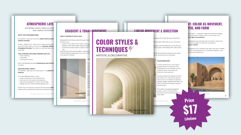
Download the Artistic & Decorative Guide Here
Ready to take the next step?
You can book an appointment with me for personalized support or schedule a discovery call if you’d like to explore how I can help.
Enjoy this blog?