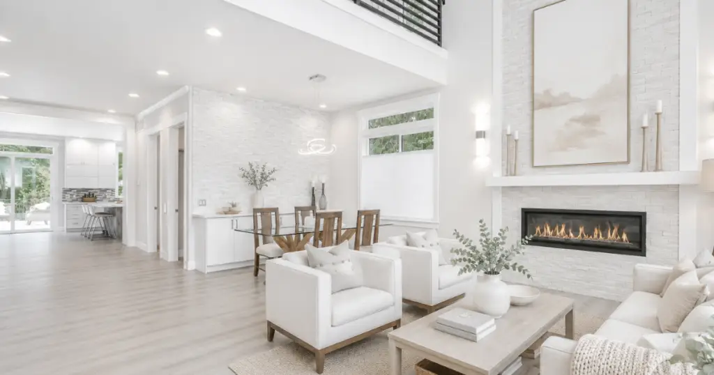
For years, stark white interiors have been presented as the ultimate expression of modern luxury.
Open any design magazine, scroll through Pinterest, browse real estate listings, or watch a home renovation show, and you’ll find room after room wrapped in brilliant white walls, bright white ceilings, and highly reflective surfaces. The message is subtle but consistent:
White equals clean.
White equals sophisticated.
White equals expensive.
But there is an important question that rarely gets discussed.
What happens when a space becomes too bright?
Not from a lighting standpoint, but from a sensory standpoint.
As someone who studies color as an architectural tool rather than simply a decorative choice, I’ve noticed that many people are drawn to these bright white interiors online, yet often feel surprisingly uncomfortable when they try to recreate them in their own homes.
The room may look beautiful.
It may photograph beautifully.
Yet something feels slightly off.
The space feels cold.
Harsh.
Unsettling.
Fatiguing.
Often, the color itself is not the problem.
The problem is how the human brain processes the environment created by that color.
Brightness Is Not the Same as Comfort
Human beings evolved in environments filled with variation.
Natural landscapes contain shadows, texture, depth, and gradual shifts in light. Trees filter sunlight. Clouds soften brightness. Natural materials absorb and scatter light rather than reflecting it uniformly.
Our visual systems developed within these conditions.
When we enter a space dominated by highly reflective white surfaces, the visual experience changes dramatically.
Instead of absorbing light, many bright whites reflect large amounts of it back into the room. The walls, ceiling, cabinetry, trim, countertops, and flooring can begin acting like a series of light amplifiers.
The result is often a space that feels visually louder than people expect.
Nothing may be obviously wrong, but the room requires more visual processing effort than a softer environment.
Many people describe this feeling without realizing what is causing it.
They might say:
“The room feels sterile.”
“It doesn’t feel cozy.”
“It feels unfinished.”
“It feels cold even though it’s warm.”
Often, what they are sensing is not temperature.
It is sensory friction.
The Hidden Role of Reflectance
One of the most overlooked aspects of color selection is reflectance.
Every paint color reflects a certain percentage of light.
Ultra-bright whites reflect significantly more light than softer whites, creams, bone tones, or muted neutrals.
When multiple high-reflectance surfaces exist together, especially in homes with large windows, strong southern exposure, glossy finishes, or open floor plans, the cumulative effect can become surprisingly intense.
Light bounces continuously throughout the room.
Edges become sharper.
Contrast increases.
Visual rest decreases.
What feels bright and fresh in a professionally photographed image may feel overstimulating in a real home occupied twelve hours a day.
This is one reason many homeowners struggle after selecting the brightest white available.
They achieve the look they saw online.
But they don’t achieve the feeling.
Why Photography Reinforces the Problem
Photography loves bright whites.
Cameras are designed to capture contrast.
Photographers often use additional lighting, reflectors, editing software, lens corrections, and exposure adjustments to create clean, bright imagery.
The result is beautiful.
But photographs are frozen moments.
Homes are lived experiences.
A photograph cannot show what a room feels like during a bright afternoon, a cloudy morning, a rainy day, or an evening under artificial lighting.
It cannot communicate visual fatigue.
It cannot show glare.
It cannot show how brightness accumulates over time.
The room that appears calm on a screen may actually be creating constant visual stimulation in real life.
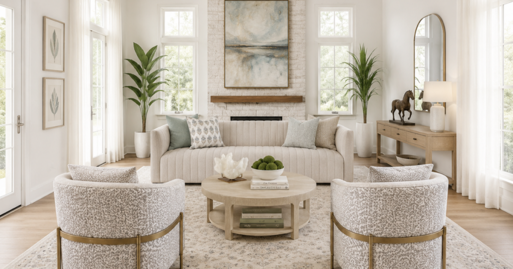
The Power of Quiet Whites
This is where experienced color selection often differs from trend-driven color selection.
Many of the most successful interiors are not painted with the brightest white available.
Instead, they rely on what I often call quiet whites.
These colors still read as white.
Most homeowners would identify them as white immediately.
Yet they contain subtle amounts of warmth, mineral influence, softness, or complexity that allow them to interact with light more gently.
Rather than aggressively reflecting light, they diffuse it.
Rather than creating sharp visual contrast, they soften transitions.
Rather than demanding attention, they create calm.
This is one reason bone tones, chalky whites, softened mineral whites, and nuanced architectural neutrals often feel more expensive than stark whites.
They create comfort without sacrificing brightness.
They allow the architecture, furnishings, materials, and natural light to become the focus rather than the paint itself.
Luxury Is Often Softer Than We Think
One of the biggest misconceptions in residential design is that luxury comes from maximum brightness.
In reality, many high-end spaces succeed because they create balance.
The best interiors are rarely trying to be the brightest room in the neighborhood.
They are trying to create an environment where people feel comfortable spending time.
Luxury often feels quieter.
More grounded.
More intentional.
It uses light strategically rather than maximizing it.
It understands that comfort and brightness are not the same thing.
And it recognizes that the human brain responds differently to a room than a camera does.
The goal is not simply to create a beautiful photograph.
The goal is to create a space that feels good to live in.
Because ultimately, color is not just something we see.
It is something we experience.
Most people choose color one room at a time.
Professionals design color as a system.
If your home feels disconnected, flat, or difficult to pull together, the problem may not be the individual colors themselves. It may be the lack of relationship between them.
Spatial Color System teaches you how to use color to create flow, balance, depth, and visual harmony throughout your home. You’ll learn how color influences movement, defines boundaries, shapes proportion, and connects spaces into a cohesive whole.
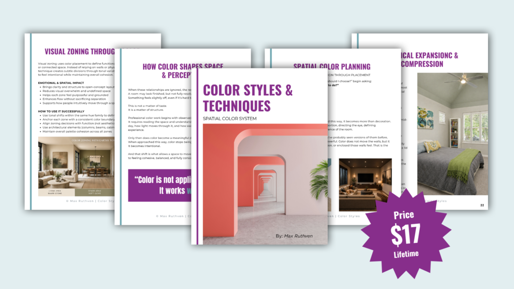
Stop choosing colors in isolation.
Start designing your home as a complete visual system.
Download Spatial Color System Here!
Ready to take the next step?
You can book an appointment with me for personalized support or schedule a discovery call if you’d like to explore how I can help.
Enjoy this blog?