We have never consumed more design imagery than we do today.
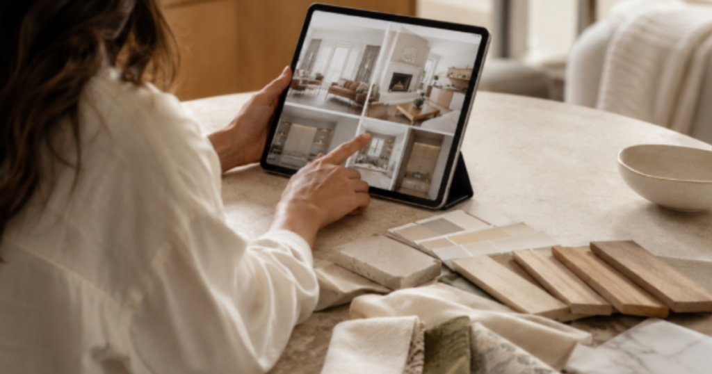
Every day, we scroll through beautifully styled interiors on Instagram, Pinterest, design blogs, builder websites, and real estate listings. We save inspiration photos, compare kitchens, screenshot living rooms, and create digital mood boards before ever stepping inside a paint store or furniture showroom.
Access to design inspiration has never been easier.
But this constant exposure has quietly changed the way we think about good design.
Many of us have been trained to evaluate spaces almost entirely through photographs.
The challenge is that photographs are experienced with the eyes.
Homes are experienced with the body.
That distinction matters more than most people realize.
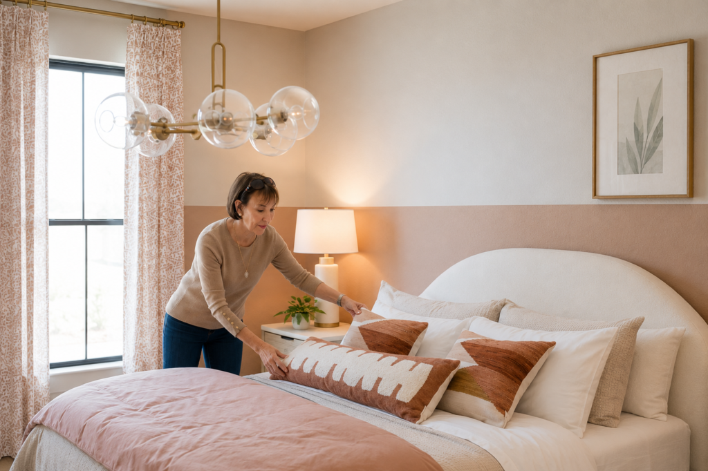
A photograph captures a fraction of a second. A home is experienced for hours, days, and years.
What looks beautiful in a still image does not always feel comfortable in real life.
In fact, some of the most visually impressive spaces can become surprisingly difficult to live in.
The Difference Between Looking and Living
The human brain processes far more than color and appearance.
Every environment influences our nervous system.
We respond to light levels, contrast, visual complexity, acoustics, texture, spatial proportion, movement, and even the way surfaces reflect light throughout a room.
Much of this happens automatically.
We may not consciously recognize why a space feels calming, stressful, welcoming, or exhausting.
We simply experience the result.
A photograph cannot capture that experience.
It cannot show glare bouncing across a room in the afternoon.
It cannot communicate visual fatigue after several hours of exposure.
It cannot reveal how an open floor plan affects concentration or how excessive brightness impacts comfort over time.
A photograph shows what a room looks like.
It does not show what a room feels like.
Why Social Media Rewards Extremes
Social media operates on attention.
The images that perform best are often the ones that create the strongest visual reaction.
High contrast.
Bright whites.
Bold color.
Dramatic lighting.
Large open spaces.
Striking architectural features.
These elements work exceptionally well on a small screen because they capture attention quickly.
But attention and comfort are not the same thing.
Many of the qualities that make a room successful on social media are very different from the qualities that support long-term comfort in everyday life.
Designing for photographs often prioritizes visual impact.
Designing for people prioritizes experience.
The two goals are not always aligned.
The Nervous System Lives in the Space
When we enter a room, our bodies immediately begin gathering information.
Is this environment safe? Is it overwhelming? Can I relax here? Can I focus here?
Do I feel comfortable staying?
These assessments occur largely beneath conscious awareness.
This is why two rooms with similar furniture and color palettes can feel completely different.
One may feel grounded and restorative.
The other may feel restless and difficult to inhabit.
The difference is rarely one single design decision.
It is the cumulative effect of how all the elements work together.
Light.
Color.
Scale.
Texture.
Contrast.
Materiality.
Spatial boundaries.
Every decision contributes to the overall experience.
Great Design Supports Human Behavior
The most successful spaces are not necessarily the ones that generate the most likes online.
They are the ones that support the people who live within them.
They make daily routines easier.
They encourage rest when rest is needed.
They promote focus when concentration is required.
They create comfort without demanding constant attention.
This is one reason color should never be viewed as decoration alone.
Color influences how light behaves within a space.
It affects visual contrast.
It contributes to spatial perception.
It helps define boundaries, create rhythm, and support the emotional character of an environment.
The goal is not simply to make a room look beautiful.
The goal is to create a space that functions well for human beings.
Moving Beyond the Photograph
Online inspiration can be incredibly valuable.
It can introduce us to new ideas, new materials, and new possibilities.
The problem begins when we assume that a beautiful photograph automatically represents a successful environment.
A room should be evaluated by more than how it looks on a screen.
It should be evaluated by how it feels to inhabit.
The future of great design may not be creating spaces that photograph better.
It may be creating spaces that help people feel better.
Because ultimately, design is not experienced through a camera lens.
It is experienced through the human body.
Most people choose color one room at a time.
Professionals design color as a system.
If your home feels disconnected, flat, or difficult to pull together, the problem may not be the individual colors themselves. It may be the lack of relationship between them.
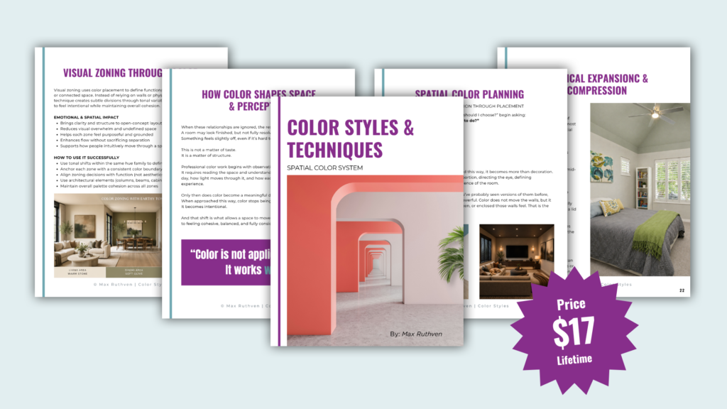
Spatial Color System teaches you how to use color to create flow, balance, depth, and visual harmony throughout your home. You’ll learn how color influences movement, defines boundaries, shapes proportion, and connects spaces into a cohesive whole.
Stop choosing colors in isolation.
Start designing your home as a complete visual system.
Download Spatial Color System Here!
Ready to take the next step?
You can book an appointment with me for personalized support or schedule a discovery call if you’d like to explore how I can help.
Enjoy this blog?