Why the relationship between materials matters more than their price tags.
Homeowners often assume that investing in higher-quality materials will naturally result in a more cohesive home.
They choose natural stone, custom cabinetry, designer tile, premium flooring, and statement lighting. Yet when everything comes together, something still feels off.
The individual selections may be attractive, and the quality may be excellent. But quality alone doesn’t guarantee that materials belong together.
A successful interior depends on how those materials relate through color, scale, texture, proportion, and visual weight.
When Every Finish Demands Attention
One of the most common mistakes is allowing too many finishes to demand attention.
Imagine a kitchen with heavily veined countertops, decorative backsplash tile, strongly grained wood cabinetry, and patterned flooring.
Each material may be attractive individually. Together, they can create visual competition.
This is where visual hierarchy becomes important.
One or two elements can take the lead, while the others provide support. A countertop with dramatic movement may benefit from a quieter backsplash. Strongly patterned flooring may need simpler cabinetry.
Scale, texture, sheen, and contrast also influence how much attention a material attracts. A glossy surface, for example, can become more prominent because of reflected light.
The goal isn’t to eliminate contrast or personality. It’s to give each material a clear role.
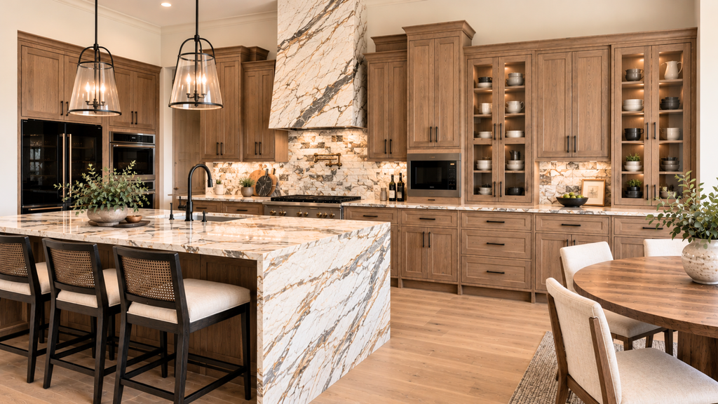
Why these materials compete—and how I would correct them
The individual materials in this kitchen may be expensive and attractive, but together they create unnecessary visual competition.
The heavily veined stone on the island already makes a strong statement. Repeating that movement on the range hood, while introducing yet another busy stone pattern on the backsplash, gives the eye too many competing focal points.
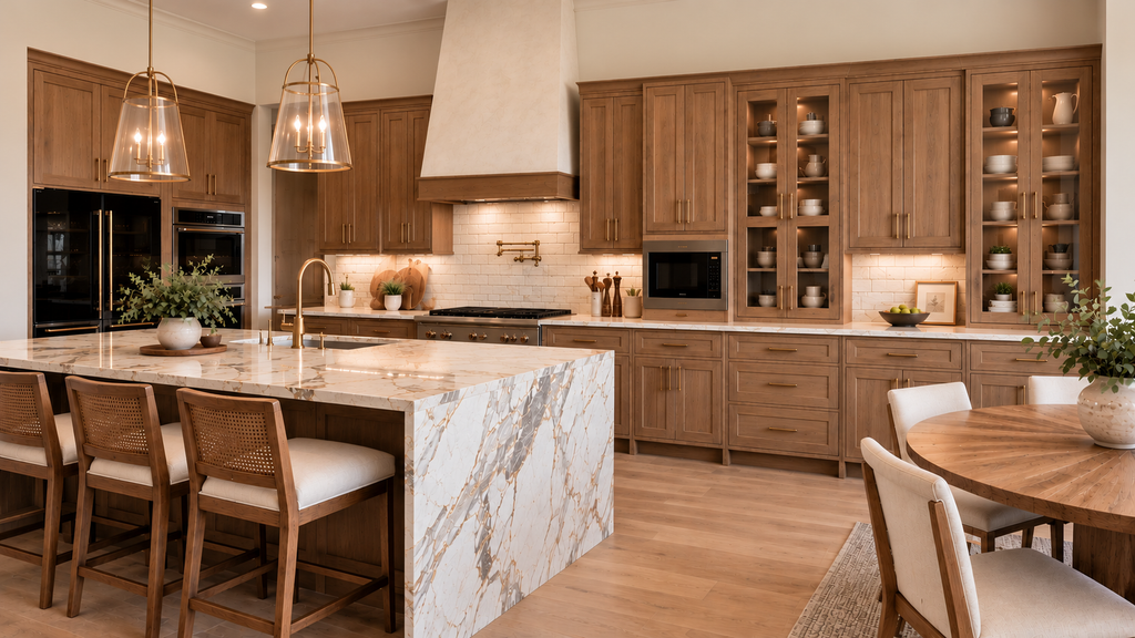
I would allow the dramatic countertop to remain the focal point and simplify the surrounding finishes. A creamy-white matte subway tile would provide a quieter backdrop, while a limewashed range hood with wood trim matching the cabinetry would introduce texture without additional pattern. Champagne bronze hardware and fixtures would reduce the strong contrast of the black metal finishes.
Color Relationships Still Matter
Materials described as warm, neutral, or natural don’t necessarily coordinate.
A stone countertop may have a pink-beige direction, while the flooring leans yellow-orange. The cabinetry may be a cooler taupe, and the backsplash may introduce a green-gray influence.
None of these colors is inherently wrong. But their specific hue families, chromatic intensity, and relationships must be considered.
This becomes especially important when permanent finishes meet directly.
A shared description doesn’t guarantee a shared color relationship.
Style and Architecture Matter Too
Two products labeled contemporary or traditional may still have very different visual characteristics.
One may be refined and polished, while another is rustic and heavily textured.
Rather than relying on style labels, consider the character of each material. Is it formal or relaxed? Restrained or decorative? Smooth or textured?
And most importantly, does it support the architecture?
A finish that looks exceptional in a showroom may not belong in your particular home.
Start With What Matters Most
Before selecting additional finishes, identify what should lead the design.
It might be a distinctive stone slab, existing wood flooring, architectural tile, or cabinetry in a color you love.
Then evaluate the remaining selections in relation to that element.
Whenever possible, bring actual samples together and observe them in the intended space, under natural and artificial lighting. Include grout, paint, and metal finishes, since these smaller decisions can influence the overall composition.
Look at the materials both close up and from a distance.
Sometimes the strongest design decision isn’t adding another feature. It’s simplifying a surface, repeating an existing material, or allowing a quieter finish to provide balance.
The Value of Thoughtful Decisions
A cohesive home isn’t defined by how much its materials cost.
It’s defined by how well they work together.
This is central to my Color in Context Method™: understanding the architecture, existing materials, light, and relationships before committing to new selections.
Luxury materials can certainly elevate a home. But it’s the considered decisions behind them that make the result feel intentional, cohesiv
Ready to take the next step?
You can book an appointment with me for personalized support or schedule a discovery call if you’d like to explore how I can help.
Enjoy this blog?