How repetition creates continuity—and why some colors are better left to stand alone.
Repetition is one of the simplest ways to create a sense of connection throughout a home.
A wall color may continue into an adjoining room.
A deeper cabinet color may relate to a shade found in artwork or upholstery.
A warm metal finish may appear in lighting, hardware, or architectural details.
These relationships help create visual continuity, particularly when several rooms can be seen at once.
But there’s a difference between creating a connection and making everything match.
When every color appears in every room, the result can feel overly coordinated or predictable. Instead of allowing individual spaces to develop their own character, the palette begins to follow a formula.
The goal isn’t to repeat everything. It’s to understand when repetition serves a purpose and when a color should be allowed to stand alone.
Repetition Helps Connect Spaces
When a color appears more than once, our eyes begin to recognize a relationship between the different spaces.
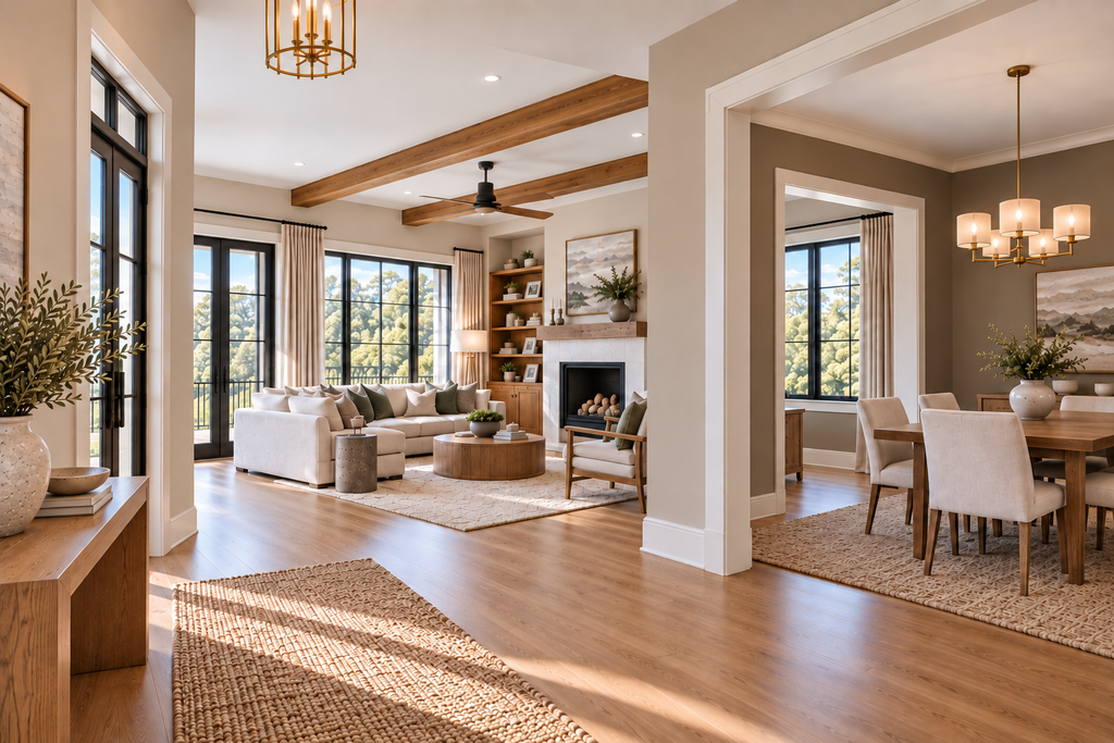
For example, a muted green used in a study might reappear in a patterned rug, a piece of artwork, or a small detail in an adjoining room.
The color doesn’t need to appear in the same amount or on the same type of surface.
Sometimes a subtle reference is enough to establish a connection.
This can be particularly effective in open floor plans, long hallways, or homes where several rooms are visible from one location.
However, repetition should be considered in relation to the architecture and existing finishes, rather than simply introducing the same accent color into every room.
Repetition Doesn’t Needs to Be Exact
A repeated color does not have to be duplicated perfectly.
In fact, exact repetition can sometimes feel too deliberate.
A deeper green in one room may return as a softer, grayer version elsewhere. A rust-colored chair may relate to a quieter terracotta detail in another space. A dark brown cabinet may connect to medium-toned wood rather than another identical brown-painted surface.
The relationship can come through:
- the same hue family;
- a lighter or darker value;
- a more muted version;
- a different material;
- a smaller amount;
- a pattern containing a related color.
This creates continuity without making the palette feel repetitive.
Repetition Creates Visual Rhythm
Repetition can also establish rhythm.
Much like rhythm in music, a recurring element creates familiarity and structure. But variation keeps the composition interesting.
In a home, visual rhythm might come from recurring wood tones, related wall colors, architectural details, or a metal finish that appears in different locations.
It can also develop through a consistent approach to contrast, texture, or the relationship between lighter and darker surfaces.
Not every room needs the same combination.
Sometimes the strongest connection comes from repeating a design relationship rather than an actual color.
For example, several rooms may feature quieter wall colors balanced by deeper architectural elements, even though the colors themselves are different.
The result is a recognizable design language without unnecessary repetition.
Some Colors Should Stand Alone
Not every color needs to appear elsewhere to justify its presence.
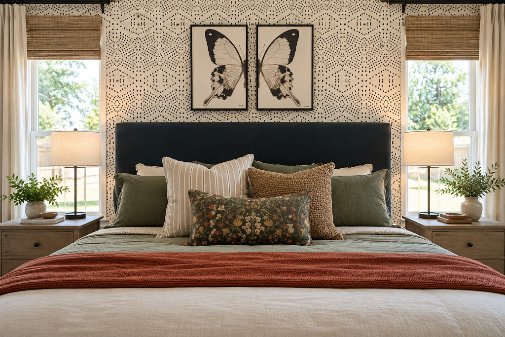
I took this photograph while visiting a model home, and what caught my attention was the way the designer layered patterns, textures, and colors without making everything match.
The patterned wallpaper, upholstered headboard, and assortment of pillows each contribute something different. There’s a wonderful mix of stripes, florals, and textured fabrics, yet the arrangement feels balanced rather than overly coordinated.
What I particularly liked was the terracotta throw across the foot of the bed.
If you look closely, you’ll notice a small hint of that color in the floral lumbar pillow. But the terracotta isn’t repeated in every pillow, accessory, or piece of artwork. It has its own presence in the room.
And that’s an important distinction.
A color doesn’t need to be repeated throughout a space to feel as though it belongs.
Sometimes a subtle connection is all that’s needed. The rest comes from how the colors, patterns, and textures work together.
Why Too Much Coordination Can Feel Forced
You’ve probably seen interiors where the same accent color appears in every pillow, rug, artwork, and decorative accessory.
Although the intention may be to create cohesion, the result can feel overly planned.
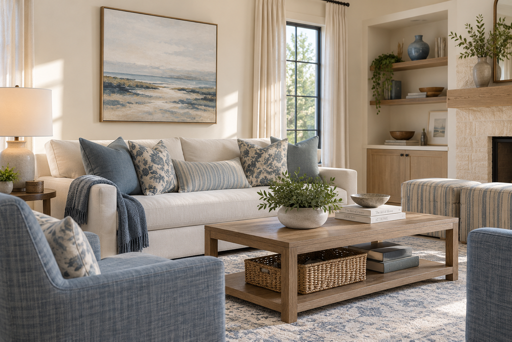
The same applies when every room follows an identical formula of wall color, wood tone, metal finish, and contrast.
A home needs enough consistency to feel connected, but also enough variation to remain interesting.
Different rooms have different functions, lighting conditions, architectural characteristics, and personal significance.
A bedroom doesn’t need to carry the same visual energy as a living room. A study may benefit from a deeper, more intimate palette, while adjoining spaces remain lighter and more open.
These differences can coexist within a cohesive home.
The objective is not sameness. It’s a thoughtful relationship between the spaces.
Consider What You Can See From One Room to Another
Sightlines are especially important when evaluating color repetition.
If a dining room is visible from the living room, the two palettes should be considered together.
That doesn’t mean they need the same wall color or matching accessories.
Instead, look at how the colors relate through their hue families, lightness or depth, existing materials, and overall contrast.
A strong color in one room may work perfectly well beside a quieter palette in another, provided the relationship feels intentional.
Sometimes the connection is obvious. Other times, it may come from something as subtle as a shared wood tone or a neutral already present in both spaces.
The important thing is to evaluate the rooms together rather than making decisions in isolation.
When Is Repetition Actually Necessary?
Before repeating a color, consider what you’re trying to accomplish.
Is the repetition helping connect adjoining spaces? Is it reinforcing an architectural material? Is it creating rhythm or supporting the overall color direction?
Or are you repeating it simply because you feel you should?
There isn’t a rule that says an accent color must appear three times in a room or continue throughout the home.
Sometimes one carefully placed color makes a stronger statement than several repeated references.
Other times, repetition provides exactly the connection a space needs.
The decision should come from the room, the surrounding architecture, and the overall palette—not from a decorating formula
Final thought
A cohesive home doesn’t require every color to appear in every room.
Some colors provide continuity through larger architectural surfaces. Others may reappear in smaller details, while a few deserve to stand alone.
Repetition is useful when it creates a meaningful relationship between spaces. But variation is equally important.
I believe our homes should have personality. They should reflect the people who live in them, their collections, their memories, and their individual preferences.
The goal is to create a home that feels connected without making every room look alike.
If you struggle, let me help! Click on the link below and let’s pull your home together!
Ready to take the next step?
You can book an appointment with me for personalized support or schedule a discovery call if you’d like to explore how I can help.
Enjoy this blog?