Why making decisions in the right sequence can prevent costly mistakes and create a more cohesive home.
Many design mistakes don’t happen because someone chose the wrong color or material.
They happen because decisions were made in the wrong order.
A homeowner may fall in love with a paint color before considering the flooring. New cabinetry may be selected without evaluating the existing stone or tile. Light fixtures may be purchased without considering how the lighting will affect the surrounding colors and finishes.
Each selection may work perfectly well on its own, yet the finished space still feels disconnected.
The problem isn’t necessarily the individual choices. It’s the relationships between them.
One of the most important things I’ve learned through years of working with architectural color is that the order in which we make decisions matters just as much as the decisions themselves.
Here is how I recommend approaching color and finish selections in your home.
1. Begin With What Is Already Fixed
Before selecting anything new, identify what will remain.
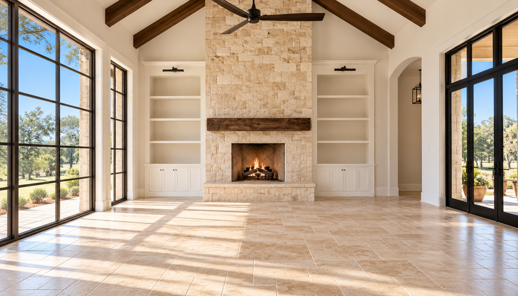
These are the architectural elements that are difficult or expensive to change, such as existing flooring, stone, brick, cabinetry, countertops, tile, fireplaces, and stained wood.
Take time to observe their color direction, lightness or depth, texture, pattern, and visual weight.
Which materials already relate well to one another? Which ones seem disconnected? And which elements will have the greatest influence on future selections?
A fireplace that will remain for another twenty years deserves more consideration than a countertop scheduled for replacement next year.
Start with what you have before deciding what you need.
2. Establish the Overall Direction
Before selecting individual finishes, consider what you want the home to feel like.
Do you prefer a lighter, more open atmosphere or something warmer and more grounded?
A quieter palette or one with stronger contrast?
Do you want to introduce more color, or work with the existing architectural character?
You don’t need to settle on a particular design style.
In fact, I believe homes are more interesting when they reflect the personalities, experiences, and preferences of the people living in them.
But you do need a general direction.
Without one, it’s easy to collect materials and colors that appeal to you individually but don’t necessarily work together.
3. Start With the Flooring
When selecting new finishes, flooring is usually where I begin.
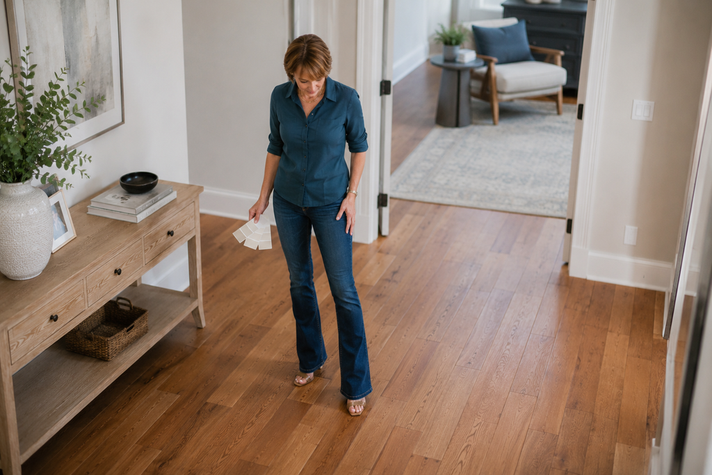
It is one of the largest continuous surfaces in a home, and its color, texture, and pattern can influence almost everything around it.
Whether you’re working with wood, luxury vinyl plank, tile, or another material, consider its relationship to the existing architectural elements and adjoining rooms.
Pay attention to:
- The overall color direction
- Lightness or depth
- Grain, pattern, and texture
- Surface finish and reflectivity
- How the flooring transitions between spaces
Flooring should be considered in the context of the entire home, not simply the room where it will be installed.
And if your existing flooring is staying, it becomes one of the most influential fixed elements in your color decisions.
4. Coordinate the Remaining Architectural Finishes
Once the flooring direction is established, consider the other significant surfaces and finishes.
Depending on the project, these may include cabinetry, countertops, tile, stone, stained wood, doors, and other architectural details.
Not every home needs new countertops or cabinetry. Sometimes the project involves nothing more than updating wall colors while working with existing materials.
The important thing is to understand how the finishes relate to one another.
Consider their color direction, pattern, texture, sheen, and visual weight.
A material with strong movement or contrast may need quieter supporting finishes. Too many competing surfaces can make a room feel unnecessarily busy.
This is also where I encourage homeowners to think beyond a single room.
A selection that works in the kitchen should still make sense when viewed alongside the flooring, adjoining living areas, and other visible architectural features.
The goal is coordination, not making everything match.
5. Consider Furniture, Textiles, and Artwork
Although my primary focus is architectural color, I don’t believe we should ignore the furnishings and personal possessions that make a house a home.
An existing sofa, an important rug, a favorite piece of artwork, or a family heirloom may influence the overall color direction.
These pieces don’t necessarily need to dictate the architectural finishes, but they deserve consideration.
I also don’t believe every room needs to look as though it came straight out of a design magazine.
There should be room for personality, collected pieces, unexpected color combinations, and the things that hold personal meaning.
The architectural palette should provide a foundation that allows those elements to belong.
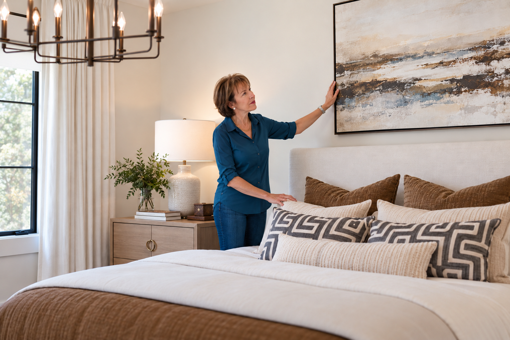
6. Evaluate and Coordinate the Lighting
Lighting plays a significant role in how we perceive color.
This is why I consider existing lighting conditions from the beginning of a project, even when final lighting selections come later.
Natural light changes throughout the day, while artificial lighting can alter how paint colors, flooring, cabinetry, and other finishes appear.
Before finalizing paint colors, pay attention to the bulbs and light sources being used.
Consider color temperature (Kelvin), brightness (lumens), and color rendering (CRI), along with consistency between connected spaces.
A warm light source and a cooler light source can make the same paint color appear quite different.
Decorative fixtures also need to relate to the surrounding finishes, but the quality of the light they produce is equally important.
You cannot accurately evaluate color without considering the light in which it will be seen.
7. Choose the Paint Colors Last
This is where homeowners are often surprised.
Paint may be one of the first finishes applied during construction or renovation, but it is usually one of the last major color decisions I finalize.
Why?
Because paint offers far more flexibility than flooring, stone, cabinetry, and many other architectural materials.
Once those relationships are understood, paint can help connect the elements and establish a more cohesive palette.
Consider more than just the wall color.
Ceilings, trim, doors, built-ins, and paint sheen all contribute to the overall composition.
And they don’t necessarily have to be the same color.
Thoughtful variation can highlight architectural details, create contrast, or give individual rooms their own identity while maintaining continuity throughout the home.
Always evaluate your final paint selections alongside the actual materials and under the lighting conditions in which they will be used.
Paint should support the architectural finishes, not be expected to correct unrelated material decisions.
Why the Order Matters
Every selection influences the next.
Flooring establishes a significant part of the visual foundation. Architectural finishes introduce additional color, pattern, and texture. Furnishings and personal possessions help shape the character of the space. Lighting influences how everything appears.
Paint then becomes an important tool for connecting those elements.
When homeowners begin with paint simply because it’s the easiest or least expensive decision, they may find themselves trying to coordinate permanent finishes around a color that should never have led the process.
That’s when unnecessary compromises and costly changes can happen.
A more thoughtful sequence helps reduce confusion and makes the selection process easier to manage.
A Flexible Sequence, Not a Rigid Formula
Of course, every project is different.
If you’re keeping your existing flooring, there’s no reason to select it again. If you’re renovating a kitchen, the cabinetry and countertop relationships may require more attention. If you own an important piece of artwork or a treasured rug, it may influence the palette from the beginning.
The sequence can adapt to the project.
What matters is understanding which elements are permanent, which carry the greatest visual influence, and which offer more flexibility.
The most influential decisions should guide the more flexible ones, not the other way around.
Final Thought
A cohesive home isn’t created by choosing everything in the same color family or making every finish match.
It’s about understanding how the architectural elements relate to one another and making decisions that support the home as a whole.
That doesn’t mean sacrificing personality or limiting creativity.
Quite the opposite.
When the foundation is thoughtfully considered, there’s more freedom to introduce color, contrast, personal collections, and the unexpected details that make a home feel like your own.
The right order doesn’t guarantee that every decision will be easy, but it can help you avoid unnecessary mistakes and move forward with greater confidence.
Need help establishing the right color direction for your home?
A fixed-elements or a Comprehensive Color Consultation can help you evaluate your existing finishes, understand their relationships, and make more confident color decisions before committing to costly changes.
Ready to take the next step?
You can book an appointment with me for personalized support or schedule a discovery call if you’d like to explore how I can help.
Enjoy this blog?