How to combine colors, woods, and materials without making everything look alike.
Have you ever searched for a rug that perfectly matches your sofa, or a dining table in exactly the same wood tone as your flooring?
It’s understandable. Matching feels safe.
But a room doesn’t need identical colors and finishes to feel cohesive. In fact, trying too hard to match everything can sometimes make the differences more noticeable.
The goal isn’t to make everything look alike. It’s to understand how the elements work together.
Matching Isn’t the Same as Coordinating
Matching means choosing colors or finishes that are identical, or nearly identical.
Coordinating means understanding how different elements relate to one another.
A patterned rug doesn’t need to contain the exact beige of your sofa. Your furniture doesn’t have to match your flooring. And your cabinet hardware doesn’t necessarily need to match every other metal finish.
What matters is how the colors, materials, and finishes work together.
Matching certainly has its place, particularly when consistency helps create architectural continuity. But insisting on matching everything can make a home feel unnecessarily predictable.
Beware of the Almost-Match
One of the most common mistakes I see is trying to match two finishes that are just slightly different.
Imagine choosing a wood dining table that looks almost identical to your flooring. Once you bring it home, however, the table appears more orange while the floor has a muted brown undertone.
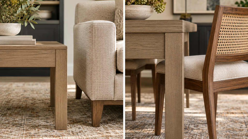
Neither finish is wrong, but the difference may look unintentional.
A distinctly darker wood table might have worked much better.
When two finishes can’t match convincingly, a deliberate difference is often more successful than an almost-match.
This applies to flooring, tile, countertops, fabrics, and painted surfaces as well.
Look Beyond the Color Name
Two materials may both be called beige, gray, brown, or white, yet have very different color directions.
A peachy beige tile, for example, may not coordinate comfortably with a strongly yellow-beige fabric. This is where the undertone conversation starts!
That’s why I encourage homeowners to compare actual samples rather than relying on color names.
Look at the dominant hue, the lightness or depth of each color, and how the materials relate to one another.
Different hue families can absolutely work together. The important thing is that the relationship looks intentional.
Mixing Wood Tones
Not every piece of wood furniture needs to match your flooring.
You might have oak floors, a walnut dining table, stained cabinetry, and a beautiful antique chest that’s been in the family for generations.
There’s no reason those pieces can’t coexist.
When combining woods, I pay attention to three things:
- Color direction: Does the wood lean yellow, orange, red, brown, or toward a more muted tone?
- Lightness and depth: Would a lighter or darker wood create a more pleasing contrast?
- Grain and movement: If your flooring has a prominent grain, a quieter furniture finish may provide better balance.
The objective isn’t identical wood finishes.
It’s a combination that feels comfortable and considered.
What About Mixing Metals?
Brushed nickel, aged brass, stainless steel, and dark metal finishes can work together beautifully.
But I wouldn’t recommend mixing metals simply because it’s fashionable.
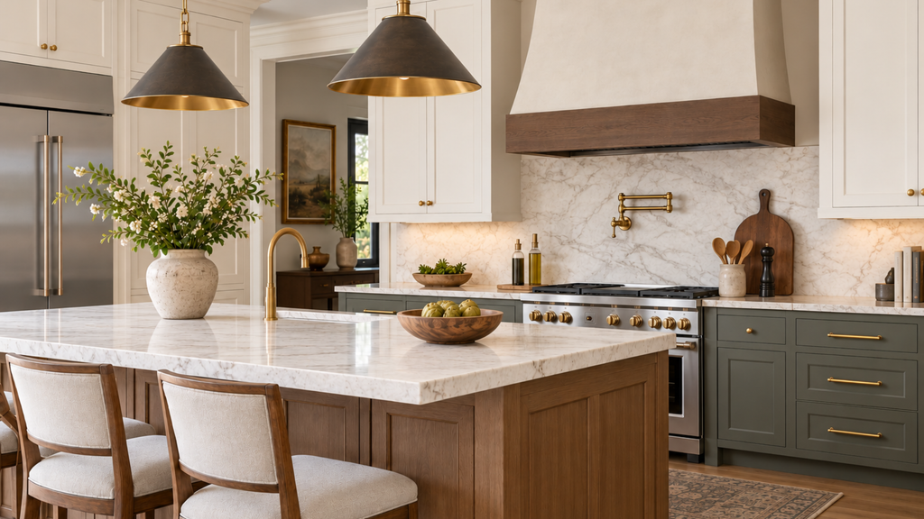
Start with the finishes already present in your home. Stainless steel appliances, for example, don’t mean every faucet, handle, and light fixture must also be stainless steel.
Consider the surrounding cabinet colors, countertops, and other materials.
And remember that polished brass and aged brass can create very different impressions, even though they’re both brass.
Sometimes consistency is the better choice. Other times, a contrasting finish adds warmth or interest.
Let the space guide the decision, not a decorating trend.
Texture Changes How We See Color
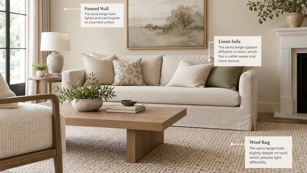
Even when colors are nearly identical, different materials can make them appear quite different.
Think of a beige linen sofa, a wool rug, and a painted wall.
The linen has a visible weave, the wool absorbs light differently, and the painted surface may reflect more light.
This is why exact color matching across different materials can be so difficult.
It’s also why a room with a limited color palette can still feel rich and interesting through texture alone.
A Simple Way to Compare Finishes
Before making your final selection, place your samples together and ask yourself:
- Do their dominant hues work comfortably together?
- Would a lighter or darker option create a better relationship?
- How do their textures, grain patterns, or surface finishes affect the combination?
- Do they still work together in the actual room and its lighting?
Don’t judge samples individually under showroom lighting. Compare them alongside the finishes that will remain in your home.
Final Thought
Matching isn’t wrong. Sometimes it’s exactly what a space needs.
But a beautiful antique chest doesn’t need to match your new flooring, and a favorite rug doesn’t have to repeat the exact color of your sofa.
Your home should have room for pieces you love, including those with history, personality, and meaning.
This is central to my Color in Context Method™. Rather than evaluating colors and materials in isolation, I consider how they relate to the surrounding finishes, architecture, lighting, and the people who live there.
Because a cohesive home isn’t about collecting matching pieces.
It’s about making thoughtful choices that belong together.
Ready to take the next step?
You can book an appointment with me for personalized support or schedule a discovery call if you’d like to explore how I can help.
Enjoy this blog?