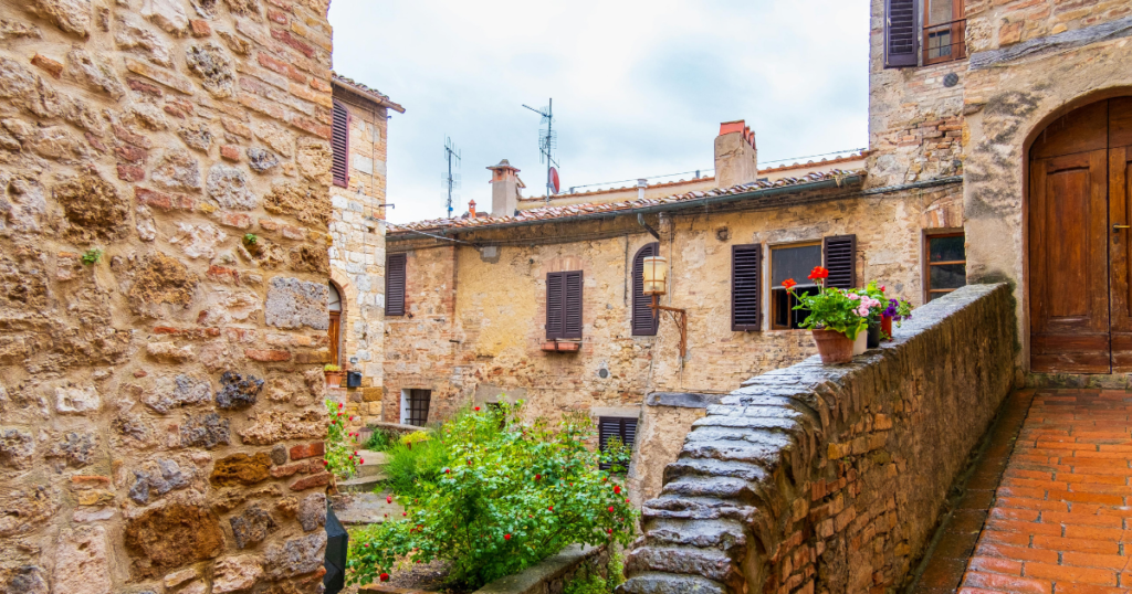
Before paint chips existed, color had a very different origin. It didn’t come from a fan deck or a screen; it came from the earth. Stone, clay, minerals, and materials found within reach of where a building stood defined the palette.Because of that, something remarkable happened: color belonged. Not because it was styled to fit, but because it couldn’t have been any other way.
Color Was Never Separate From Place
In traditional architecture, color was not a design decision—it was a consequence. Pigments were determined by geography, shaped by local light, and influenced by how materials responded to climate.
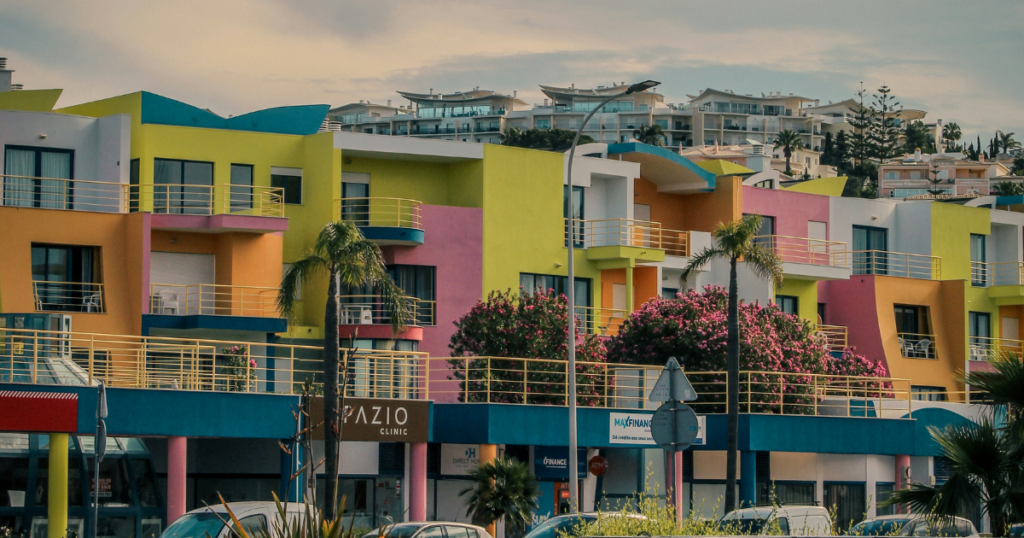
Over time, this created strong regional identities: the warm ochres of Tuscany, the chalky whites of the Greek islands, the deep reds of Scandinavian farmhouses, and the softened grey-greens of coastal New England.
These palettes didn’t need to be coordinated. They emerged from context.
What matters is not the palette itself—but the fact that it was never separate from its environment.
Color Existed in Relationship to Light
Traditional builders understood something we often overlook. Color does not exist independently; it exists in light. And light is never neutral.
It shifts with orientation, latitude, season, and time of day. In high-sun climates, color had to hold its presence against intensity. In northern environments, tones softened in response to diffused light.
This wasn’t theoretical—it was observed over time. Color wasn’t chosen for how it looked in isolation; it evolved based on how it was experienced in place.
Material and Color Were One System
Before synthetic coatings, color was not something applied to a surface—it was part of the surface itself. Limewash absorbed into plaster, pigments were mixed directly into stucco, and wood carried its color through stain or natural weathering. Color and material aged together, responded together, and developed depth over time.
Modern paint, by contrast, sits as a film. It separates color from material rather than integrating with it, often resulting in a kind of visual flatness that traditional surfaces rarely had.
What Changed When Color Became Manufactured
The industrial shift introduced something entirely new: unlimited choice. Pigments could be produced anywhere, and colors could be replicated endlessly.
A home in one region could now be painted like a home in another—with no connection between them.
This was positioned as freedom. But in reality, it removed the constraints that once made color decisions reliable. Color became disconnected from place, from material, and from light.
We gained access—but lost orientation
The Problem With Infinite Options
When anything is possible, nothing feels inevitable. And without that sense of inevitability, spaces begin to feel constructed rather than resolved.
This is where many modern interiors struggle; not because the choices are wrong, but because they lack a unifying logic.
Selections are often based on images, trends, or isolated preference. But what works on a screen rarely translates into a cohesive spatial experience—because the screen has no context, no light, no material relationship, and no sense of place.
Why Traditional Color Still Feels Complete
When you study traditional architecture across regions, a pattern emerges. The palettes are restrained, the relationships are clear, and the variation is controlled.
And yet, these spaces feel complete. Not because they were designed to impress, but because they were built to respond—to light, to material, and to environment.
That responsiveness created coherence without needing to manufacture it.
How to Reintroduce This Logic in Modern Spaces
This isn’t about recreating the past. You don’t need historical materials to benefit from traditional thinking. What matters is reintroducing context before selection.
Start With Light
Begin by observing how light behaves in your space. Consider its direction, how it shifts throughout the day, and whether it reads as soft, direct, warm, or cool. Let light inform your decisions—not the other way around.
Rebuild Material Relationships
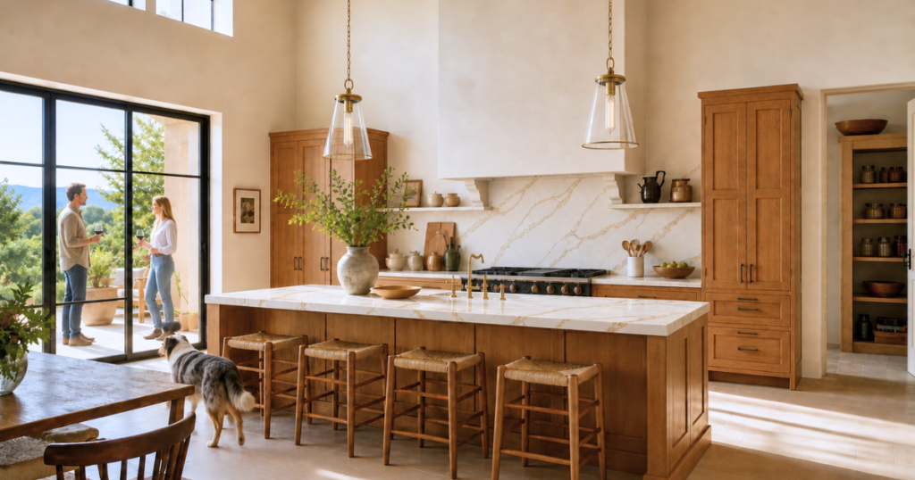
Identify what already exists—flooring, stone, cabinetry, and fixed finishes. Color should respond to these elements, not compete with them.
Reconnect to Environment
Look beyond the interior. The soil, vegetation, sky, and surrounding tones all influence how a space feels. When interior color quietly echoes its environment, the space begins to feel grounded.
Use Constraint Intentionally
Traditional architecture didn’t rely on endless variation—it worked within limits. Constraint creates clarity, and clarity is what allows a space to feel resolved rather than overworked.

The Shift: From Selection to Response
When you begin to approach color this way, the process changes. You stop asking, What looks good? and start asking more useful questions:
- What does this light require?
- What do these materials suggest?
- What would feel inevitable here, not just attractive?
This is how traditional architecture approached color—and it remains one of the most reliable ways to create spaces that feel complete.
Where This Is Going
This is the fourth layer in understanding color as architecture. We’ve explored structure, function, coherence—and now context.
In the next post, we’ll look at why modern homes are often harder to resolve—even with more options, better tools, and greater design awareness—and what it actually takes to bring them back into alignment.
If you’re ready to move beyond trend-based color decisions and create a home that feels grounded in its light, materials, and environment, my architectural color guides will help you understand how to approach color with clarity, intention, and confidence.
👉 Download the free guide to making color work here!
The Strategic Color Guide shows you how to approach color with clarity, structure, and confidence.
Don’t let your home feel “off” any longer.
If your spaces feel disconnected, the solution may be found in nature’s own palette. Nature-Inspired Color System shows you how to move beyond trends and use grounded, balanced color relationships with more confidence.
From soft neutrals to richer earth-inspired hues, this guide helps you understand what works, why it works, and how to get the details right the first time.
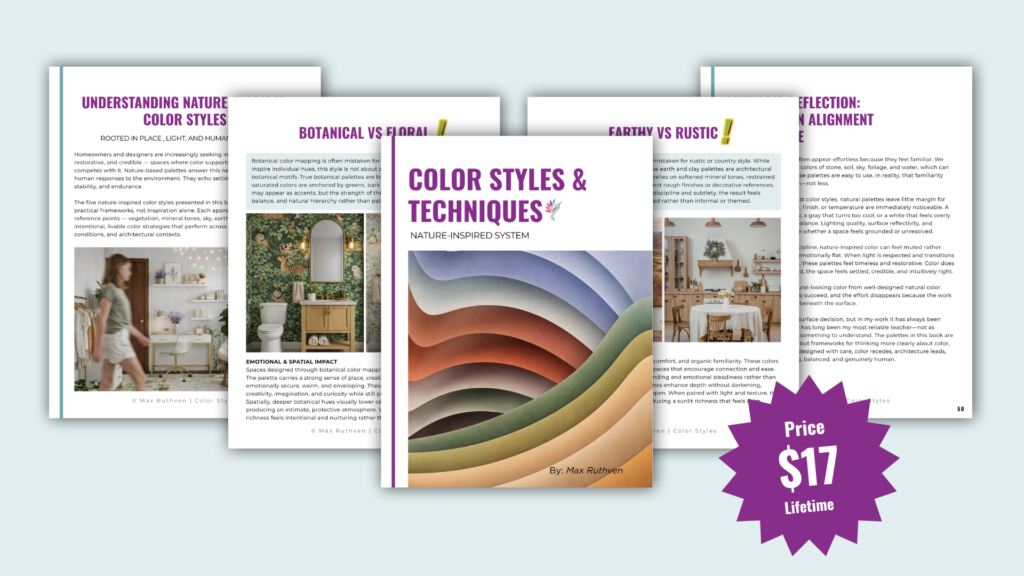
Click Here to Download the new Nature-Inspired Color System eBook
Ready to take the next step?
You can book an appointment with me for personalized support or schedule a discovery call if you’d like to explore how I can help.
Enjoy this blog?