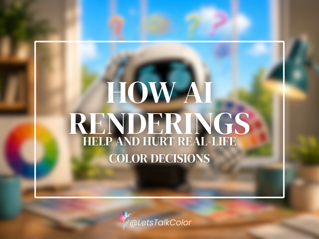
Why rendered colors rarely match reality, and how to use them the right way
AI renderings have changed the design world quickly!
Homeowners, designers, builders, and developers can now generate beautiful interiors and exteriors in minutes. What once required expensive software or professional rendering teams can now happen almost instantly.
And honestly, that can be incredibly helpful.
I use renderings in my own consultation process because they help clients visualize direction. They make it easier to understand color placement, contrast, proportion, and the overall mood of a space before anything is painted.
But there is also a growing problem I see almost daily:
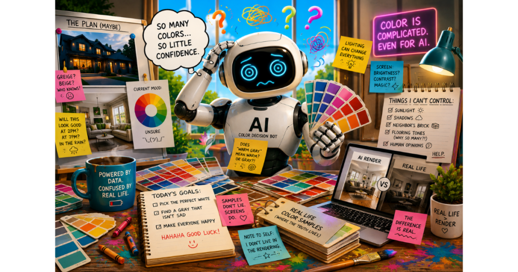
People are starting to expect renderings to behave like reality.
And color simply does not work that way.
A Rendering Is an Interpretation — Not Reality
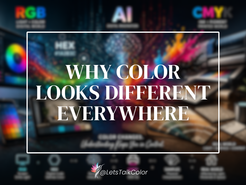
Even when a rendering looks realistic, the color has already been altered by lighting simulation, screen settings, texture interpretation, white balance, and digital enhancement.
Then you view it on a phone, laptop, or tablet — each with different brightness, calibration, and color settings. Some screens oversaturate color, while others flatten it entirely. That means the exact same rendering can look noticeably different depending on the device being used.
This is usually where frustration starts.
People say things like:
- “The color looked warmer in the rendering.”
- “The gray looked softer online.”
- “The green feels completely different in real life.”
And to be fair, the rendering probably did look different.
But digital color is simulated. Real-life color is physical. Those are not the same thing.
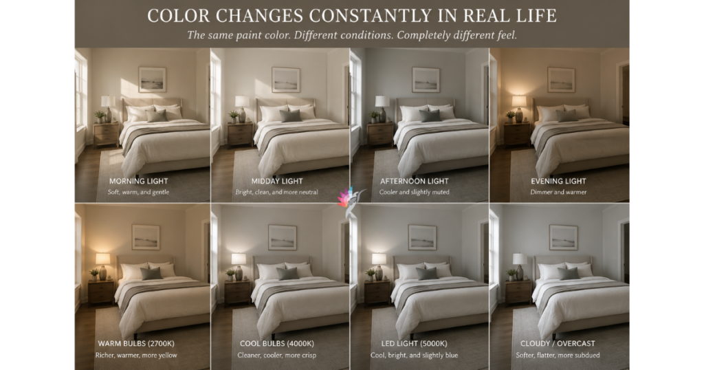
Color Changes Constantly in Real Life
One of the biggest misconceptions about color is that people assume it is stable.
It is not.
Color changes depending on:
- natural light
- time of day
- surrounding materials
- flooring
- bulb temperature
- sheen
- shadow
- texture
- and even weather conditions
The same paint color can feel calm or warmer in the morning, cooler in the afternoon, and completely different at night under LEDs
That does not mean the paint changed. It means the environment changed.
Renderings can suggest lighting, but they cannot fully recreate how color behaves in a real home or on a real exterior over time.
And that is especially important with whites, greiges, greens, charcoals, and soft atmospheric neutrals, because these colors are highly responsive to light.
I created this image via AI (go figure!) just to give you a visual representation of how color will shift throughout the day
AI Often Prioritizes Beauty Over Accuracy
This is another important piece people do not always realize.
Most AI systems are designed to create images that feel visually appealing. So the software often enhances:
- lighting
- contrast
- symmetry
- brightness
- texture
- and overall harmony
That is part of why renderings can look so impressive.
But beautiful imagery is not always an accurate color representation.
A rendered white exterior may look soft and elegant online, but in direct Texas sunlight it could feel far brighter than expected.
A dark cabinet color may look perfectly balanced in a rendering, but much heavier in a kitchen with limited natural light.
A soft green may suddenly pull yellow, blue, or gray once it interacts with the actual environment.
That is why renderings should guide decisions — not finalize them.
What Renderings ARE Extremely Good For
Renderings are incredibly valuable when used correctly.
They help people:
- understand color placement
- compare contrast levels
- evaluate proportions
- visualize architectural hierarchy
- simplify complex decisions
- and communicate ideas clearly before construction begins
They are especially helpful for:
- exterior color palettes
- open-concept interiors
- renovations
- new builds
- commercial projects
- and spaces with multiple fixed materials
A rendering may not tell you the exact way a color will behave at 5:00 p.m. in your home, but it can help you understand whether the overall direction makes sense.
And that is where renderings become powerful.
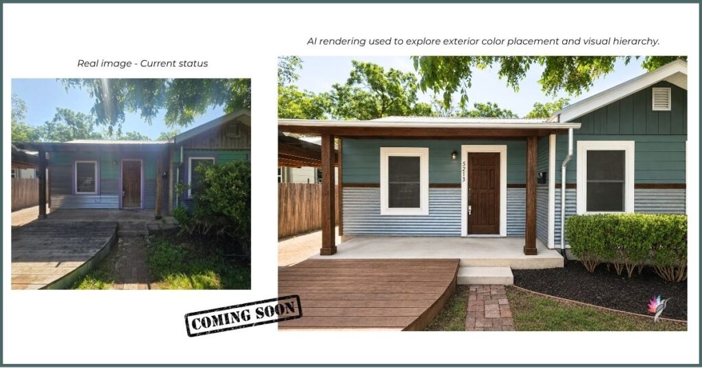
A Real Example
I recently did a consultation on this older home in a funky part of Austin. The goal was not to completely reinvent the home, but to improve it as cost-effectively as possible before listing it for sale.
The homeowner and th realtor wanted to keep the existing corrugated metal panels, so I used AI as a visual communication tool to explore color placement, simplify the visual clutter, and create a stronger architectural hierarchy.
The rendering helped illustrate how a deeper body color, cleaner trim placement, richer wood tones, and minor landscaping improvements could dramatically change the overall feel of the property.
But it also highlights an important lesson about AI renderings: they often beautify reality. The rendering presents smoother surfaces, cleaner materials, and more polished conditions than the actual home currently has, which is why renderings should be used as visual guides rather than exact predictions of real-life results.
Why Real-Life Testing Still Matters
This is why professional color consultations still rely heavily on physical testing.
Large-scale samples matter.
Lighting matters.
Existing materials matter.
Context matters.
Because color must be observed in the actual environment where it will live.
A rendering can help narrow the direction, but physical sampling helps confirm reality.
Those are two very different parts of the process.
The Most Important Shift
The goal of a rendering is not perfect color accuracy. The goal is clarity.
A good rendering helps you understand the relationship between surfaces, contrast, mood, and architectural direction.
It is a communication tool. Not a guarantee.
And once people understand that distinction, renderings become far more useful — because expectations become realistic.
The strongest projects happen when digital visualization is paired with real-world testing.
Not rendering instead of sampling. Rendering plus sampling.
Now you know
AI is changing the design industry, and these tools will continue to improve.
But no technology can fully replace human observation, environmental context, and the complexity of real-world light.
Color is responsive.
It changes with architecture, materials, reflection, weather, texture, and lighting conditions throughout the day.
That does not make renderings useless.It simply means we need to use them intelligently.
Because ultimately, you do not live inside the rendering.
You live inside the space!
Explore the Architectural Side of Decorative Color
If your home feels visually flat, disconnected, or lacking in depth, the solution is not always more décor or a different paint color. Sometimes the issue is how the surfaces themselves are interacting with light, proportion, and architecture.
Artistic & Decorative Color Styles & Techniques explores how decorative finishes can be used as intentional architectural tools rather than surface decoration alone.
Inside the guide, you’ll learn how techniques such as limewash, glazing, ombré, strié, Venetian plaster, and layered finishes influence movement, softness, rhythm, and material presence within a space.
Rather than focusing on trends or DIY application methods, this eBook provides a professional framework for understanding when decorative finishes support a room—and when they overwhelm it.
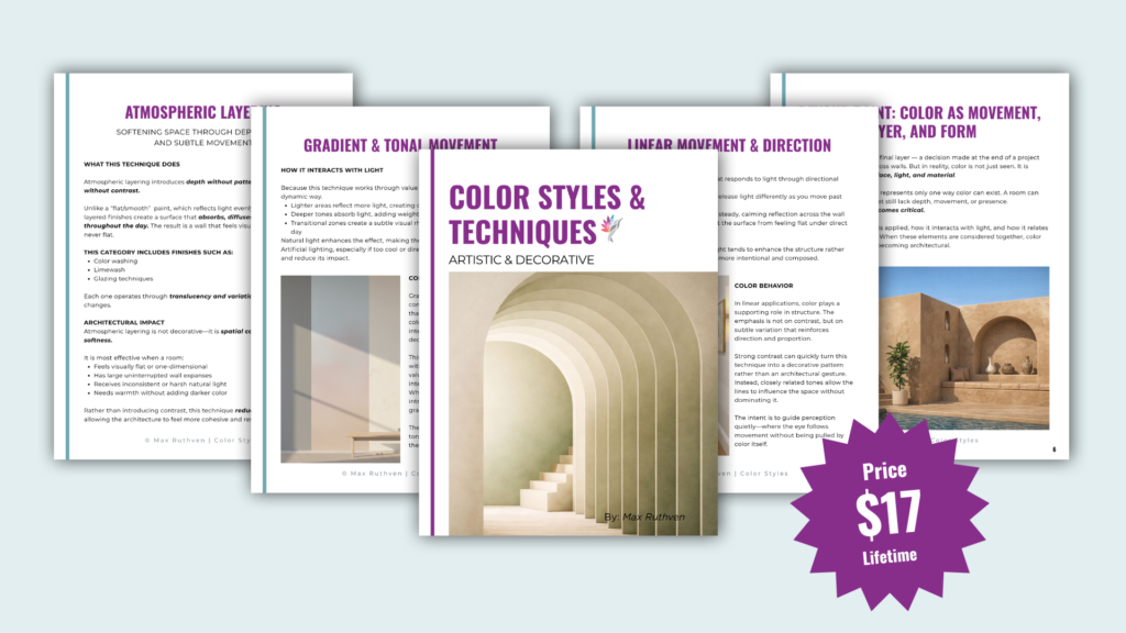
Download the Artistic & Decorative Guide Here
Ready to take the next step?
You can book an appointment with me for personalized support or schedule a discovery call if you’d like to explore how I can help.
Enjoy this blog?