
Warm white sounds like a simple category—until you place several warm whites beside one another.
One may look soft and balanced. Another may appear creamier, more muted or almost beige. The differences are often subtle on a paint chip but much more noticeable across an entire room.
This comparison looks at five popular Sherwin-Williams warm whites using two kinds of information:
Measurable information: LRV and digital hex reference
Observational information: how the color commonly behaves in different surroundings
The observations are not guarantees. Your lighting and materials will always affect the final result.
Five Warm Whites at a Glance
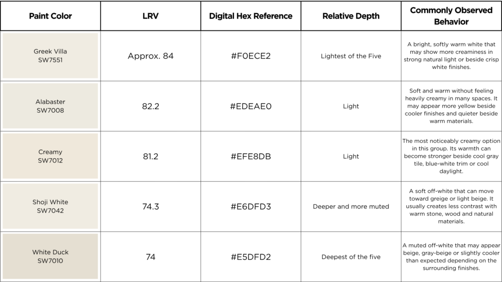
Technical data is based on Sherwin-Williams’ published digital color information. Screen colors are references only and should not be used for final paint approval. (Sherwin-Williams)
Greek Villa SW 7551
Greek Villa is the lightest and brightest color in this comparison. 🕶️😎
Sherwin-Williams describes it as a sunny white that responds well to natural light. In a bright room, it may feel open and softly warm. Beside a cleaner white, however, its creamier character can become more noticeable. (Sherwin-Williams)
It may suit homeowners who want warmth without moving too far into beige, but it still needs to be compared with the room’s trim, flooring and cabinetry.
Alabaster SW 7008
Alabaster is a soft warm white with slightly more depth than Greek Villa.
It often feels balanced because it is not as obviously creamy as Creamy and not as muted as Shoji White or White Duck. Sherwin-Williams describes it as a warm white that maintains a sense of brightness. (Sherwin-Williams)
That does not make it universally neutral. Beside cool tile or a blue-white countertop, the yellow tones will become much more visible.
Creamy SW 7012
Creamy lives up to its name.
It has a similar LRV to Alabaster but can appear more distinctly yellow or cream because LRV measures reflected light—not hue or color character. Sherwin-Williams also identifies its soft yellow quality in the manufacturer’s description. (Sherwin-Williams)
Creamy can work beautifully with warm wood, traditional materials and softer palettes. It requires more caution around cool gray finishes and very crisp whites.
Shoji White SW 7042
Shoji White is considerably deeper than the first three colors.
It is a warm, soft off-white that blends creamy beige with subtle gray undertones. Its understated warmth creates a welcoming, relaxed feel while remaining versatile enough to complement both warm and slightly cooler finishes.
That extra depth can make Shoji White useful when a brighter white feels disconnected from warm flooring, stone or cabinetry. In lower light, however, it may no longer read as a true white.
White Duck SW 7010
White Duck and Shoji White have nearly identical LRVs, but they should not be expected to look identical.
White Duck often appears quieter and less creamy than its name suggests. Depending on the light and surrounding materials, it may shift toward beige, softly muted off-white. I have even seen it show the slightest of orange tones in a specific home
Sherwin-Williams itself describes White Duck as creamy yet comparatively cool, which illustrates why simple warm-or-cool labels do not tell the entire story. (Sherwin-Williams)
Which Warm White Should You Choose?
Begin with the fixed materials in your room.
For a lighter, brighter result: Compare Greek Villa and Alabaster.
For more visible creaminess: Test Creamy.
For a softer, more muted result: Compare Shoji White and White Duck.
Then place the samples beside the flooring, countertops, cabinetry and trim. A color that looks beautifully warm on its own may appear too yellow beside cool finishes—or unexpectedly gray beside warmer materials.
A Note About the Hex Codes
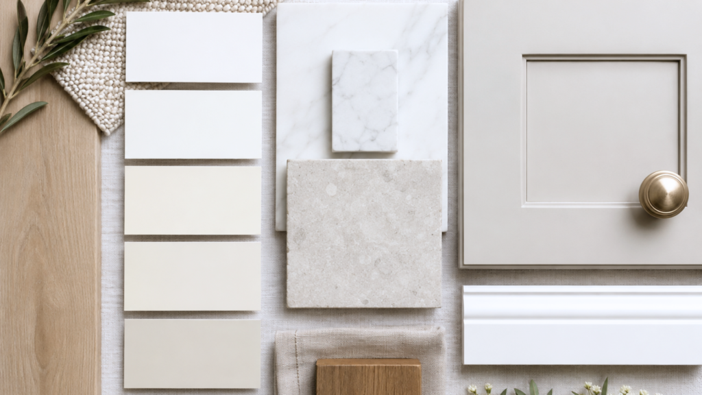
The hex codes in the chart are included for digital mood boards and AI renderings.
They are not paint formulas.
Use the paint name, number and hex reference together when creating a rendering, but treat the result as a general visualization. A screen produces light, while painted walls reflect the light in your actual room.
The rendering can help you compare direction and placement. A large physical sample must make the final decision.
The Bottom Line
These five colors all belong in the broad warm-white and off-white conversation, but they do not create the same result.
Greek Villa is the brightest. Alabaster is soft and balanced. Creamy shows more obvious warmth. Shoji White and White Duck are deeper, quieter and closer to beige or greige.
Do not choose one because it appears on a list of popular whites.
Choose it because you have compared it with the materials and lighting already present in your home.
One correction before publishing: the second table entry should read Alabaster SW 7008, not “White Dove SW 7008.” The technical figures shown in that row are for Alabaster.
Continue reading the Neutral Paint Color Series to better understand how neutral colors behave in real homes:
Hue Family vs. Undertone: What Paint Color Labels Actually Mean
How to Use Paint Hex Codes in AI Renderings
Modern Beige Paint Colors Compared
Why Neutral Paint Turns Gray Beside Warm Wood Floors
How to Narrow a Neutral Paint Shortlist Without Sampling 25 Colors
Ready to take the next step?
You can book an appointment with me for personalized support or schedule a discovery call if you’d like to explore how I can help.
Enjoy this blog?





3 Responses