You choose a warm beige or greige because you want the room to feel soft and inviting.
Then you place the sample beside your honey oak, golden maple or warm brown flooring—and suddenly the paint looks gray.
What happened?
The paint did not change. The comparison did.
Color Is Always Seen in Context
We rarely see a paint color by itself.
Your eye is comparing it with the flooring, cabinetry, countertops, trim and furnishings around it. When a neutral is placed beside a strongly warm wood floor, the floor’s yellow, orange or red quality can make the wall color appear cooler by comparison.
This is a normal part of color perception.
Wood flooring is especially influential because it covers a large area and contains natural variation in color and grain. Sherwin-Williams also notes that wall and floor colors must be considered together because undertone, contrast and natural light affect how the combination is perceived. (Sherwin-Williams)
The Floor May Be Warmer Than the Paint
A paint color can be classified as warm and still look gray beside an even warmer material.
Imagine placing a soft beige beside a white sheet of paper. The beige may look obviously warm.
Place that same beige beside golden oak, and the wood may become the warmest element in the comparison. The paint can then appear more muted, gray or even slightly green.
This does not mean the beige was mislabeled.
Words such as warm and cool are relative. A color may be warm in one comparison and appear cooler in another.
Why Greiges Shift So Easily
Greige contains qualities associated with both beige and gray.
That balance is part of what makes greige versatile, but it also makes the color highly responsive to its surroundings.
Beside cool gray tile, the beige side of a greige may become more obvious.
Beside golden wood, the gray side may move forward.
A muted green-gray quality may also become easier to notice because red and orange wood tones create a stronger visual contrast with green.
The paint is not developing a new color. The surrounding material is making one part of its existing character more noticeable.
Lighting Can Strengthen the Effect
Flooring is only part of the equation.
Natural light changes throughout the day, while artificial lighting varies by bulb and fixture. Color and material appearance can also change with illumination and viewing conditions, which is why controlled color measurement and real-room color perception are not the same thing. (NIST)
In lower light, a neutral may appear:
- Darker
- Grayer
- More muted
- Less obviously beige
Warm artificial light can make the floor look richer and more golden, increasing the contrast between the floor and the paint.
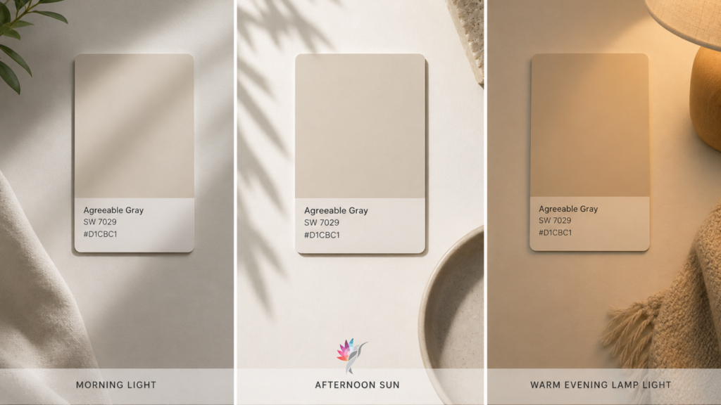
This is why a neutral may look perfectly balanced at noon and noticeably gray at night.
Is the Gray Appearance Always a Problem?
No.
Sometimes the quieter, grayer appearance creates exactly the balance the room needs.
A softer greige such as Elmira White HC-84 Benjamin Moore can calm highly golden flooring and prevent the entire room from feeling overly yellow or orange.
The goal is not always to match the floor’s warmth exactly. It is to create a relationship that looks intentional.
The problem arises when the wall looks disconnected, dull or unexpectedly green—or when the homeowner wants a clearly warm beige and instead sees gray throughout most of the day.
How to Choose a Neutral for Warm Wood Floors
Compare the paint directly with the floor
Do not evaluate the paint chip across the room or against a white wall.
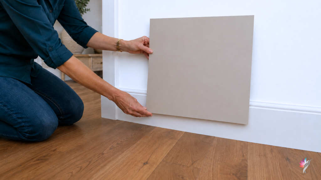
Place a large movable sample vertically near the flooring. You need to see the wall color and floor in the same field of vision.
Compare several nearby neutrals
One sample alone may simply look gray.
When you compare three or four related colors, you can see which one is warmer, cleaner, more muted, greener or more golden.
Comparison is often more revealing than the paint name.
Look at the other fixed materials
Your paint does not need to coordinate only with the floor.
Consider the countertops, backsplash, fireplace, cabinetry and large furnishings. A warmer beige may suit the floor but conflict with cooler stone or tile elsewhere in the room.
The right neutral needs to connect the complete space.
Test it throughout the day
View the sample in morning light, afternoon light and under your artificial lighting.
Do not approve it based on the one hour when it looks its best.
Should You Choose a Warmer Paint?
Possibly—but not automatically.
Choosing a more golden beige may reduce the gray appearance, but it can also make the entire room feel too yellow when combined with warm flooring.
Sometimes the better solution is a muted beige like Elmira White HC-84, taupe or gray such as Agreeable Gray that relates to the wood without repeating its strongest warmth.
The goal is coordination, not duplication.
The Bottom Line
A neutral paint color may appear gray beside warm wood flooring because your eye is comparing the two surfaces.
The warm floor becomes the reference point. By comparison, the wall color looks cooler and more muted.
The paint has not changed. The relationship has.
That is why neutral paint should never be selected from a name, a small chip or an online photograph alone. Test a large sample beside the actual flooring and fixed materials in your home.
Choose the color that creates the best relationship—not the one with the most reassuring label.
Continue reading the Neutral Paint Color Series to better understand how neutral colors behave in real homes:
Hue Family vs. Undertone: What Paint Color Labels Actually Mean
How to Use Paint Hex Codes in AI Renderings
Warm White Paint Colors Compared: Alabaster, Greek Villa, Creamy, Shoji White and White Duck
Modern Beige Paint Colors Compared
How to Narrow a Neutral Paint Shortlist Without Sampling 25 Colors
Ready to take the next step?
You can book an appointment with me for personalized support or schedule a discovery call if you’d like to explore how I can help.
Enjoy this blog?