
Beige is back—but it does not look exactly as it did twenty years ago.
Many of today’s beiges are softer, more muted and less golden. Some sit close to greige. Others feel warmer and more grounded.
The difference is not simply whether a color is called beige, gray or neutral. Its depth, hue family, lighting and surrounding materials all influence how it appears.
Here are five modern beige paint colors compared using both measurable information and commonly observed behavior.
5 Modern Beige Paint Colors Compared
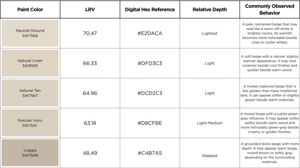
Please note: The above color blocks are according to the hex codes. The actual paint color will look different on your walls when used on a large surface
Modern beige is softer and more muted than the heavy golden beiges many people remember.
Some modern beiges are pale and quiet. Others have more warmth, depth or an earthy quality. None should be judged by the paint name alone.
This comparison looks at five Sherwin-Williams beiges using both measurable information and commonly observed behavior.
Five Modern Beiges at a Glance
The LRV and digital color values are based on Sherwin-Williams’ published color information. Screen colors are references only and should not be used for final paint approval. (Sherwin-Williams)
How These Beiges Differ
Neutral Ground is the lightest option. In a bright room, it may function more like a warm off-white than a true beige.
Natural Linen has slightly more color and warmth. It works well when white feels too stark but you still want the room to remain light.
Natural Tan is quieter and more muted than its name suggests. It offers warmth without the stronger golden appearance associated with older beige palettes.
Grecian Ivory SW 7541 is a softer, more muted beige than Kilim Beige for instance. It has a subtle green-gray quality that keeps it from feeling overly golden or connected to the older Tuscan beige palette. Sherwin-Williams describes it as a green-gray neutral, and its published LRV is 63.18.
Loggia has considerably more depth. It feels closer to stone or earth and can support substantial materials such as brick, wood and natural stone without disappearing.
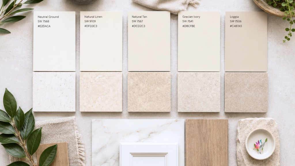
Which Modern Beige Should You Choose?
For a pale, warm result, compare Neutral Ground and Natural Linen.
For a soft, balanced beige, test Natural Tan.
For a quieter, more muted beige with a subtle green-gray quality, consider Grecian Ivory.
For greater depth and a grounded, stone-like effect, look at Loggia.
These descriptions are starting points, not guarantees. A beige beside warm oak may appear quieter or grayer. The same color beside cool tile may suddenly look warmer or more golden.
The paint has not changed. The comparison has.
A Note About the Hex Codes
The hex codes are included as digital references for mood boards and AI renderings. They are not paint formulas.
Use the manufacturer, paint name, number and hex code together when creating an AI rendering. Then use the image to study general direction, placement and depth—not to approve the final paint color.
A physical sample viewed beside your flooring, cabinetry, countertops and trim must make the final decision.
The Bottom Line
Modern beige is not one color.
Neutral Ground is pale and restrained. Natural Linen is softly warm. Natural Tan is muted and balanced. Grecian Ivory is quieter and more subdued, with a subtle green-gray influence. Loggia adds depth and an earthy, stone-like quality.
Do not choose a beige because its name sounds right.
Choose it because you have seen how it behaves with the light and materials in your home.
Continue reading the Neutral Paint Color Series to better understand how neutral colors behave in real homes:
Hue Family vs. Undertone: What Paint Color Labels Actually Mean
How to Use Paint Hex Codes in AI Renderings
Warm White Paint Colors Compared: Alabaster, Greek Villa, Creamy, Shoji White and White Duck
Why Neutral Paint Turns Gray Beside Warm Wood Floors
How to Narrow a Neutral Paint Shortlist Without Sampling 25 Colors
Ready to take the next step?
You can book an appointment with me for personalized support or schedule a discovery call if you’d like to explore how I can help.
Enjoy this blog?


One Response