
Matching vs. Coordinating: Why Your Colors and Finishes Don’t Have to Match
How to combine colors, woods, and materials without making everything look alike. Have you ever searched for a rug that perfectly matches your sofa, or a dining table in exactly the same wood tone as your flooring? It’s understandable. Matching feels safe. But a room doesn’t need identical colors and finishes to feel cohesive. In […]
The Right Order for Making Color and Material Decisions
Why making decisions in the right sequence can prevent costly mistakes and create a more cohesive home. Many design mistakes don’t happen because someone chose the wrong color or material. They happen because decisions were made in the wrong order. A homeowner may fall in love with a paint color before considering the flooring. New […]
The Hidden Role of Contrast in a Well-Designed Interior
When people hear the word contrast, they often imagine black against white or a dark accent wall in a light room. But contrast is much broader than that. It is one of the tools that gives a room definition, depth, hierarchy, and visual interest. Without enough contrast, a room can feel flat. With too much, […]
Why Open-Concept Homes Are Harder to Color Than They Look
Open-concept homes often appear easier to color because there are fewer walls and fewer enclosed rooms. In reality, they can be more difficult. The kitchen, dining area, living room, entry, and hallway may all be visible at once. A color choice made in one area immediately affects the others. The challenge is not simply finding […]
Why Trim Color Changes the Way We Read a Room
Trim is not merely a finishing detail — its color shapes contrast, continuity, proportion, and the way we perceive architecture. Many homeowners choose a wall color first, then default to white trim. In some homes that works beautifully. In others, it introduces more contrast than the room needs, draws attention to features that were never […]
How to Narrow a Neutral Paint Shortlist Without Sampling 25 Colors
Choosing a neutral paint color often starts with good intentions and ends with a wall covered in samples. Beige, greige, taupe, warm white, soft gray—after a while, they all begin to blur together. The solution is not to sample more colors. It is to narrow the field before you start testing. Start With the Room, […]
Hue Family vs. Undertone: What Paint Color Labels Actually Mean
Have you ever looked at a neutral paint color and seen beige, while someone else called it green or gray? Neither person is necessarily wrong. You may be looking at the same color under different lighting, beside different materials or even on different screens. Often, what is being described is not the color alone, but […]
Why Every Color Consultation Is Translation
In The Color Conversation We Were Never Taught to Have, we explored how choosing paint isn’t really about color—it’s about translating emotion into atmosphere. This week, we’re continuing that conversation by decoding the words that often lead homeowners astray. Because when someone says, “I just want something neutral,” they’re rarely talking about paint. They’re talking […]
The Function of Color in a Space: Why Every Color Needs a Purpose
Most people choose color by asking one question: Do I like this color? And honestly, that makes sense. Color feels personal. We are drawn to certain colors because they remind us of something, make us feel comfortable, or simply look beautiful on a paint strip, pillow, cabinet sample, or inspiration photo. But liking a color […]
Beyond Paint: The Real Power of Color in Design
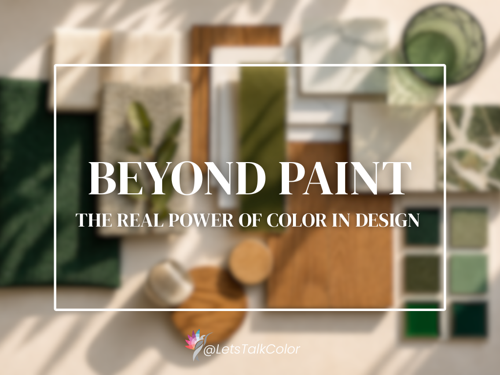
For years, I’ve struggled to talk about the most popular paint colors; the undertones of taupe, gray, or beige, the “perfect” white, the warmest gray. Over the course of my career, I’ve seen that there is so much more to color than just paint. In fact, color has never been just about paint. In my […]