Trim is not merely a finishing detail — its color shapes contrast, continuity, proportion, and the way we perceive architecture.
Many homeowners choose a wall color first, then default to white trim. In some homes that works beautifully. In others, it introduces more contrast than the room needs, draws attention to features that were never meant to stand out, or leaves the space feeling visually fragmented. Trim isn’t just an outline around a room — it changes how the architecture reads.
Trim Can Emphasize Architecture
Contrast between walls and trim draws the eye to doorways, windows, baseboards, crown molding, and other architectural details. That’s an advantage when the trim is substantial, well-proportioned, and worth emphasizing — crisp contrast gives traditional millwork definition and makes details feel intentional.
But contrast highlights every line, not just the good ones. If the trim is narrow, inconsistent, heavily divided, or unremarkable, a bright contrasting color can make those flaws more noticeable than intended. Before creating contrast, ask whether the architecture deserves the attention it will receive.
Trim Can Become a Decorative Element
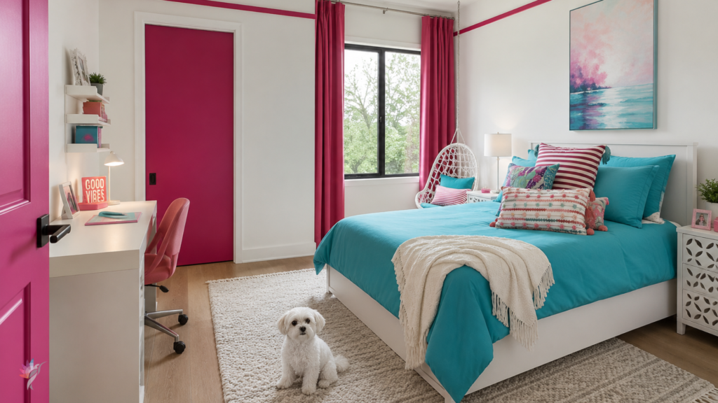
Trim doesn’t have to be neutral. Doors, casings, baseboards, and other painted trim can become intentional color features that reinforce a room’s palette rather than simply frame it. When the trim color is coordinated with the walls, furnishings, textiles, and fixed finishes, it feels purposeful instead of distracting.
In the bedroom shown here, the pink door is a deliberate focal point, while the casing and baseboards match the walls and recede rather than compete for attention. A pink horizontal molding near the ceiling extends the color beyond the door, reinforcing it as an architectural feature rather than an isolated accent — proof that trim can be used selectively, drawing attention where it earns it while letting everything else quietly disappear.
Trim Can Soften Transitions
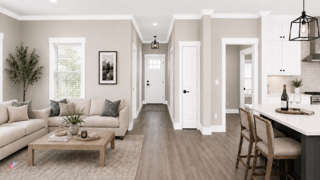
Trim doesn’t have to stand apart from the walls. A softer, closely related trim color makes transitions feel calmer and more connected — especially useful in rooms with many doors, windows, openings, or changes in wall direction. The trim still defines the architecture, just without interrupting the room repeatedly.
In some spaces, painting trim and walls the same color creates an even quieter effect, with the distinction coming from finish rather than color — matte or eggshell walls, for instance, with satin trim. The architectural detail stays visible without a hard outline around every surface.
Contrast Changes Proportion
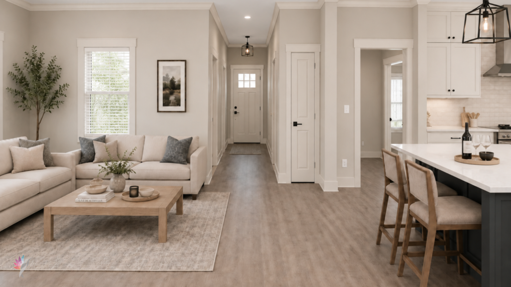
Beyond emphasis, trim color affects how large or defined a room feels. High contrast creates clear boundaries — it sharpens windows, doors, and ceiling lines, but can also chop a small room into many separate shapes. Lower contrast lets the eye move continuously through the space, which can make a room feel calmer and sometimes more expansive.
Neither approach is automatically better. The right choice depends on the architecture and the effect you’re after.
Not All White Trim Is the Same
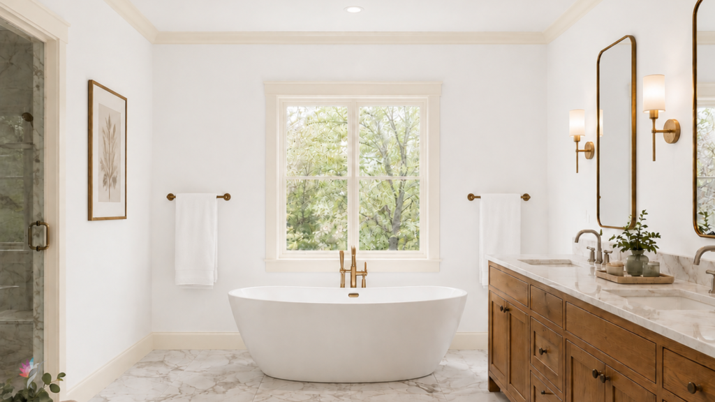
Even when white trim is the right call, the specific white matters. A very bright or cool white can feel disconnected from warm flooring, creamy walls, natural stone, or aged cabinetry; a softer white often creates a more balanced relationship. Trim color should respond to the wall color and fixed elements in the room, not be chosen as a separate, unrelated decision — which is why the same white doesn’t work equally well in every home. The rendered photo below will show that a warmer white such as Alabaster SW7008 against a crisp cool white tile, would be wrong, even if it has been specified throughout the whole house due to its warmer flooring
One Trim Color Doesn’t Have to Run Through the Whole House
Many homes benefit from a consistent trim color, especially in connected spaces — repetition creates continuity and simplifies the palette. But consistency doesn’t mean every painted architectural element needs the same treatment.
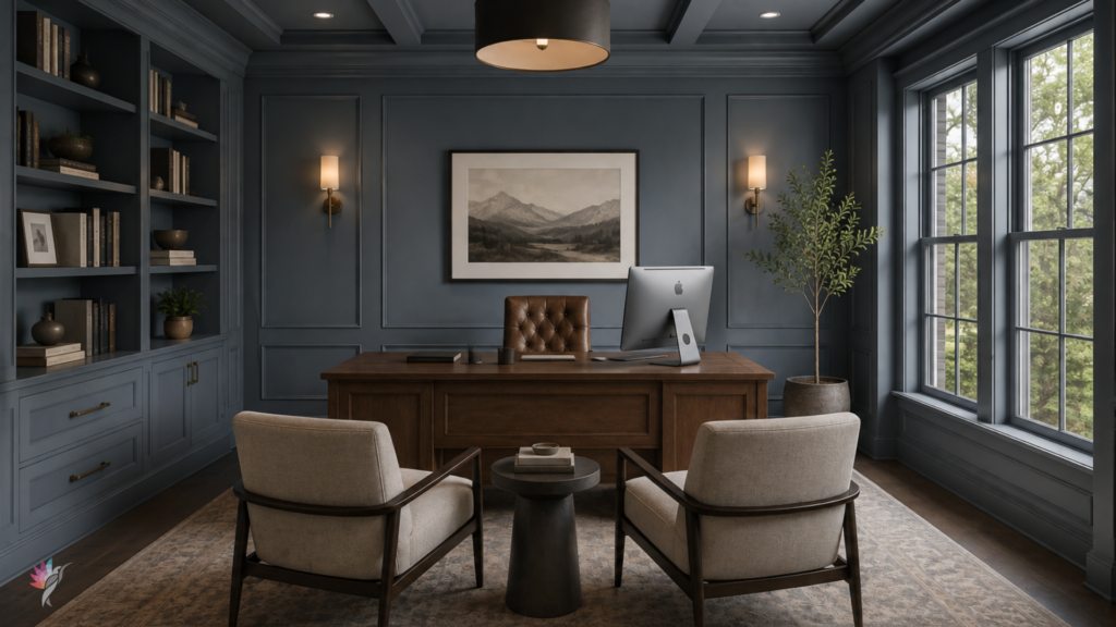
A paneled room, a dark office, a color-drenched bedroom, or a space with distinctive millwork may call for something different — matching trim to the walls, or using a deeper coordinated color, instead of carrying the main white trim through. The question isn’t whether every room matches; it’s whether the choices make sense together.
When Trim Makes a Room Feel Fragmented
Trim creates fragmentation when it introduces too many sharp boundaries. This tends to happen with:
- several doors placed close together
- numerous windows or divided openings
- narrow or builder-grade molding
- open floor plans with many transitions
- bright white trim against mid-tone or deeper walls
- different trim colors used without a clear reason
In these situations, the eye focuses on the outlines instead of the room as a whole. Reducing contrast can help the architecture feel more integrated.
Ask What the Trim Should Do
Before choosing a trim color, decide what role it should play. Should it:
- highlight beautiful architectural detail
- create a crisp frame around the room
- soften transitions
- connect several adjoining spaces
- recede into the wall color
- add depth through a subtle value change
- become a decorative feature that reinforces the room’s palette
- support a more immersive, color-drenched effect
Once the purpose is clear, the color becomes easier to determine.
One Last Thought
Trim color influences more than the look of molding — it shapes visual rhythm, contrast, proportion, and how one space transitions into another. Sometimes it quietly supports the architecture; sometimes it becomes a decorative feature that strengthens the room’s color story. Either can work when it’s intentional and right for the space.
The goal isn’t to make every line stand out. It’s to decide which architectural elements deserve attention — and which should quietly support the room.
A professional color plan considers walls, trim, ceilings, fixed finishes, and connected spaces together. If your home feels visually busy, disconnected, or overly outlined, trim color may be part of the reason.
Ready to take the next step?
You can book an appointment with me for personalized support or schedule a discovery call if you’d like to explore how I can help.
Enjoy this blog?