When people hear the word contrast, they often imagine black against white or a dark accent wall in a light room.
But contrast is much broader than that.
It is one of the tools that gives a room definition, depth, hierarchy, and visual interest.
Without enough contrast, a room can feel flat. With too much, it can feel restless or fragmented.
The most successful interiors usually use several forms of contrast quietly and intentionally.
Contrast Through Value
Value refers to how light or dark a color is.
A room can use colors from the same general hue family and still create contrast through value.
For example, a pale warm neutral wall, medium-toned wood, deeper upholstery, and dark metal accents may create plenty of definition without introducing strong color differences.
Value contrast helps the eye understand what should advance, recede, or become a focal point.
It is often more important than the color name itself.
Contrast Through Texture
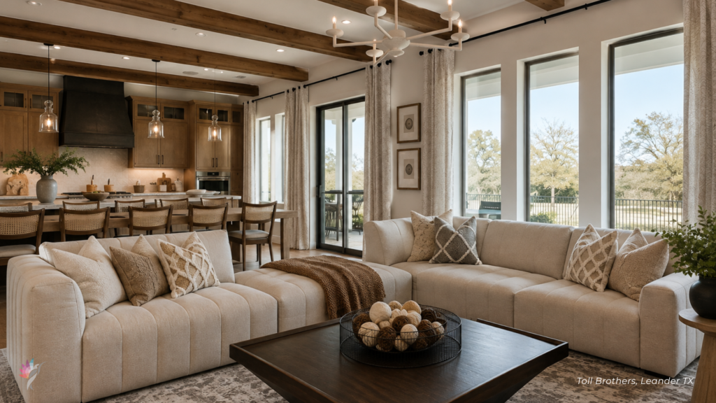
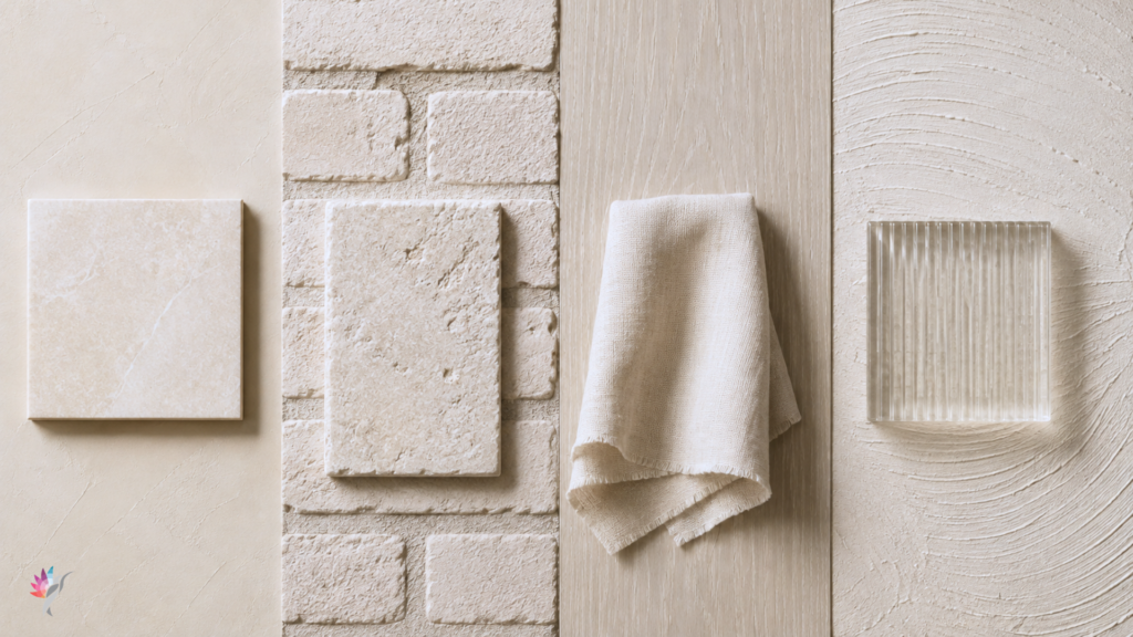
A room filled with similar colors can still feel layered when the textures vary.
Smooth painted walls, woven fabric, natural wood, stone, linen, plaster, and metal all respond to light differently.
Texture creates contrast through surface rather than hue.
This is especially important in neutral interiors. Without changes in texture, a restrained palette can feel unfinished or one-dimensional.
Contrast Through Sheen
The same color can look different in matte, eggshell, satin, semi-gloss, or high-gloss finishes.
Sheen changes how much light the surface reflects.
A wall and trim painted in the same color can still remain visually distinct when the finishes differ. A glossy cabinet against a matte wall creates contrast even if the colors are closely related.
Sheen can add definition without introducing another color.
Contrast Through Material
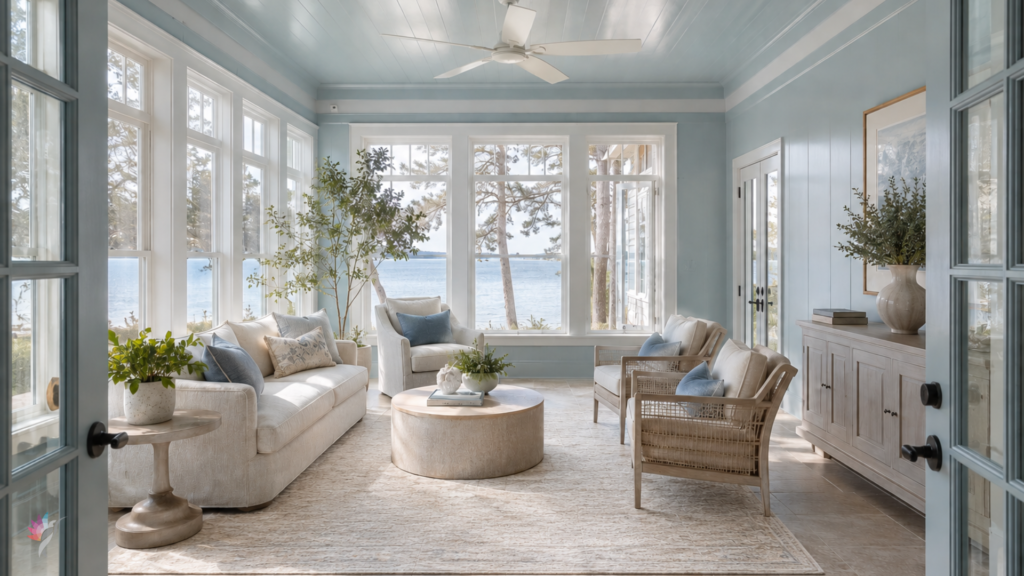
Paint, wood, tile, stone, metal, glass, and fabric each carry their own visual character.
A warm plaster wall beside polished stone creates a different kind of contrast than a painted wall beside rough brick.
Material contrast gives the room depth and prevents every surface from feeling visually equal.
It also allows natural elements to become part of the color story.
Contrast Through Temperature
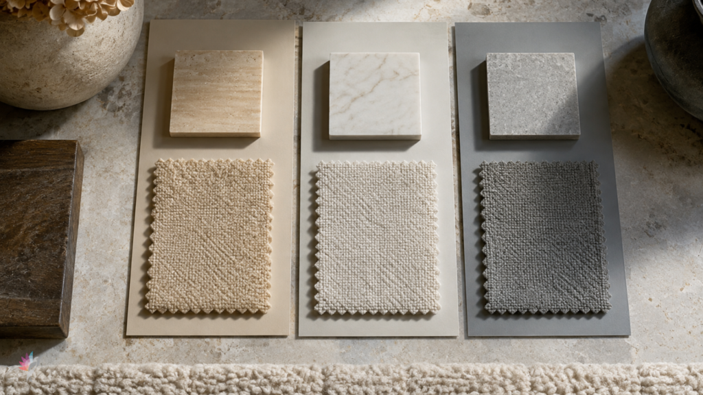
Warm and cool colors can create subtle tension even when their values are similar.
A warm beige beside a cooler blue-gray may feel more contrasting than two colors that are farther apart in value but share the same temperature.
Temperature contrast can be useful, but it must be handled carefully.
When the relationship is intentional, it creates balance. When it is accidental, the room may feel disconnected.
Contrast Through Saturation
Saturation describes the intensity or purity of a color.
A muted green and a saturated green may belong to the same hue family but create very different levels of visual energy.
A mostly muted room can use one more saturated element as a focal point.
This allows color to have impact without overwhelming the entire space.
Contrast Creates Hierarchy
A well-designed room does not ask every element to compete equally for attention.
Contrast helps establish hierarchy.
The strongest contrast usually attracts the eye first. Softer contrasts support the composition and allow quieter elements to recede.
This is why contrast should be placed intentionally.
Ask:
- What should be noticed first?
- What should support the room?
- Which feature deserves emphasis?
- Where does the eye need a place to rest?
More Contrast Is Not Always Better
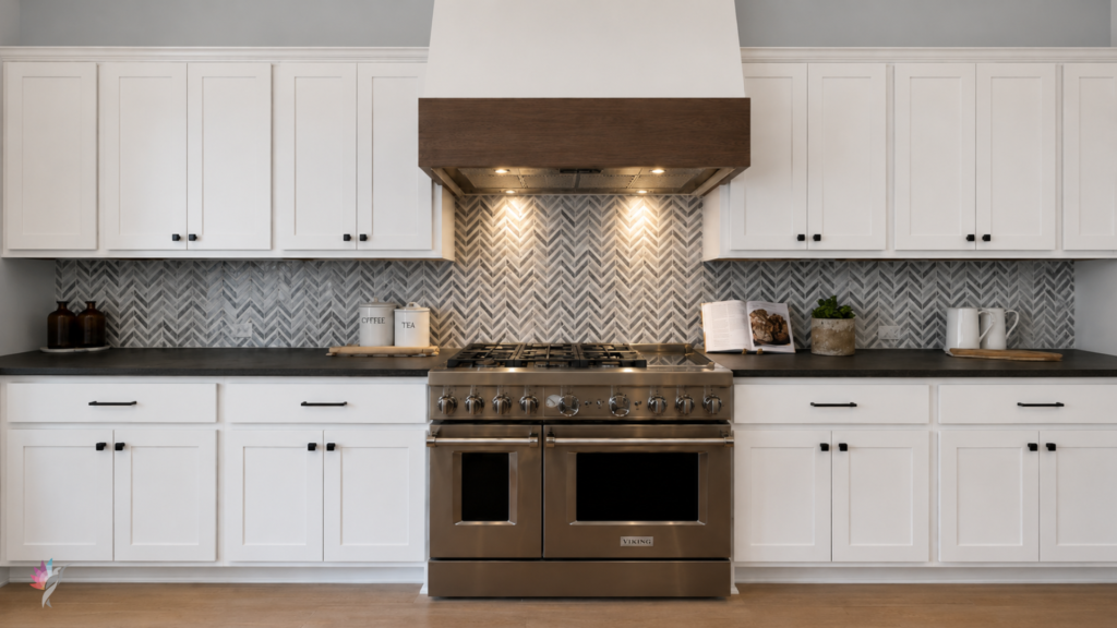
A room with too many competing contrasts can feel unsettled.
Dark trim, strong wall color, patterned tile, reflective metal, bold upholstery, and high-saturation artwork may all be beautiful individually, but together they can compete.
The solution is not to remove all contrast.
It is to establish a clear hierarchy and allow some elements to remain quiet.
Final Thought
Contrast is one of the reasons a room feels layered and complete.
It can come from light and dark, but also from soft and rough, matte and glossy, warm and cool, muted and saturated, natural and refined.
The most effective contrast is rarely random.
It helps the eye understand the room.
A thoughtful color plan considers not only which colors belong together, but how value, finish, material, texture, and saturation create balance throughout the space.
Ready to take the next step?
You can book an appointment with me for personalized support or schedule a discovery call if you’d like to explore how I can help.
Enjoy this blog?