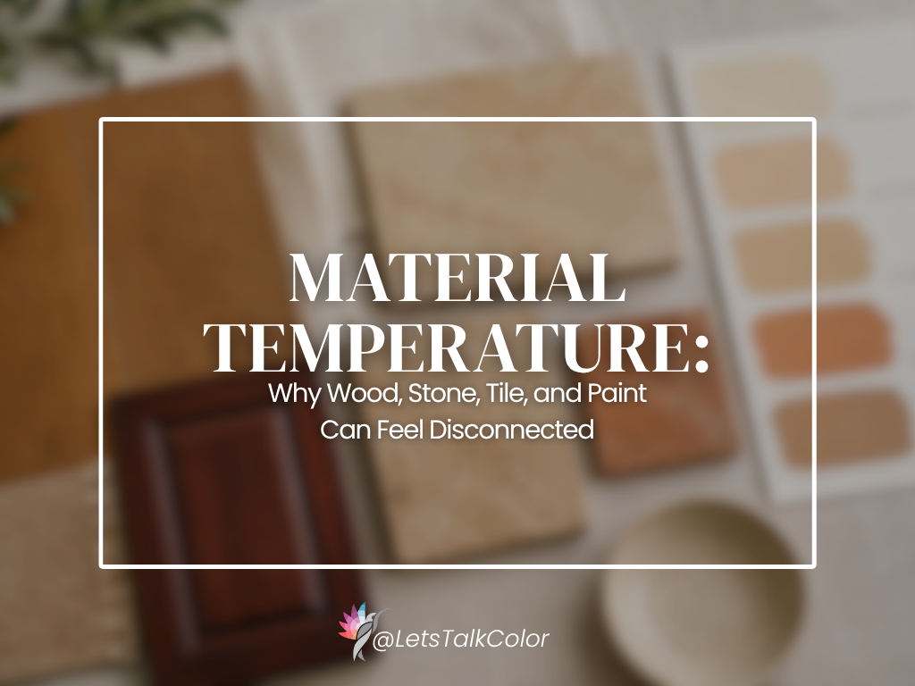
Homeowners often describe a room by saying, “Everything is warm.”
The wood flooring is warm. The stone is warm. The tile is warm. The paint is warm.
And yet the room still feels disconnected.
That is because warmth alone does not create harmony.
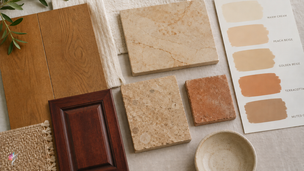
Two materials can both be warm and still have very different color characteristics. One may lean yellow, another orange, another pink or red, and another toward a muted orange-brown. They may technically belong on the warm side of the color spectrum, but that does not mean they naturally support one another.
Warm Is Too Broad a Description
The word “warm” is useful, but it is not specific enough to guide a whole room.
A warm wood floor may contain:
- golden yellow
- honey
- orange
- red
- brown
- muted taupe
A warm stone may lean:
- creamy
- peachy
- softly pink
- yellow
- rust
- earthy brown
A warm tile or paint color can introduce yet another variation.
When these materials are placed together, the question is not simply whether they are all warm. The question is whether their specific warmth is related.
Why Warm Materials Can Still Clash
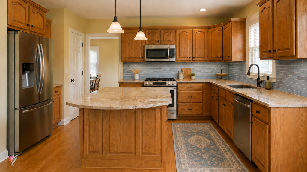
Imagine a kitchen with golden oak flooring, pink-beige stone, cream tile, and a yellowed off-white wall color.
Every element is warm.
But the flooring may pull yellow-orange, the stone may pull pink, the tile may feel creamy, and the wall color may push even more yellow into the room.
Instead of feeling cohesive, the room may feel unsettled because each material is asking the eye to follow a different direction.
The same thing can happen with warm gray tile beside red-brown wood, or creamy stone beside orange-toned cabinetry.
Nothing is technically cool, but the relationships are still weak.
Look Beyond the Main Color
Natural materials are rarely one flat color.
Wood has grain and variation. Stone may contain veins, flecks, and movement. Tile may shift from piece to piece. Paint changes with light.
That means the most obvious color is not always the most useful one.
A countertop may appear mostly cream but contain a quieter taupe-gray that connects more successfully to the flooring. A wood floor may look golden overall but include a subdued brown that offers a better bridge to the stone.
The goal is often to find the color the materials share quietly, not the one that shouts the loudest.
Temperature Is Only Part of the Story
Color temperature matters, but it is only one part of the relationship.
Materials can also differ in:
- value, meaning how light or dark they are;
- saturation, meaning how strong or muted the color appears;
- texture;
- reflectivity;
- pattern and movement;
- visual weight.
A soft, muted stone may feel disconnected from a strongly orange wood floor even though both are warm. The problem may be intensity as much as temperature.
Likewise, a highly reflective tile may appear brighter, sharper, or more visually pronounced beside a matte, earthy surface.
Paint Can Help, but It Cannot Rewrite the Materials
Wall color can improve the relationship between fixed elements, but it cannot completely change their nature.
A well-chosen paint color may:
- soften one material;
- reduce unwanted contrast;
- connect quieter colors found in several finishes;
- keep the room from becoming too yellow, pink, or orange;
- help one material recede.
But paint should not be expected to force unrelated materials into perfect agreement.
Sometimes the best solution is to choose the most balanced bridge color and accept that one material will remain less connected until it can be replaced.
Decide Which Direction Should Lead
When several warm materials compete, one direction usually needs to become dominant.
Ask:
- Which material covers the most area?
- Which one is visible from adjoining rooms?
- Which finish is most permanent?
- Which one does the homeowner genuinely like?
- Which material may eventually change?
- Which color direction best supports the overall home?
A continuous wood floor may need to lead because it runs through several rooms. In another home, a large stone fireplace may carry more visual weight. In a kitchen, cabinetry may dominate the eye more than a lightly patterned countertop.
The answer is not automatic.
Avoid Adding More Warmth Just Because the Room Feels Warm
One common mistake is choosing an even warmer paint color to “work with” warm finishes.
That can intensify the very problem the room already has.
If the wood, stone, and cabinetry are already pulling yellow, orange, or pink, another strongly warm wall color may make the room feel heavy or overly tinted.
Sometimes the better choice is a quieter, more balanced neutral that respects the existing materials without repeating their strongest color.
Balance is not the same as matching.
The Best Question to Ask
Instead of asking:
“Are these materials warm or cool?”
Ask:
“What kind of warmth does each material carry, and do those directions support one another?”
That question is much more useful.
It helps explain why two warm finishes can still feel wrong together—and why the right paint color must respond to more than a simple temperature label.
Final Thought
Warmth is a category, not a complete color description.
Wood, stone, tile, and paint can all be warm while leaning yellow, orange, pink, red, cream, or brown in very different ways.
A cohesive room depends on the relationship between those materials, not on whether they all fit under the same broad label.
A professional color consultation can help identify the specific color characteristics within your fixed materials and determine which direction should lead. The goal is not simply to choose a warm paint color, but to create a palette in which the materials actually support one another.
Ready to take the next step?
You can book an appointment with me for personalized support or schedule a discovery call if you’d like to explore how I can help.
Enjoy this blog?