What to do when your flooring, countertops, tile, stone, and cabinetry do not seem to belong to the same palette
Sometimes you walk into a room in your own home and know something feels off, even if you cannot immediately explain why.
The flooring may look busy or “dirty.” The countertops may read cooler. The backsplash may introduce another color direction, while the cabinetry or stone seems to belong to a completely different palette.
And then comes the question: What color am I supposed to paint the walls?
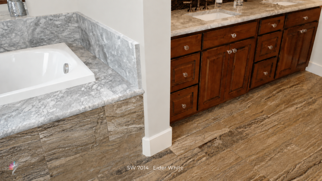
The photograph below is a perfect example. I took it while touring a home several years ago, during the height of the gray trend. The cool gray bathtub surround, heavily patterned warm flooring, reddish-brown cabinetry, creamy countertop, and cool blue-gray wall color are all competing for attention.
None of these materials is necessarily wrong on its own. But this combo was not ideal and is a nightmare to try and solve, especially when working with trends. Have I mentioned to you that I dislike trends! People get completely obsessed with the new shiny thing out there and think paint color will magically fix everything!
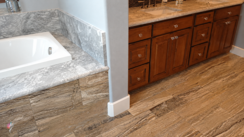
The problem is that they have very little relationship to one another.
When that happens, choosing a wall color is not as simple as finding a neutral that “goes with everything.”
When Your Fixed Elements Compete
Fixed elements are the permanent or difficult-to-change surfaces in your home: flooring, countertops, cabinetry, backsplash tile, fireplace stone, shower tile, and other large architectural finishes.
Ideally, these materials share enough visual characteristics to feel connected. They don’t have to match, but their color families, undertones, temperatures, values, or patterns should have some common ground.
Sometimes they simply don’t.
You might have creamy stone beside cool gray tile, warm flooring against a blue-gray countertop, or golden cabinetry beneath a pink-beige backsplash.
Once several fixed elements start pulling the room in different directions, your wall color cannot make all of them agree.
Paint can reduce contrast, soften a difficult finish, and make a room feel more settled. But it cannot completely correct a collection of unrelated materials.
First, Decide What Is Staying
Before choosing a paint color, think about whether any of your fixed elements are likely to change.
Perhaps you want to replace the flooring in two years, repaint the cabinetry later, or update the countertops when the budget allows.
Those plans matter.
If you already know you dislike your backsplash and intend to replace it, it probably shouldn’t dictate the entire color palette today.
Instead, your current paint color can support the finishes that are staying, minimize those you like less, and leave enough flexibility for future updates.
The goal is to avoid solving today’s problem by creating another one tomorrow.
What Should Lead the Color Direction?
You may have heard that you should always choose paint colors based on the most permanent or expensive material in the room.
That’s a useful starting point, but it isn’t an absolute rule.
An expensive countertop may occupy relatively little visual space, while flooring may continue through the kitchen, living room, entry, and hallway.
Usually, the material that deserves the greatest influence is the one with the strongest combination of visual presence, permanence, connection to surrounding rooms, and likelihood of remaining long-term.
Your own preferences matter too.
Which finish would you choose again?
Which one are you simply tolerating?
Which one feels closest to where you eventually want to take your home?
If you love your flooring but cannot wait to replace your backsplash, don’t let the backsplash dictate your entire palette simply because it has the strongest undertone.
Look for the Common Ground
Even when fixed elements compete, there may be a quieter connection between them.
It could be a secondary color running through the countertop and flooring, a muted quality shared by several materials, or a neutral found in both the flooring and stone.
This is often where I begin looking for the wall color.
You do not necessarily want to match the most obvious color in a countertop, tile, or stone.
That dominant vein, stripe, or fleck may already have enough visual presence. A quieter supporting color can sometimes create a much better bridge between competing materials.
Decide What Should Stand Out—and What Should Recede
Not every fixed element deserves equal attention.
If you love your flooring but dislike your backsplash, you don’t want your wall color making the backsplash even more noticeable.
A carefully selected color can strengthen the material you want to emphasize while allowing another to become less visually dominant. It may help warm cabinetry appear less yellow, cool tile feel less disconnected, or a busy countertop become less prominent.
Ask yourself:
What do I want my eye to notice first—and what would I rather allow to fall into the background?
That question is far more useful than asking which paint color “matches everything.”
Don’t Add Another Competing Neutral
When a room already contains several unrelated neutrals, bringing in another beige, gray, cream, or taupe can make the problem worse.
A paint color may look perfectly harmless on a paint chip while introducing yet another undertone the room didn’t need.
When your fixed elements are already competing, restraint matters.
Your wall color should create a bridge, not become another voice competing for attention.
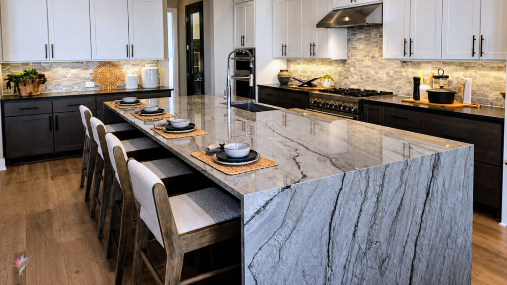
Consider What You See From the Next Room
Your kitchen or dining room doesn’t exist in isolation.
Does the flooring continue into another space? Can you see the cabinetry from the living room? Is the fireplace visible from the entry?
A wall color that appears to solve one difficult room can create a new problem in the adjoining space.
This is why whole-home color decisions should consider what you experience together, not simply what exists within four walls.
The best solution may not perfectly favor every finish. It should create the most convincing relationship across the connected spaces.
Sometimes There Is No Perfect Paint Color
When fixed elements don’t work together, there may not be a perfect paint color.
That doesn’t mean you’re choosing incorrectly. It may mean you’re asking paint to solve a problem created by the permanent materials.
In that situation, change the goal.
Use color to reduce the strongest conflict, support the materials you value most, create continuity between connected rooms, and avoid emphasizing finishes you eventually plan to replace.
Sometimes success isn’t making everything coordinate perfectly.
It’s creating enough visual order that the room finally feels calmer and more intentional.
Final Thought
When the fixed elements in your home compete, don’t begin by asking:
“Which color appears most often?”
Instead, ask:
What is staying? What may change? Which material has the greatest visual influence? What do I want to emphasize—and what would I rather allow to recede?
Sometimes the flooring should lead. Sometimes it’s the countertop, cabinetry, tile, or stone.
And sometimes the best solution is not allowing any one material to dominate, but finding the quieter common ground that helps several imperfectly coordinated finishes live together more successfully.
Need Help Finding That Common Ground?
When your home’s fixed elements are pulling the palette in different directions, choosing another neutral and hoping it works can make the problem even more complicated.
A professional color consultation can help determine which finishes should guide your palette, which ones can be visually softened, and how to create a color plan that works now while considering the updates you may make later.
Ready to take the next step?
You can book an appointment with me for personalized support or schedule a discovery call if you’d like to explore how I can help.
Enjoy this blog?