One of the most common questions I hear during a color consultation is:
“Where should this color stop?”
The question often comes up in homes with open doorways, arches, partial walls, columns, soffits, or ceilings that continue from one space into another.
These architectural transitions can make paint placement feel surprisingly complicated. I have to deal with it all the time due to the Texas Builder style. 99.8% of the homes I work in, are open concept houses! A color may work beautifully in one room, but the moment it reaches an open doorway or shared wall, the homeowner is no longer choosing only a color. They are deciding where one space visually ends and another begins.
Start With the Architecture
Color should usually stop where the architecture gives it a natural reason to stop.
A full wall return, an inside corner, a substantial doorway casing, or a clear change in ceiling height can create a logical transition point.
Problems often arise when the paint change feels arbitrary.
Stopping a color in the middle of a flat wall, on the face of an arch, or along a line that has no architectural support can make the transition look unfinished or accidental.
The goal is to make the color placement feel as though it belongs to the structure of the house.
Archways and Open Doorways
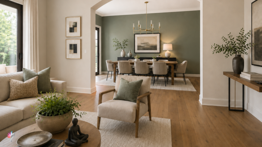
An archway or open doorway may connect two rooms, but it also creates a visual threshold.
Before changing colors, decide which room the opening belongs to.
In many cases, the inside surface of the opening should remain with the room from which it is most visible. In other situations, carrying one color through the entire opening creates a cleaner transition.
The right choice depends on:
- the depth of the opening;
- whether it has trim;
- which room is visually dominant;
- the direction from which it is most often viewed;
- whether the adjoining colors are closely related or strongly contrasting.
A thin, open arch may not provide enough visual separation for two very different colors. A deeper opening may create a more natural boundary.
Shared Ceilings
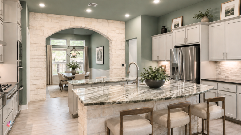
Shared ceilings can complicate room transitions because the walls may suggest separate spaces while the ceiling connects them.
If the ceiling runs continuously through several rooms, changing its color without a clear architectural break can make the change feel abrupt.
In many open layouts, one ceiling color creates continuity even when the wall colors vary.
However, a dropped ceiling, beam, soffit, tray, or change in height may provide an opportunity to treat the ceiling differently in one area.
The transition should follow the architecture rather than an imaginary line.
Soffits and Bulkheads
Soffits are often treated as an afterthought, but their color can influence how the room is perceived.
Painting a soffit the wall color can make it feel like part of the vertical architecture. Painting it the ceiling color can help it visually recede.
Neither option is automatically correct.Ask what you want the soffit to do:
- disappear;
- connect to the ceiling;
- reinforce a cabinet wall;
- frame a dining or kitchen area;
- become part of a larger architectural feature.
The decision should be based on function and visual weight.
Columns and Partial Walls
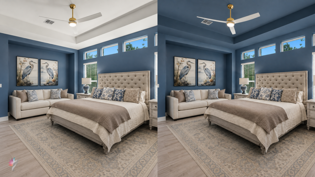
Columns and partial walls often sit between spaces rather than fully belonging to one room.
Painting them in a sharply contrasting color can draw attention to their shape and interrupt the visual flow.
In many cases, they work best in the main connecting color of the surrounding spaces.
However, a substantial column with strong architectural presence may support a deliberate accent color if that choice is repeated elsewhere and has a clear purpose.
A partial wall should also be considered from both sides. The color may look appropriate from one room but awkward from the other.
Rooms Without Clear Boundaries
Open floor plans often contain several functional areas without obvious architectural stopping points.
The dining area may flow into the living room. The kitchen may share walls with both. A hallway may open directly into the main space.
In these situations, forcing a different color into every functional zone can make the home feel divided.
Sometimes the better solution is to use one main wall color and create distinction through:
- furnishings;
- lighting;
- rugs;
- ceiling treatments;
- cabinetry;
- texture;
- artwork;
- a carefully placed accent wall.
Not every change in function requires a change in paint color.
Check the Sightlines
Before finalizing any transition, walk through the house and look at it from several directions.
A paint break should make sense from the entry, the adjoining room, the hallway, and the main seating area.
What appears logical from one angle may look awkward from another.
This is especially important with archways, partial walls, and columns because they are often seen from multiple spaces at once.
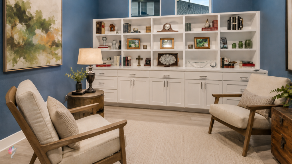
A successful paint transition does not call attention to itself.
It feels supported by the architecture and allows the eye to move comfortably from one space to another.
When deciding where a color should stop, do not begin with the paint chip.
Begin with the structure.
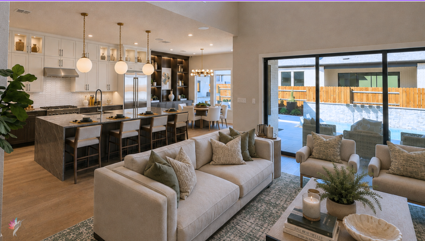
A whole-home color plan considers not only which colors to use, but exactly where each one should begin and end. Thoughtful placement can make the difference between a home that feels connected and one that feels visually fragmented.
Ready to take the next step?
You can book an appointment with me for personalized support or schedule a discovery call if you’d like to explore how I can help.
Enjoy this blog?