
How to Narrow a Neutral Paint Shortlist Without Sampling 25 Colors
Choosing a neutral paint color often starts with good intentions and ends with a wall covered in samples. Beige, greige, taupe, warm white, soft gray—after a while, they all begin to blur together. The solution is not to sample more colors. It is to narrow the field before you start testing. Start With the Room, […]
Why Neutral Paint Turns Gray Beside Warm Wood Floors
You choose a warm beige or greige because you want the room to feel soft and inviting. Then you place the sample beside your honey oak, golden maple or warm brown flooring—and suddenly the paint looks gray. What happened? The paint did not change. The comparison did. Color Is Always Seen in Context We rarely […]
5 Taupe Paint Colors Compared
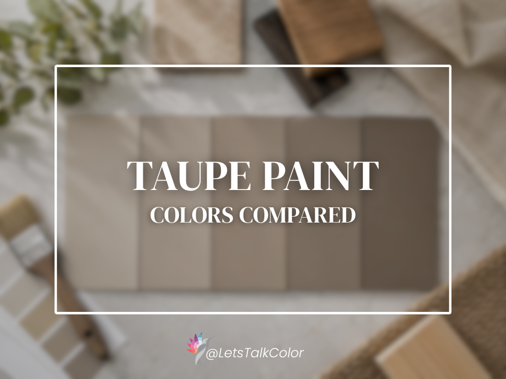
Taupe is often described as a mixture of beige and gray, but that definition does not tell the whole story. Some taupes are light and softly muted. Others have more brown, gray or earthy depth. Their appearance can shift considerably depending on the flooring, fixed materials and lighting around them. Here are five Sherwin-Williams taupe […]
5 Greige Paint Colors Compared
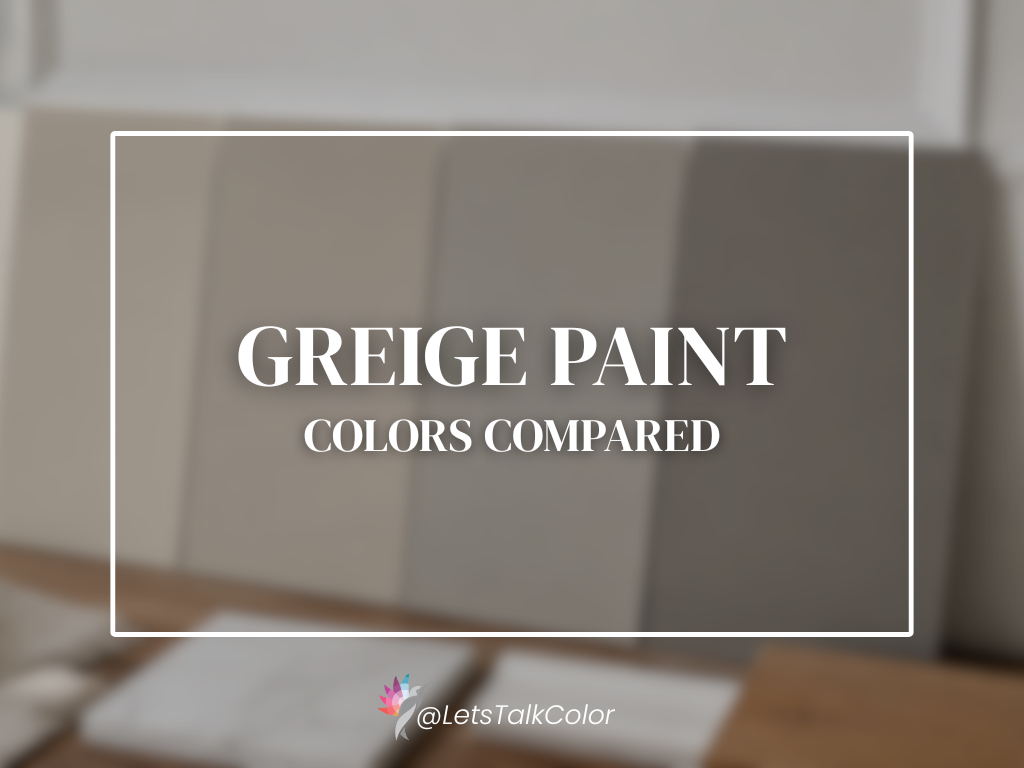
Greige sits between gray and beige—but not every greige creates the same result. Some appear light and softly warm. Others look more grounded, earthy or noticeably gray. Their depth, hue family and surrounding materials all influence what you see. Here are five Sherwin-Williams greiges compared using measurable information and commonly observed behavior. Five Greige Paint […]
5 Modern Beige Paint Colors Compared
Beige is back—but it does not look exactly as it did twenty years ago. Many of today’s beiges are softer, more muted and less golden. Some sit close to greige. Others feel warmer and more grounded. The difference is not simply whether a color is called beige, gray or neutral. Its depth, hue family, lighting […]
Warm White Paint Colors Compared: Alabaster, Greek Villa, Creamy, Shoji White and White Duck
Warm white sounds like a simple category—until you place several warm whites beside one another. One may look soft and balanced. Another may appear creamier, more muted or almost beige. The differences are often subtle on a paint chip but much more noticeable across an entire room. This comparison looks at five popular Sherwin-Williams warm […]
How to Use Paint Hex Codes in AI Renderings
AI renderings have become an incredibly useful way to explore paint colors before picking up a brush. By combining a paint manufacturer’s color information with a digital hex code, you can ask an AI image generator to visualize a room in seconds. The key is understanding what AI can—and cannot—tell you about color. Using AI […]
Hue Family vs. Undertone: What Paint Color Labels Actually Mean
Have you ever looked at a neutral paint color and seen beige, while someone else called it green or gray? Neither person is necessarily wrong. You may be looking at the same color under different lighting, beside different materials or even on different screens. Often, what is being described is not the color alone, but […]
Why Every Color Consultation Is Translation
In The Color Conversation We Were Never Taught to Have, we explored how choosing paint isn’t really about color—it’s about translating emotion into atmosphere. This week, we’re continuing that conversation by decoding the words that often lead homeowners astray. Because when someone says, “I just want something neutral,” they’re rarely talking about paint. They’re talking […]
The Color Conversation We Were Never Taught to Have

Why Choosing Paint Colors Is Harder Than It Looks “I’m such a blue person. I just love blue-greens!” Recently, I worked with a wonderful client who wanted her Texas lake house kitchen to feel happy and connected to nature. She wasn’t looking for a coastal-themed home. She simply wanted a space that felt calm, fresh, […]