Why Choosing Paint Colors Is Harder Than It Looks
“I’m such a blue person. I just love blue-greens!”
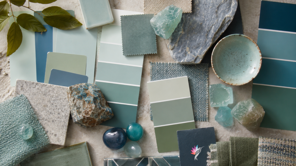
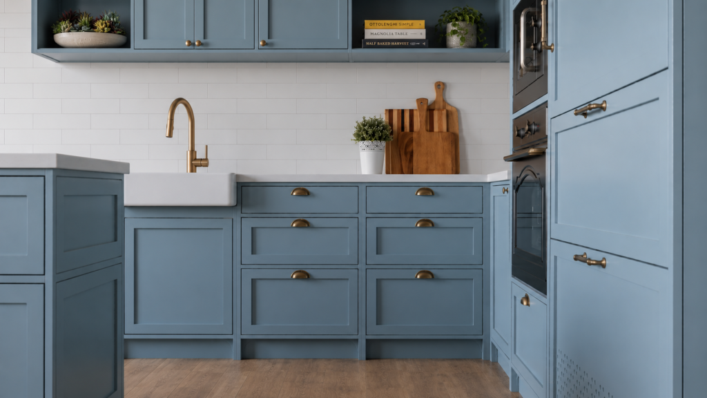
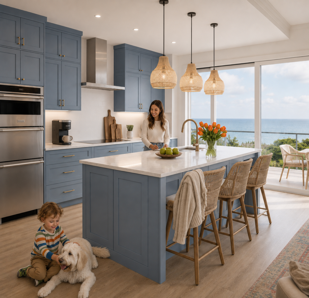
Recently, I worked with a wonderful client who wanted her Texas lake house kitchen to feel happy and connected to nature. She wasn’t looking for a coastal-themed home. She simply wanted a space that felt calm, fresh, and inspired by the water outside her windows.
As we looked through paint samples, she kept describing what she didn’t want.
“Not turquoise.”
“Not teal.”
“Not too green.”
“Not too gray.”
“I’m definitely a blue person.”
Every sample solved one concern but created another. One felt too gray. Another looked too bright. A blue-green leaned too green, while one cleaner version reminded her husband of Pepto-Bismol.
That’s when I realized something.
We weren’t really talking about paint colors.
We were trying to translate a feeling and a memory into color — and that’s a conversation most of us were never taught to have.
Why Choosing Paint Colors Feels So Overwhelming
Most homeowners think they’re choosing between blue, green, gray, or beige. In reality, they’re trying to answer a much bigger question:
How do I want this room to feel?
Words like peaceful, airy, cozy, fresh, and soft describe an emotional experience; not a paint color.
That’s why choosing paint can feel so overwhelming. We often use color names to describe emotions when what we’re really searching for is an atmosphere.
Why the Same Paint Color Looks Different in Every Room
One of the biggest misconceptions in interior design is believing that a paint color behaves the same way everywhere.
It doesn’t.
During our consultation, she asked if we could recreate the custom color she loved in her bathroom for the kitchen. My answer surprised her.
Even if we used the exact same paint, it wouldn’t look the same.
Every room creates a different environment for color.
Paint responds to everything around it, including:
- The direction your windows face
- Morning versus afternoon sunlight
- The season of the year
- The color temperature of your light bulbs
- Cabinet finishes
- Flooring, countertops, and backsplashes
- Furniture and adjacent rooms
- Even the trees, water, or sky outside your windows
This is what I often call color in context.
No paint color exists in isolation. Every surrounding surface quietly influences how we perceive it. That’s why a color that feels calm in one room may suddenly appear brighter, cooler, or flatter in another.
Pinterest Can’t Show You Your Home
Clients often show me beautiful inspiration photos from Pinterest or Houzz and ask,
“Can we make my kitchen look like this?”
The answer is…Maybe.🤷♀️
But not because of the paint color alone.
Those beautiful photos don’t show you the room’s natural light, surrounding materials, camera settings, or photo editing—all of which dramatically influence how color appears. You’re looking at a beautifully photographed moment, not necessarily a color that will behave the same way in your own home.
That’s why copying paint colors from social media so often leads to disappointment.
Why Color Names Don’t Tell the Whole Story
During this consultation, we explored colors like Benjamin Moore Mount Saint Anne, Beach Glass, Quiet Moments, Sherwin-Williams Sea Salt, and several soft blue-grays.
None of them were wrong.
Each one simply behaved differently within the context of her kitchen. Some leaned grayer, some reflected more blue, and others became noticeably more colorful as the natural daylight changed.
The challenge wasn’t finding a better paint color.
The challenge was understanding what the room — and the client — needed.
Color Is About More Than Hue
As color consultants, we often think in terms of hue, value, and chroma.
Most homeowners don’t.
They simply know when something feels right—or when it doesn’t.
When someone says; “I’m a blue person,”
they’re often really saying:
- I want my home to feel calm.
- I don’t want it to feel cold.
- I want softness.
- I want to feel happy here
- I don’t want to feel overwhelmed.
- I want to enjoy walking into this room every day.
Those are emotional goals—not color descriptions.
And that’s where a color consultant comes in!
People often assume my job is to recommend paint colors. That’s certainly part of it. But my real job is translating emotions, architecture, natural light, and fixed finishes into a color palette that works together beautifully.
Sometimes that means helping clients discover that the color they thought they wanted isn’t actually what they’re looking for.
And sometimes it means realizing that the perfect paint color isn’t a specific shade at all.
It’s the one that creates the feeling they were searching for all along.
If there’s one lesson I’d like homeowners to remember, it’s this:
Don’t start with the paint color. Start with the feeling.
Once you know how you want a room to feel, choosing the right color becomes much easier.
Because paint isn’t just about blue, green, gray, or beige.
It’s about creating a home that supports the way you want to live.
Ready to take the next step?
You can book an appointment with me for personalized support or schedule a discovery call if you’d like to explore how I can help.
Enjoy this blog?