The ceiling is often the largest uninterrupted surface in a room, yet it is frequently given the least consideration.
Many homeowners choose the wall color carefully and then default to a standard white overhead.
Sometimes white is the right choice. But the ceiling affects far more than brightness. It influences visual height, intimacy, continuity, contrast, and the way light moves through the room.
The ceiling is not simply a background. It is the fifth wall.
White Is Not the Only Neutral Choice
A white ceiling can create a clean visual break and help the ceiling feel separate from the walls.
However, a stark white ceiling may feel disconnected from warm wall colors, natural materials, or a softer overall palette.
A related off-white or a lighter version of the wall color can create a more integrated result without making the ceiling feel noticeably colored.
The goal is not to avoid white. It is to choose it intentionally.
Ceiling Color Changes Perceived Height
Lighter ceiling colors generally reflect more light and can make the ceiling feel more open.
Deeper ceiling colors can bring the visual plane downward, creating greater intimacy.
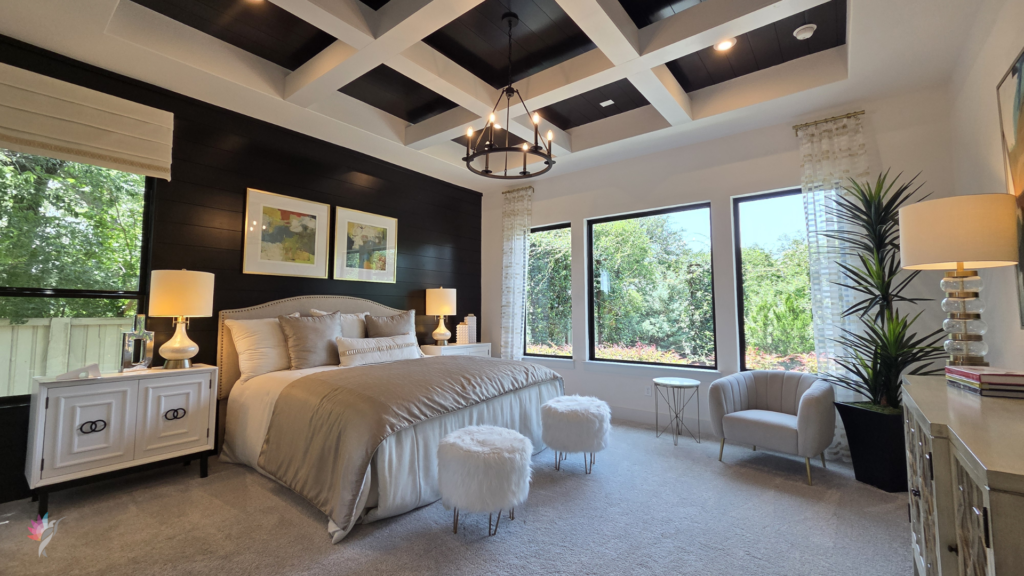
That does not automatically mean a dark ceiling will make a room feel unpleasantly small. In a tall room, a deeper ceiling can improve proportion and make the space feel more grounded.
In a bedroom, dining room, library, or powder room, that sense of enclosure can feel inviting rather than restrictive.
The effect depends on the room’s height, scale, lighting, and purpose.
Continuity Between Walls and Ceiling
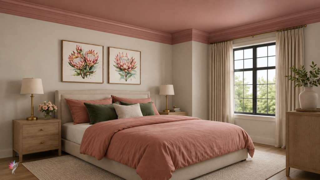
Painting the ceiling and walls the same color reduces the visual break between them.
This can create an immersive, uninterrupted effect, especially when the architecture is simple or the room has an irregular ceiling line.
Using the same color also prevents the eye from stopping at a sharp horizontal boundary.
A lighter version of the wall color can offer a softer form of continuity, while a contrasting ceiling creates a more defined architectural statement.
Each approach changes the way the room is experienced.
Color Capping
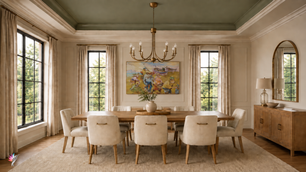
Color capping uses a related or intentional color across the ceiling to complete the room rather than leaving the upper surface disconnected.
The ceiling may match the walls, deepen them, soften them, or introduce a coordinated hue.
This technique can:
- visually complete a saturated room;
- make a tall room feel more balanced;
- strengthen a monochromatic palette;
- define a space within an open plan;
- add atmosphere without introducing more wall colors.
The ceiling becomes part of the composition rather than a blank area above it.
Reflective Light Matters
Ceiling color influences the light that returns into the room.
A bright white ceiling reflects light differently from a warm cream, muted blue, soft green, or deeper neutral.
That reflected color can subtly affect the appearance of the walls, furnishings, and skin tones below.
Natural light, artificial light, paint finish, and ceiling color all interact.
This is why a ceiling color should be tested in the room rather than selected from a small chip alone.
Ceiling Color Can Define a Zone
In an open floor plan, the ceiling may help define a dining area, kitchen, entry, or seating zone without changing every wall color.
A tray ceiling, beam, soffit, or change in height provides a natural opportunity for a different treatment.
This can create visual separation while preserving continuity through the rest of the space.
Consider the Paint Finish
Ceilings are typically painted in a flat finish because it reduces glare and helps disguise minor surface imperfections.
However, specialty finishes, subtle sheen, plaster, limewash, or reflective treatments can add depth when used intentionally.
The finish affects how the ceiling receives and reflects light, so it should be considered along with the color.
Ask What the Ceiling Needs to Do
Before defaulting to white, ask:
- Should the room feel taller or more intimate?
- Should the ceiling disappear or become part of the design?
- Does the room need continuity or contrast?
- Is the ceiling connecting several spaces?
- Will the color reflect flattering light?
- Does the architecture provide an opportunity for color capping?
The answer may still be white. But it should be a “considered white”
Final Thought
The ceiling influences the room even when no one consciously notices it.
It can expand, contain, unify, soften, or complete a space.
Treating it as part of the color plan allows the room to feel more resolved from floor to ceiling.
A complete color consultation should include the ceiling, walls, trim, lighting, and fixed materials together. The fifth wall deserves more than a default answer.
Ready to take the next step?
You can book an appointment with me for personalized support or schedule a discovery call if you’d like to explore how I can help.
Enjoy this blog?