Choosing a neutral paint color often starts with good intentions and ends with a wall covered in samples.
Beige, greige, taupe, warm white, soft gray—after a while, they all begin to blur together.
The solution is not to sample more colors.
It is to narrow the field before you start testing.
Start With the Room, Not the Paint Deck
Before looking at paint colors, identify what is staying in the room.
Pay attention to:
- Flooring
- Countertops
- Cabinetry
- Tile or stone
- Upholstery
- Trim color
- Natural and artificial light
These materials already create a color direction.
Your paint color does not need to match them exactly, but it does need to create an intentional relationship with them.
Choose the Right Neutral Family
Do not begin with twenty random neutrals.
First decide which broad family makes the most sense for the room:
Warm white: light, soft and subtle
Beige: warmer and visibly richer (more chromatic)
Greige: balanced between beige and gray
Taupe: muted, earthy and often brown-gray
Warm gray: cooler-looking but still softened by brown or beige influence
This first decision can eliminate most of the paint deck.
Decide How Much Depth/Value You Need
Next, ask whether the room needs a pale neutral or something more grounded.
A very light color may work well when you want an open, quiet feeling. A deeper neutral may connect better with substantial stone, wood or cabinetry.
Compare Colors Side by Side
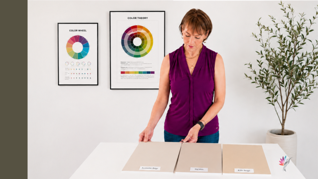
Never judge one neutral alone.
Place three or four related colors beside one another. Comparison makes the differences easier to see.
One may look more golden. Another may appear greener, grayer, cleaner or more muted.
This is far more useful than relying on the paint name or a single online photograph.
Remove the Obvious Mismatches
You do not need to analyze every sample equally.
Eliminate any color that:
- Looks too yellow beside the floor
- Turns noticeably green near the cabinetry
- Feels too gray beside warm materials
- Creates too much or too little contrast with the trim
- Looks dull in the room’s natural light
You are not looking for perfection yet. You are removing the colors that clearly do not belong. Trust your gut!
Limit the Final Shortlist
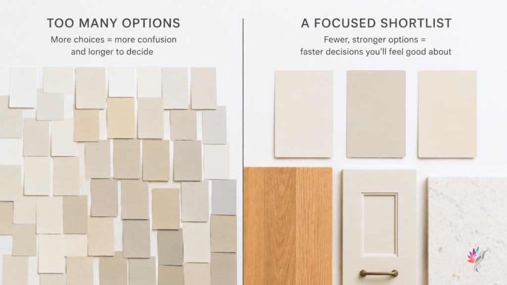
Your final shortlist should usually contain no more than three or four colors.
If you still have ten options, the colors are probably too similar—or the room’s direction has not been clearly defined.
At this stage, choose large movable samples rather than painting many small squares directly on the wall.
A large sample gives you a better sense of the color and can be moved around the room.
Test the Samples Where They Matter
View each sample:
- Beside the flooring
- Near the countertops
- Next to the cabinetry
- Against the trim
- On more than one wall
- In morning, afternoon and evening light
A neutral that looks beautiful in one corner may feel completely different near a large window or beside the floor.
Do not approve it based on the one moment when it looks its best.
Do Not Let the Name Make the Decision!
You are NOT painting the name! Paint names can be misleading.
A color called gray may behave more like beige. A beige may appear taupe. A warm white may look creamy beside crisp trim.
Use the name to identify the product—not to predict the result.
Know When the Color Is Good Enough
Homeowners often keep sampling because they are waiting for one color to look perfect at every hour of the day.
That rarely happens. Color shifts!
A successful neutral should:
- Coordinate with the fixed materials
- Support the room’s light
- Avoid unwanted color shifts most of the day
- Create the overall feeling you want
- Still look intentional as the light changes
The goal is not a color that never moves. The goal is a color whose movement still works in the room.
The Bottom Line
You do not need to sample 25 neutral paint colors. (I witnessed a 56 -yes, 56! collection of sampling whites! Crazy!) 😖
Start with the fixed materials. Choose the most appropriate neutral family. Decide how much depth the room needs. Compare a small group side by side, remove the obvious mismatches and test only the strongest three or four candidates.
A thoughtful shortlist will teach you far more than a wall full of random samples.
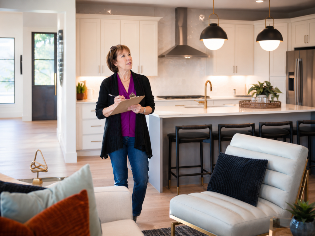
And when the room contains several competing materials, unusual lighting or an open floor plan, a professional color consultation can help narrow the choices before the sampling process becomes expensive and overwhelming.
Continue reading the Neutral Paint Color Series to better understand how neutral colors behave in real homes:
Hue Family vs. Undertone: What Paint Color Labels Actually Mean
How to Use Paint Hex Codes in AI Renderings
Warm White Paint Colors Compared: Alabaster, Greek Villa, Creamy, Shoji White and White Duck
Modern Beige Paint Colors Compared
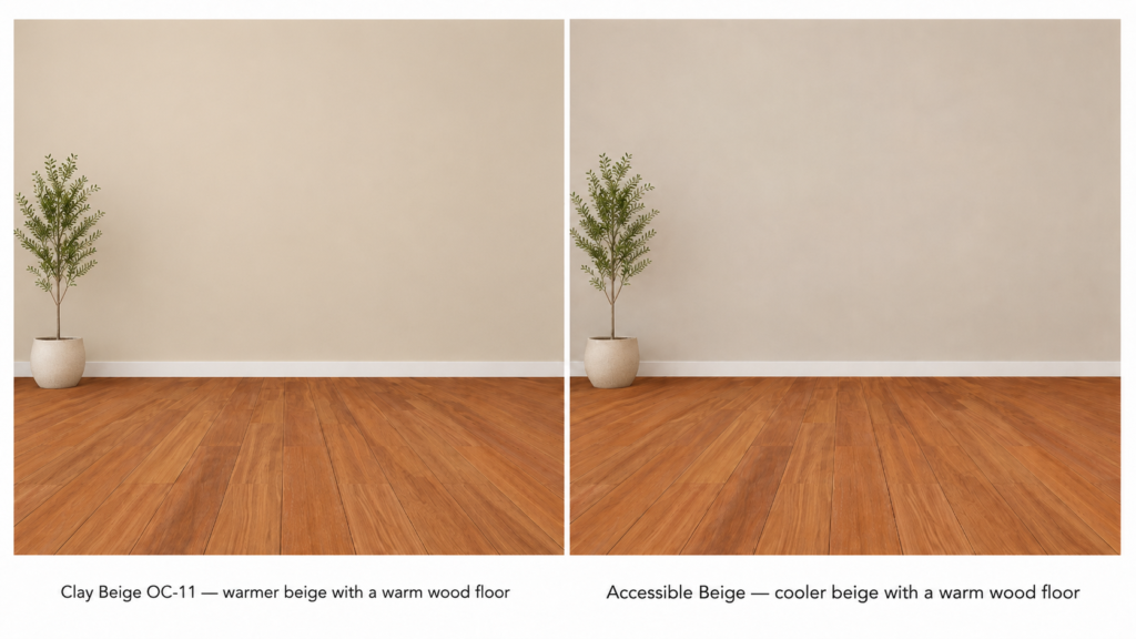
Why Neutral Paint Turns Gray Beside Warm Wood Floors
Ready to take the next step?
You can book an appointment with me for personalized support or schedule a discovery call if you’d like to explore how I can help.
Enjoy this blog?