Have you ever looked at a neutral paint color and seen beige, while someone else called it green or gray?
Neither person is necessarily wrong.
You may be looking at the same color under different lighting, beside different materials or even on different screens. Often, what is being described is not the color alone, but how it appears under a particular set of conditions.
That is the difference between hue family and undertone. The terms are often used interchangeably, but they do not mean the same thing.
Hue Family: A Measurable Classification
Hue family identifies where a color belongs within the color spectrum.
Even a muted white, beige, taupe or gray belongs to a hue family, although it may not be obvious at first glance.
Color professionals often use systems such as Munsell, which describes color through three attributes:
Hue: the color family
Value: how light or dark the color is
Chroma: how strong, colorful or muted it is
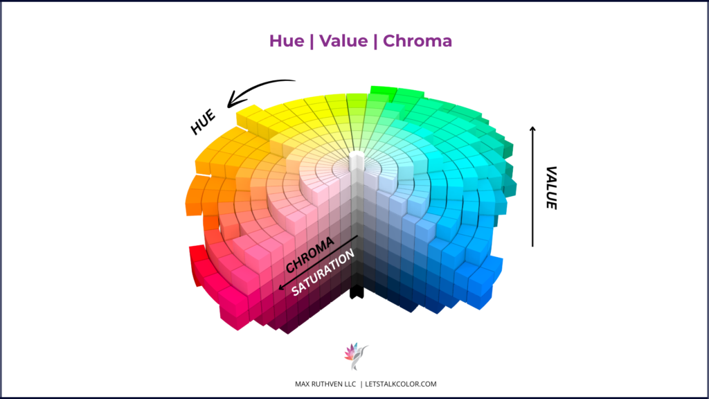
A color’s measured hue-family classification does not change when you move the sample into another room.
The color may appear different, but its classification remains the same. This makes hue family a more consistent reference point than descriptions such as warm beige, soft taupe or greige.
Undertone: An Observation, Not a Fixed Trait
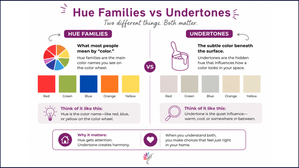
Undertone is commonly used to describe a secondary color someone notices in a paint color.
You may hear a beige described as having a green undertone or a gray described as having a violet cast.
These descriptions can be useful, but they are rarely as fixed as they sound. They are usually based on how a color appeared in a specific room, under specific lighting, beside particular finishes or in a photograph.
Hue family is measurable.
Undertone is an observation about appearance.
That is why two knowledgeable people can describe the same neutral differently and both be reporting what they genuinely saw.
Are Undertones a Myth?
Not exactly.
The color shifts people notice are real. The myth is that an undertone label can predict exactly how a paint color will look in every room.
A neutral described as having a green undertone will not necessarily look green everywhere. That characteristic may become more visible under indirect light or beside warmer materials.
A more useful description explains the condition:
“This neutral may reveal more of its green-yellow character in indirect light or beside warm flooring”
That tells you far more than simply saying the color “has a green undertone.”
Why Neutral Paint Colors Appear to Change
The paint is not changing. The viewing conditions are.
Lighting: Morning, afternoon and artificial light reveal different aspects of a color.
Flooring and fixed materials: A neutral beside warm oak may appear cooler. Beside cool gray tile, it may appear warmer. The paint has not changed; the comparison has.
Adjacent colors: Trim, cabinetry, ceilings and nearby walls influence how a color is perceived.
Screens and photographs: Lighting, camera settings, editing and your screen all affect what you see online. A photograph is a digital interpretation, not the painted wall itself.
Where LRV Fits In
Light Reflectance Value, or LRV, measures how much visible light a painted surface reflects.
It is useful when comparing the relative depth of colors, but it does not tell you:
- The color’s hue family
- Whether it will appear warm or cool
- Which color characteristic you may notice
- How it will respond to your lighting and materials
Two paint colors can have very similar LRVs and still look noticeably different.
LRV is helpful information, but it is only one part of the conversation.
How to Use Paint Color Labels
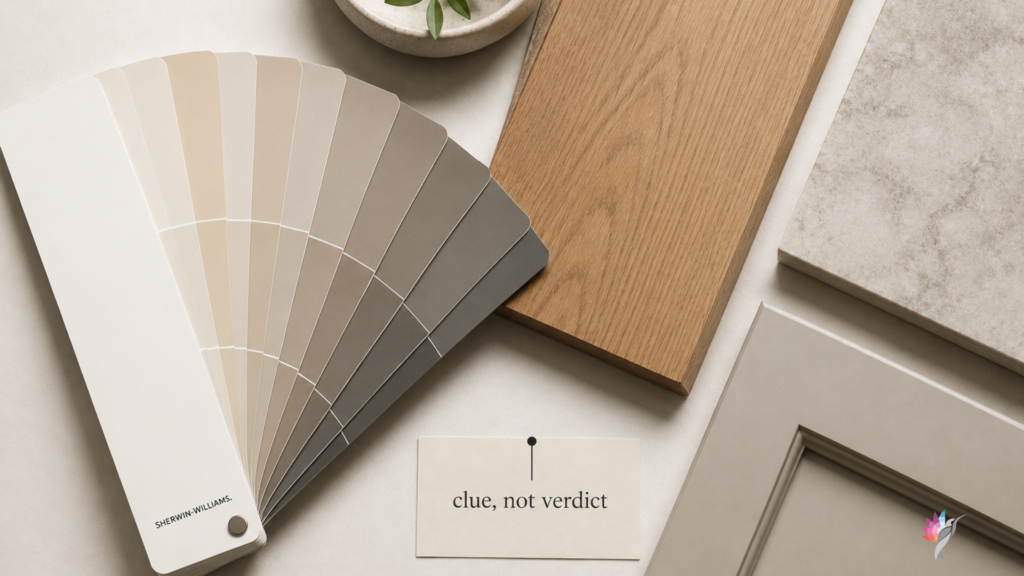
Treat paint descriptions as clues, not verdicts.
When evaluating a neutral, consider three things:
The measurable information: Paint name, hue family, LRV and relative depth/value.
The observed behavior: What people commonly notice and which conditions tend to bring it forward
Your own room: Flooring, countertops, cabinetry, trim and lighting throughout the day
Each type of information serves a different purpose.
A Better Way to Evaluate Neutrals
Instead of asking only: What undertone does this color have?
Ask: What is its hue family, and how does it respond to the materials and lighting in this room?

Then compare several similar colors side by side.
Differences are often much easier to see through comparison than when looking at one sample alone.
Use a large, movable sample and view it:
- Near the flooring
- Beside the cabinetry or countertops
- Next to the trim
- In morning light
- In afternoon light
- Under artificial light
Approve a paint color because you have seen how it behaves in your home, not because of the description on the paint chip.
The Bottom Line
Hue family is a measurable classification.
Undertone is an observed color characteristic that becomes noticeable under certain conditions.
Both are useful, but they are not interchangeable.
The next time someone describes a paint color as green, yellow, gray, warm or cool, they may be accurately describing what they saw.
That does not guarantee that you will see the same thing in your own room.
Your lighting, flooring and surrounding materials will always be part of the color story.
The label can begin the conversation. Testing has to finish it.
Continue reading the Neutral Paint Color Series to better understand how neutral colors behave in real homes:
How to Use Paint Hex Codes in AI Renderings—Without Mistaking the Rendering for the Room
Warm White Paint Colors Compared
Modern Beige Paint Colors Compared
Why Neutral Paint Turns Gray Beside Warm Wood Floors
How to Narrow a Neutral Paint Shortlist Without Sampling 25 Colors
Ready to take the next step?
You can book an appointment with me for personalized support or schedule a discovery call if you’d like to explore how I can help.
Enjoy this blog?